Logo Design & Brand Style Guide
Graphic Design
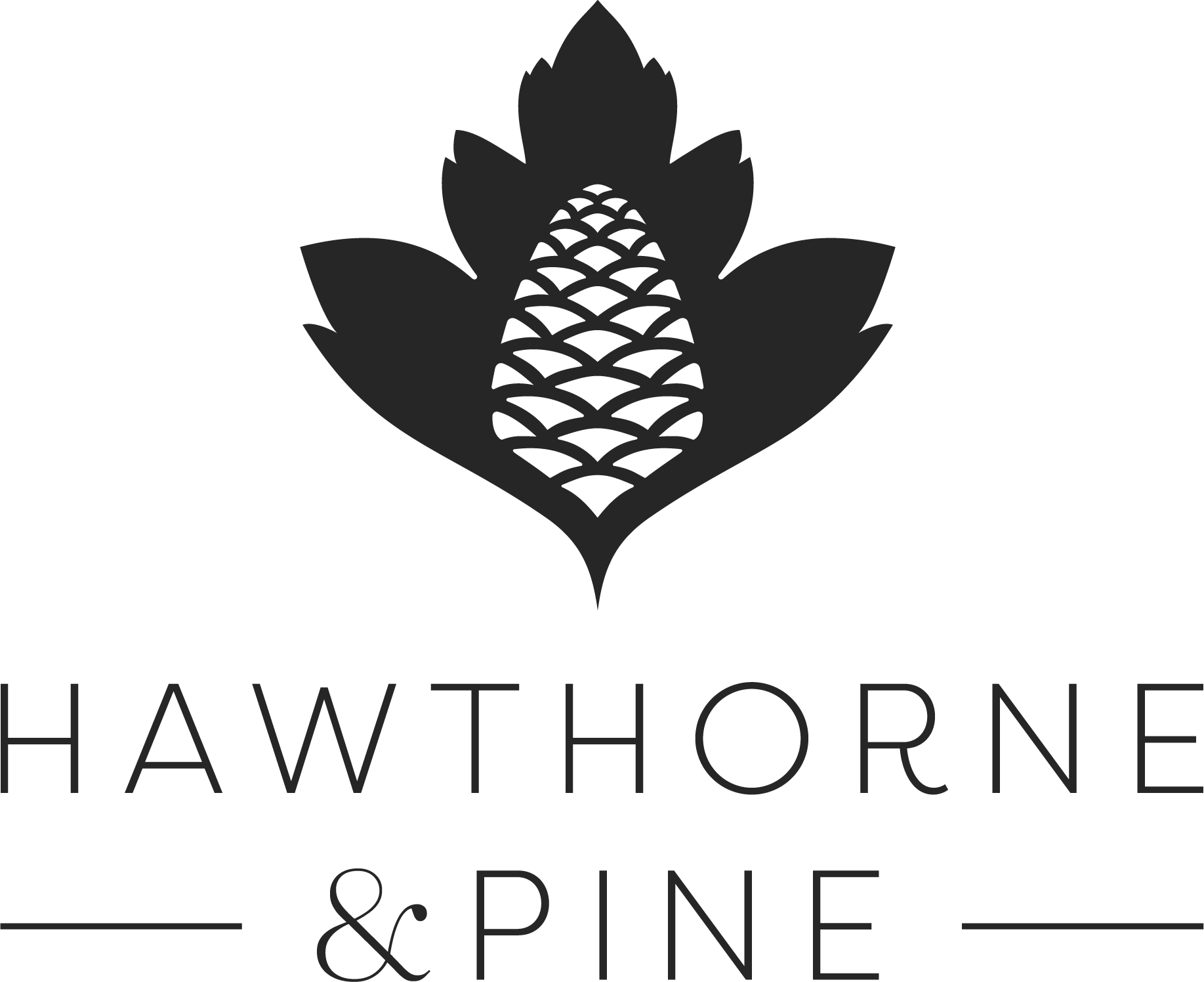
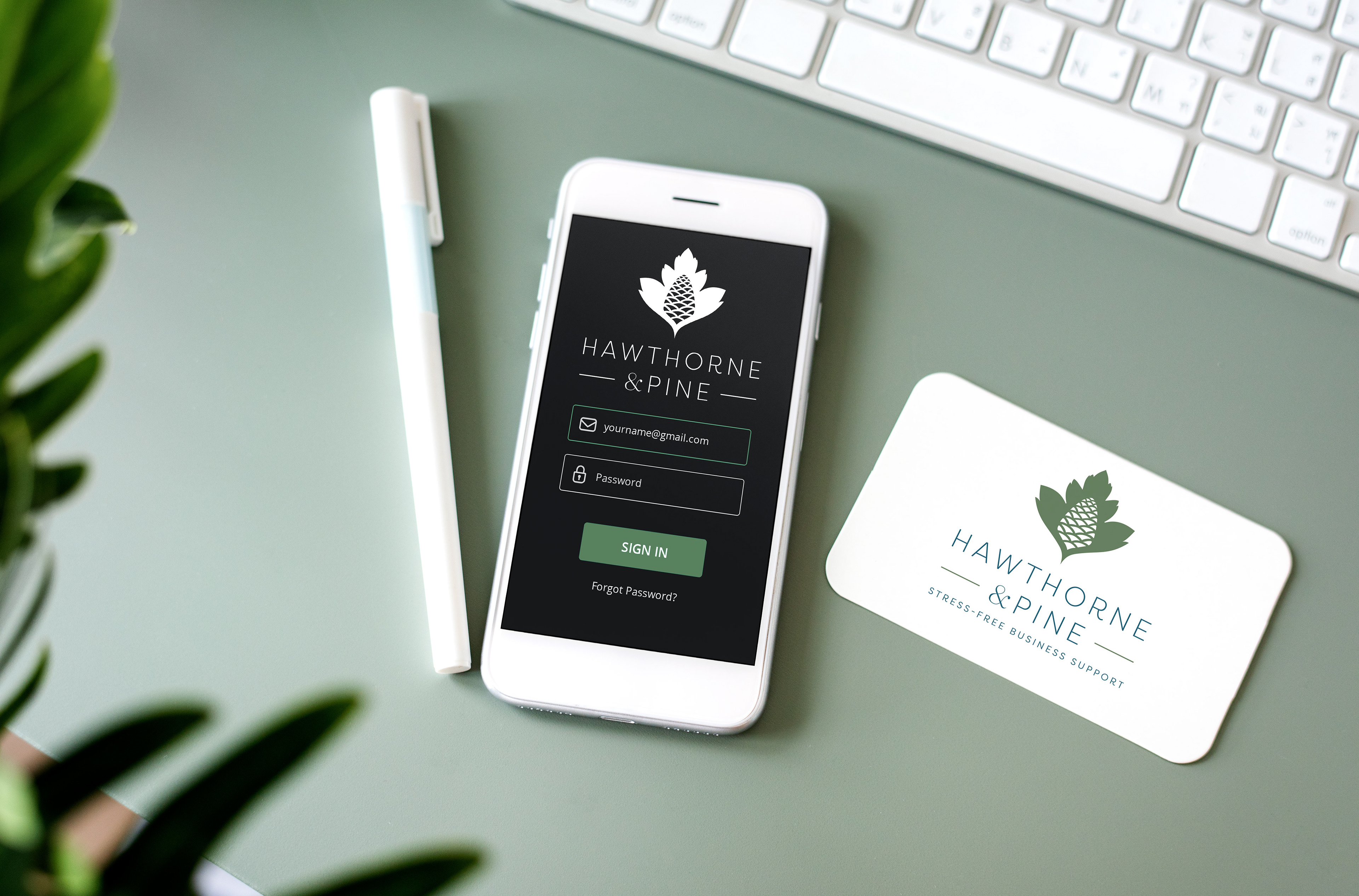
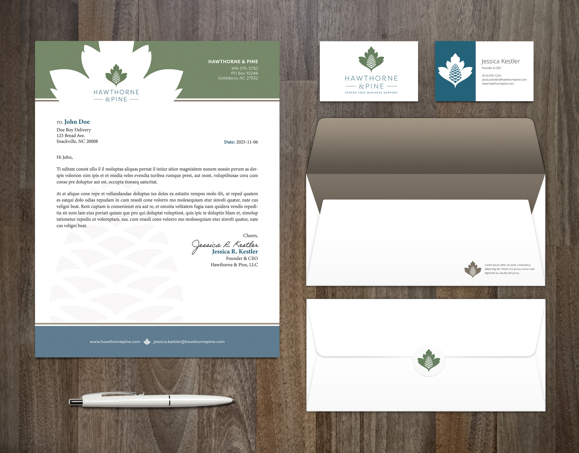
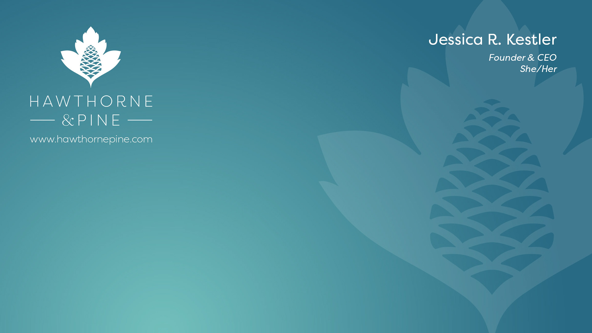
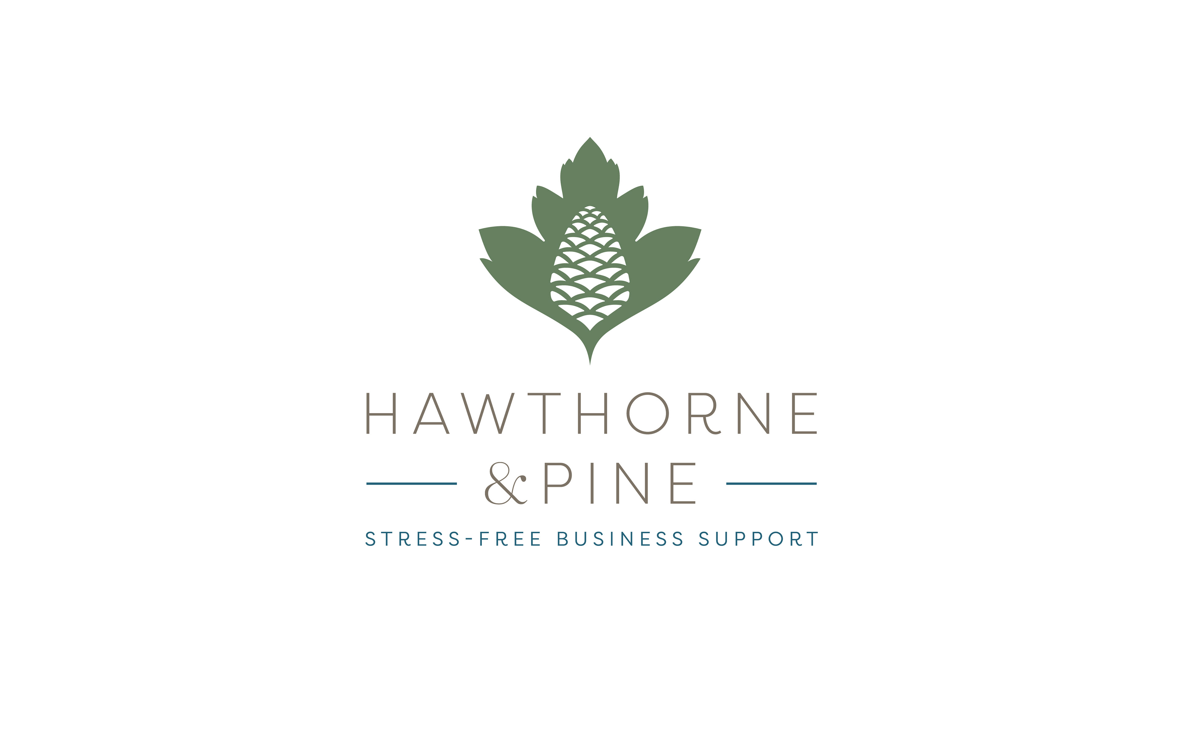
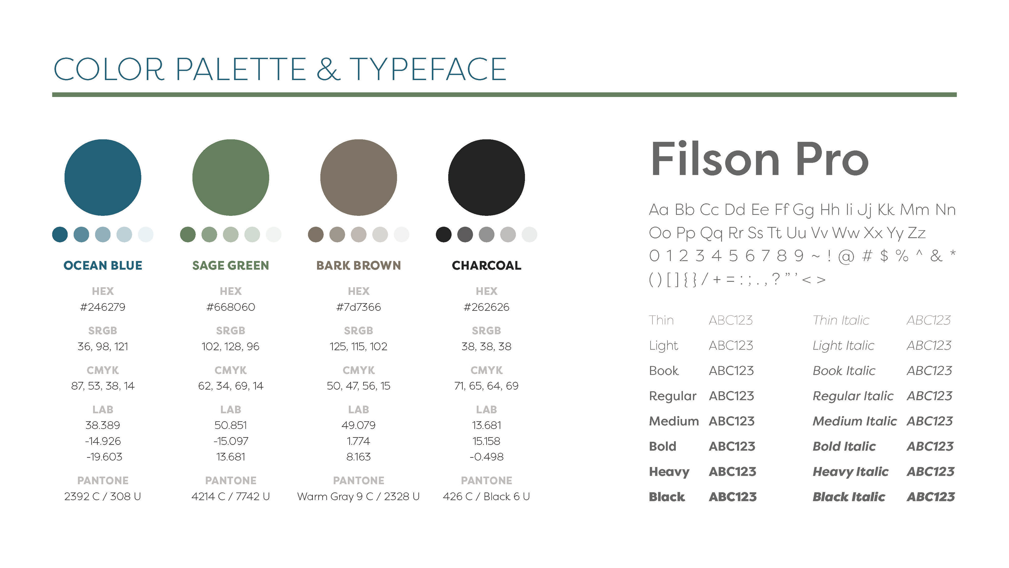
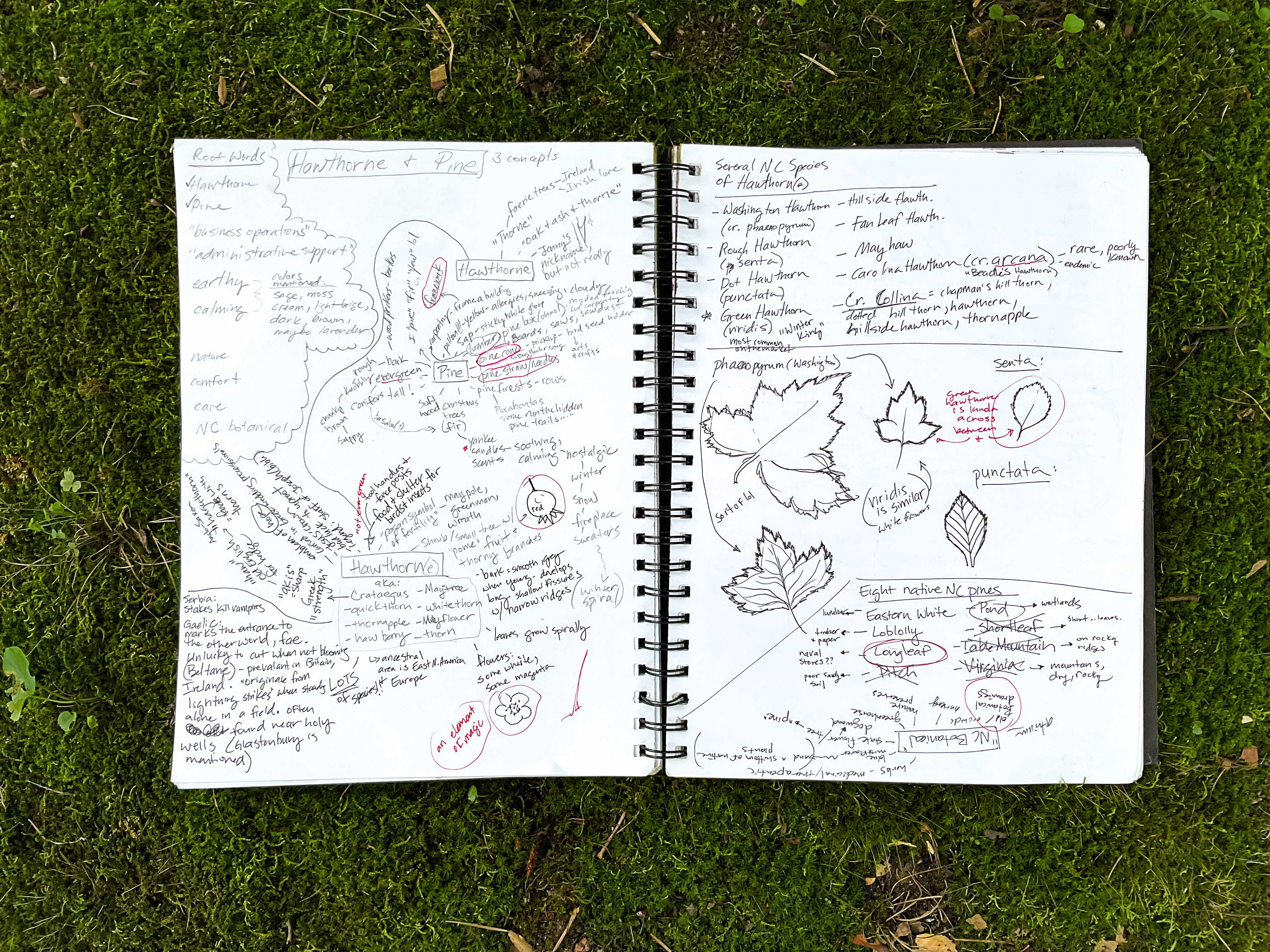
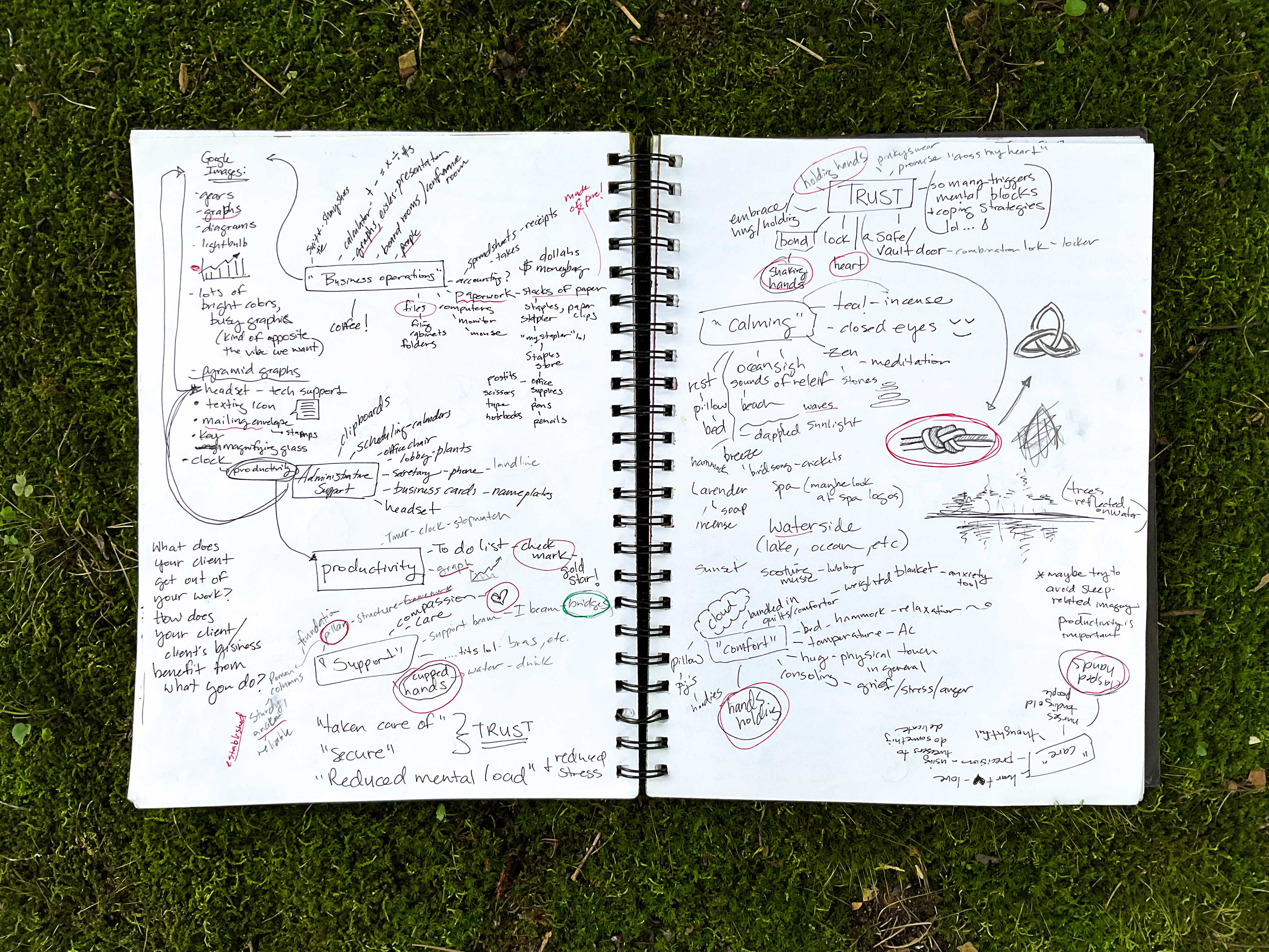
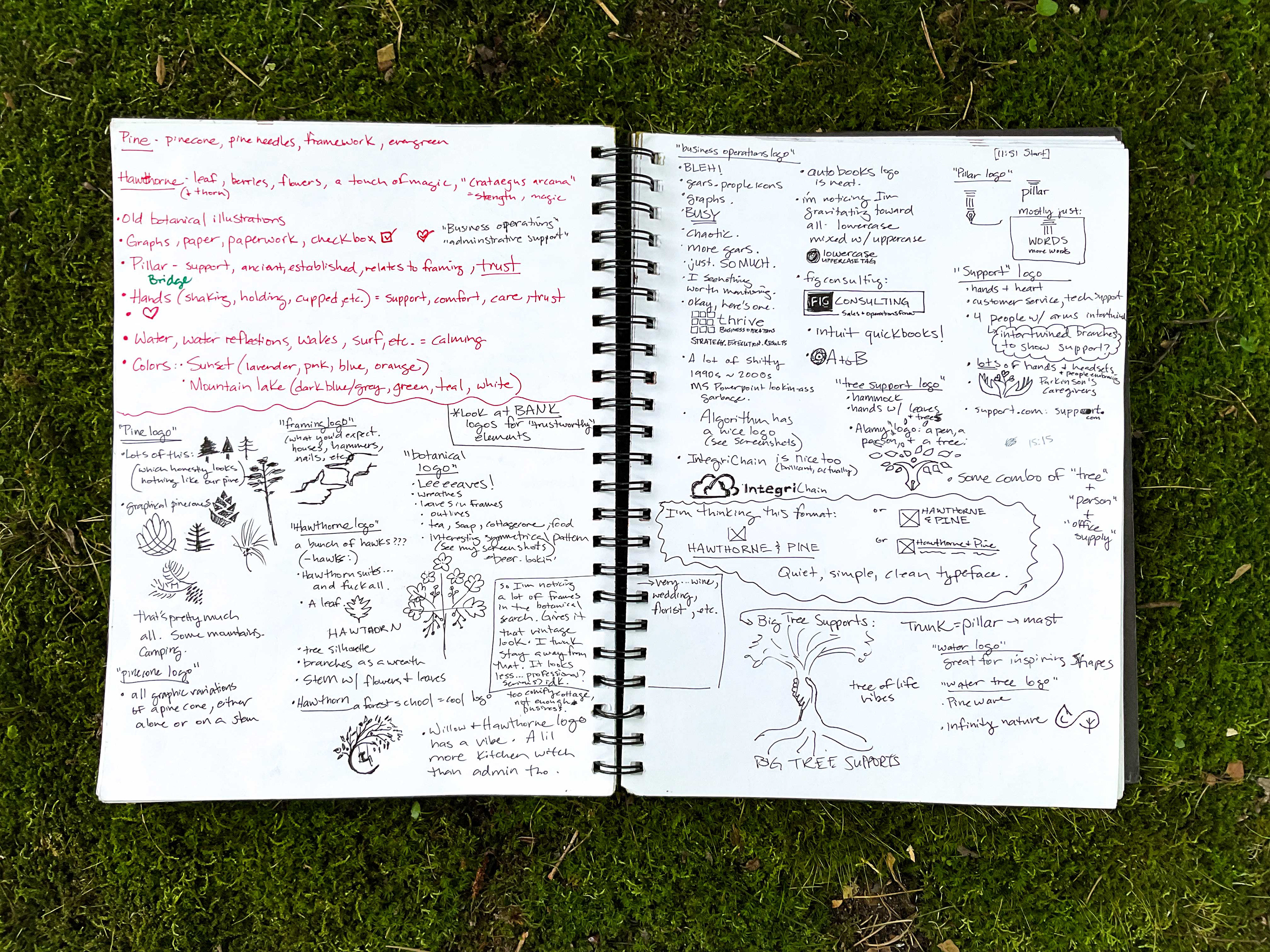
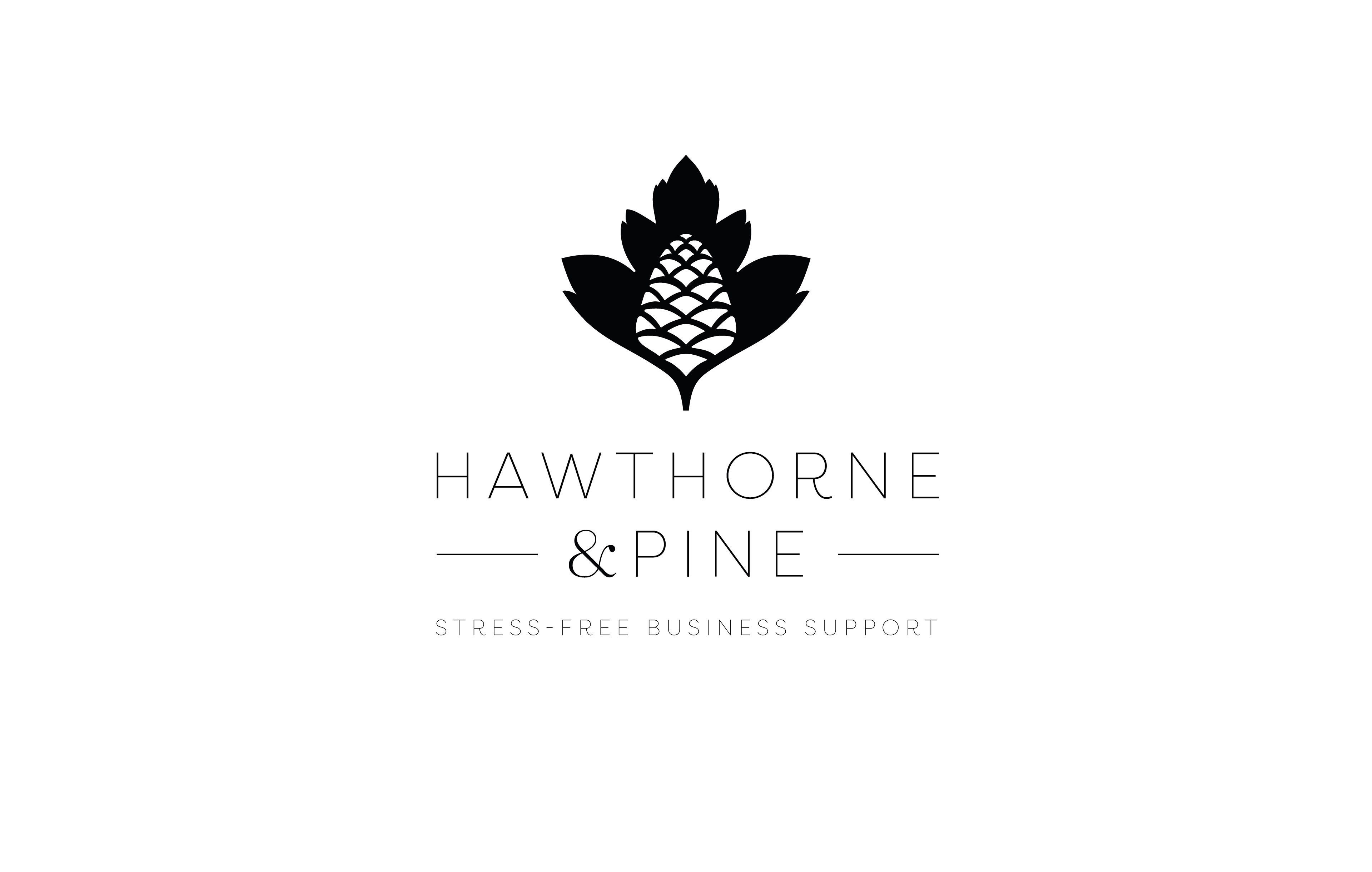
Hawthorne & Pine specializes in stress-free business support. They needed a logo, style guide, Teams background, and letterhead that communicates calm, organized professionalism, with a nod to North Carolina's native botanical roots. After learning more about administrative business support, pine trees, and hawthorn history than I ever anticipated, I developed a simple yet serene graphic echo of the business name paired with clean, open typography to create a sense of peace and stability. Crafting the perfect pinecone is trickier than it looks!
Concept Sketches & Drafts
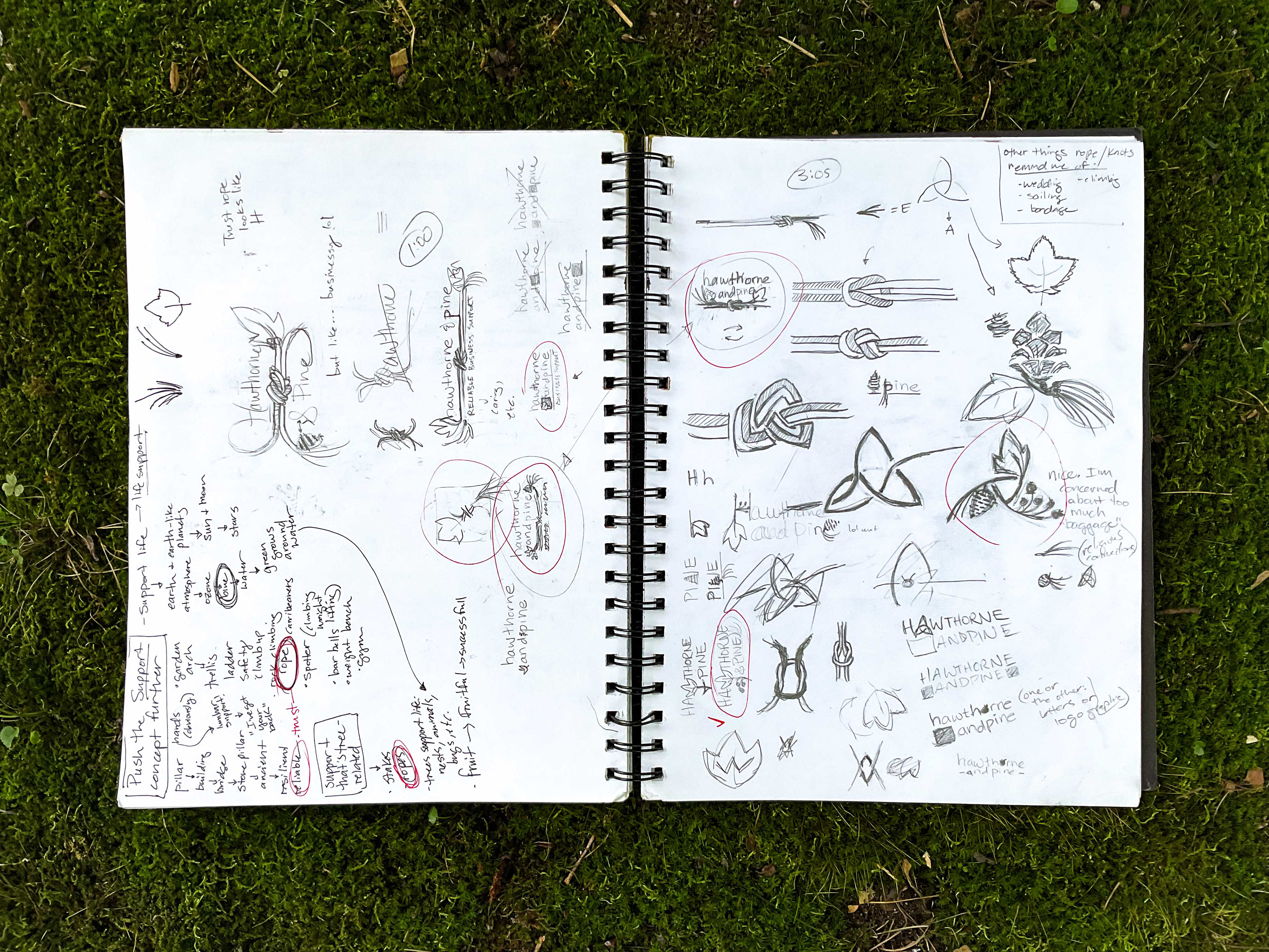
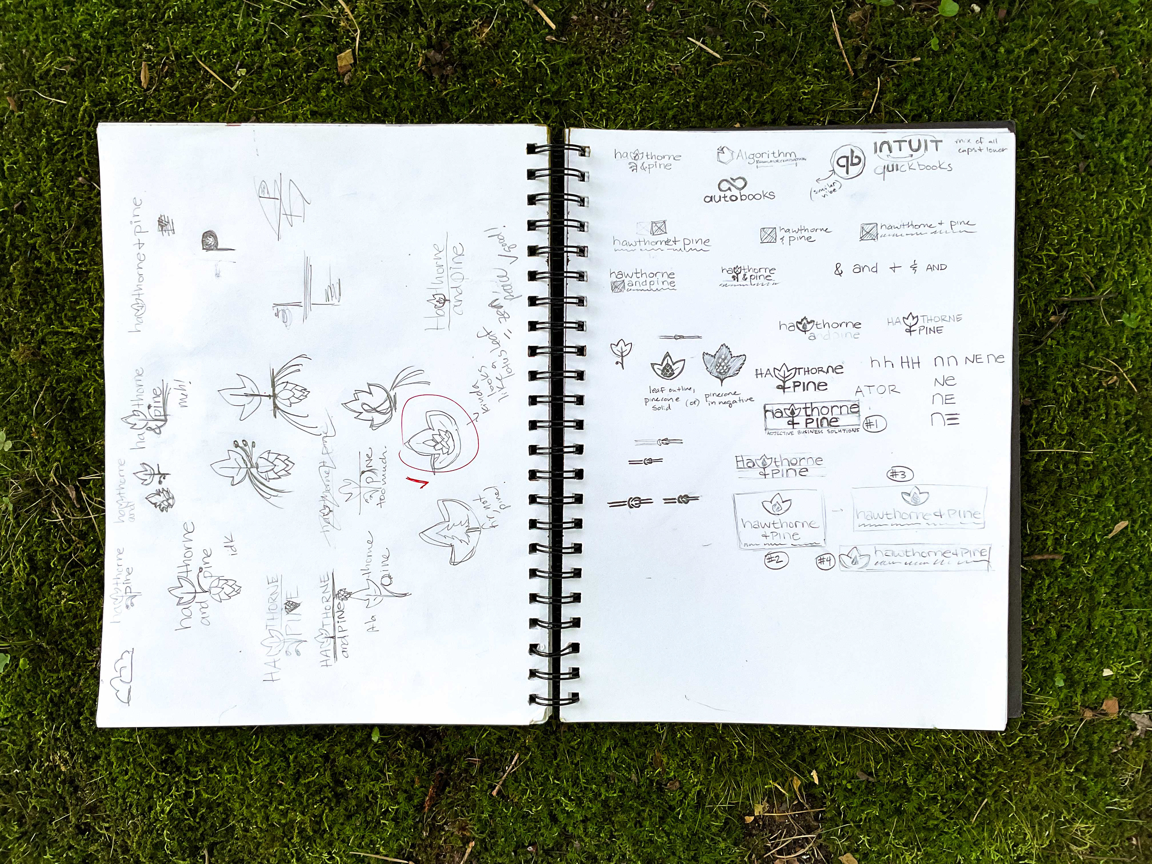
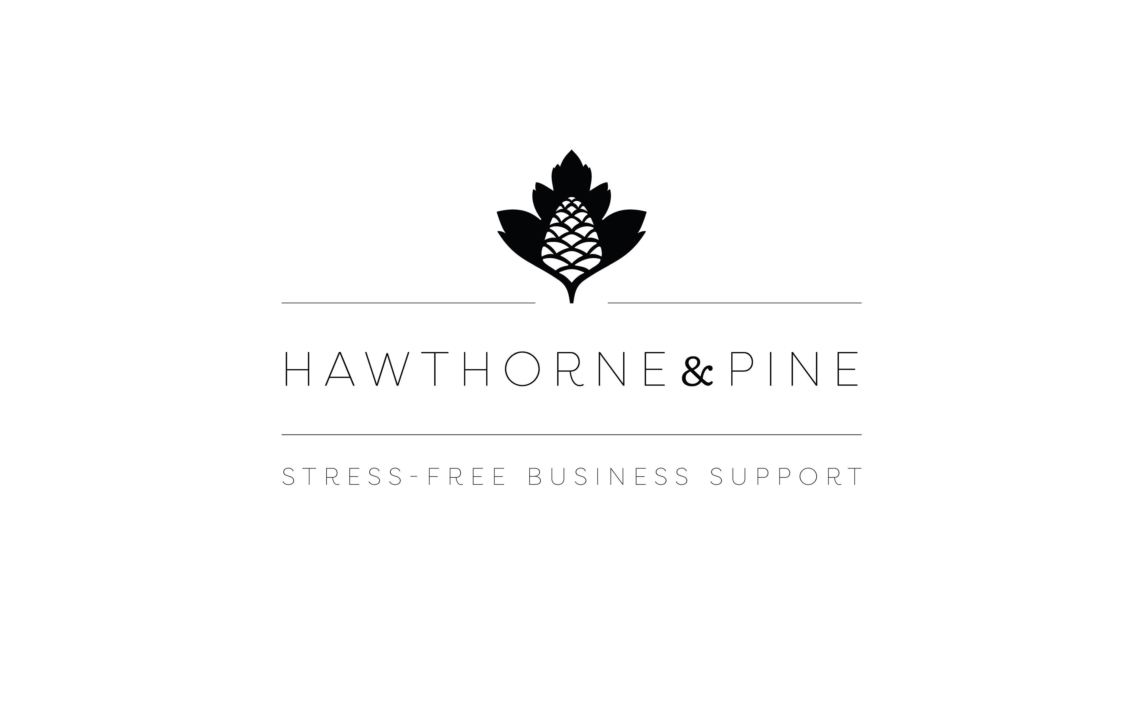
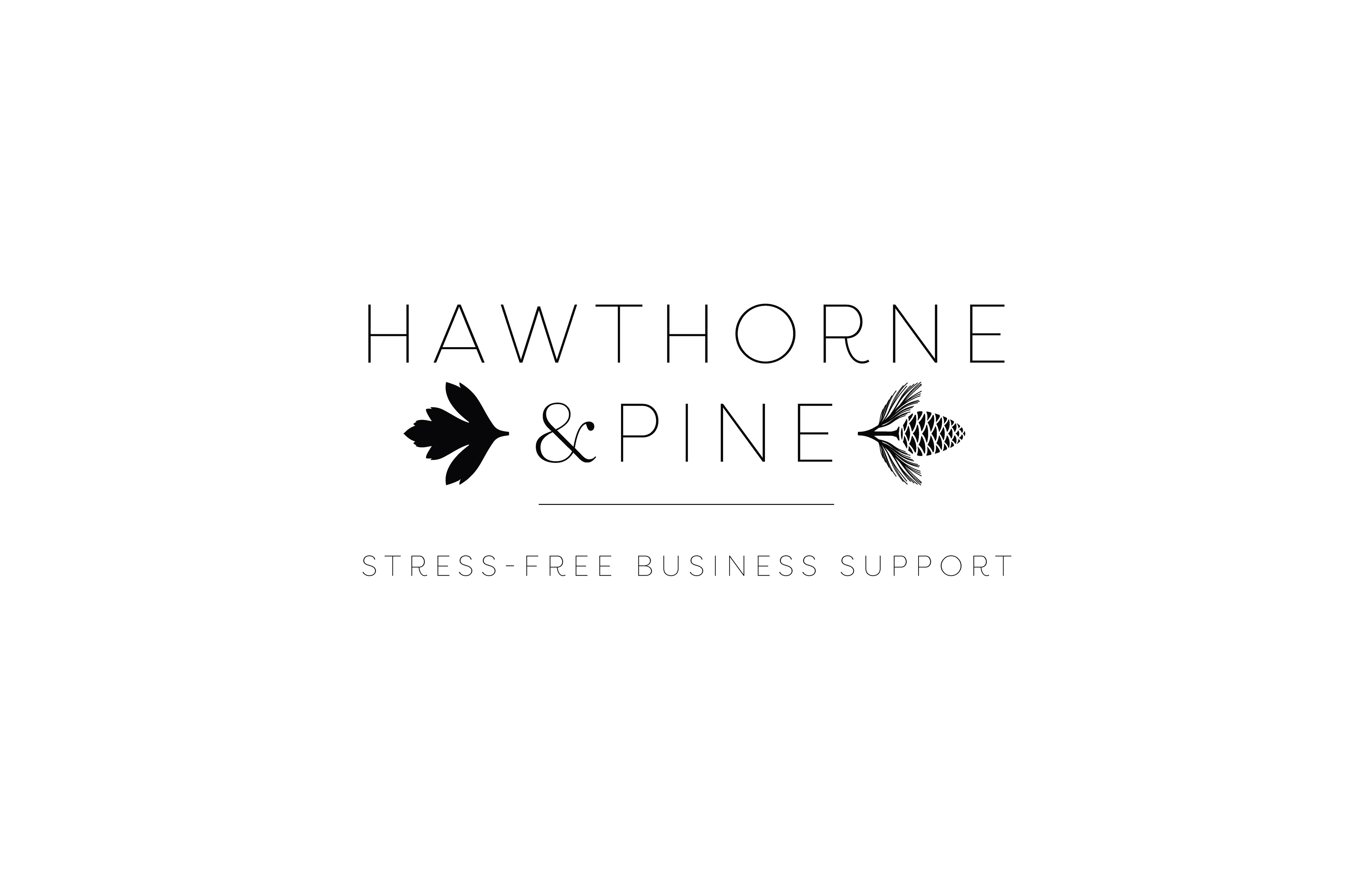
How did they like it?

"I have waxed poetic to Adrian throughout the entire process and I'm more than happy to have the opportunity to say more! I have known Adrian since 2013, his skill and dedication to his craft was already impeccable and it has only grown since then! I will not go anywhere else for brand design, art commission, or anything related. Adrian is not just the first choice, he's the only choice - add me to a waitlist if needed because it's more than worth it."
Jessica Kestler
Founder & CEO of Hawthorne & Pine
Founder & CEO of Hawthorne & Pine
_________________________________________________________
Logo Design
Graphic Design
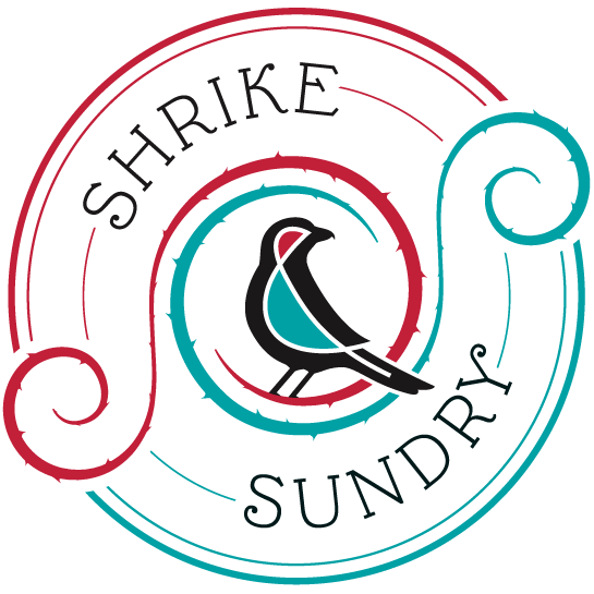
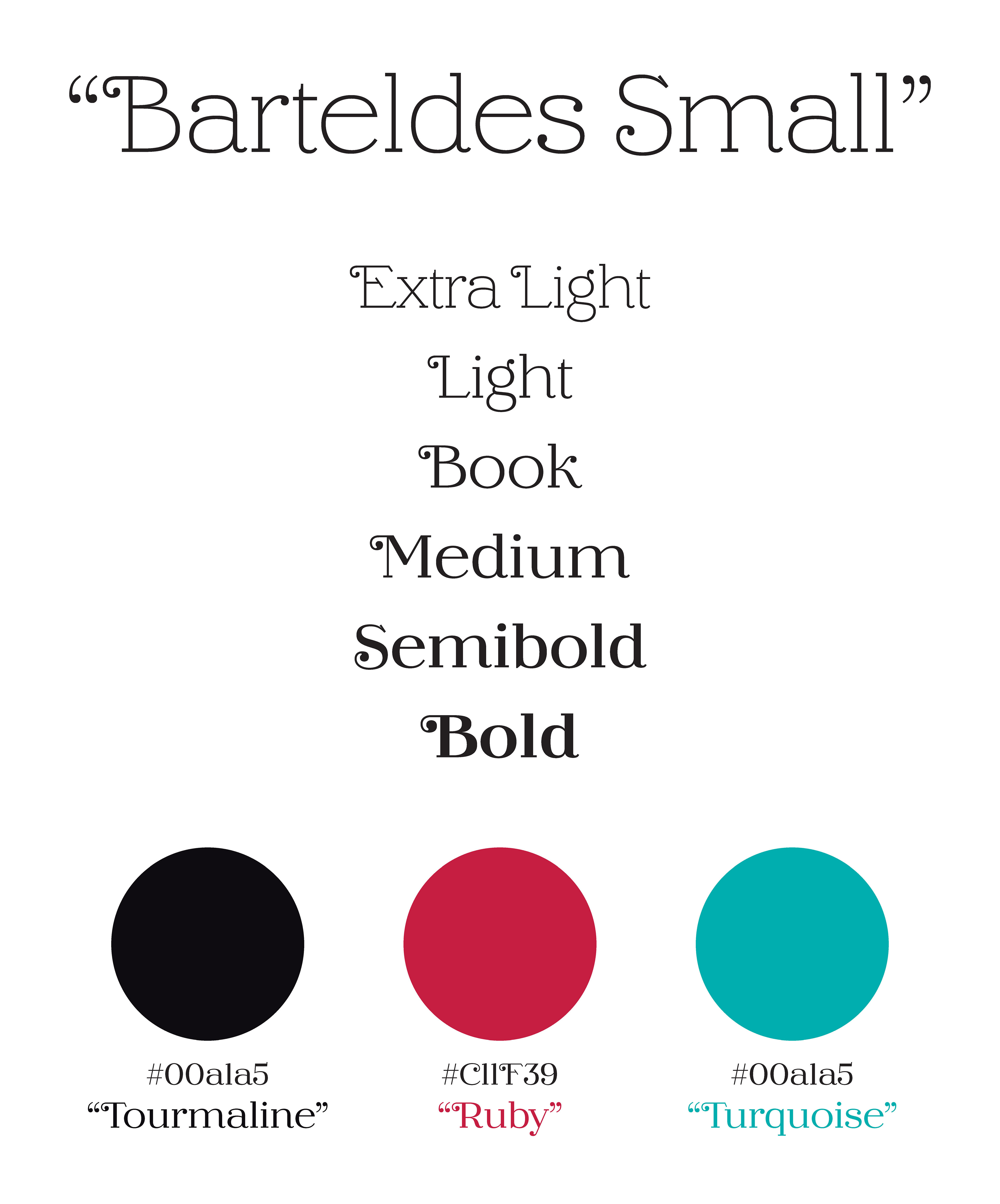
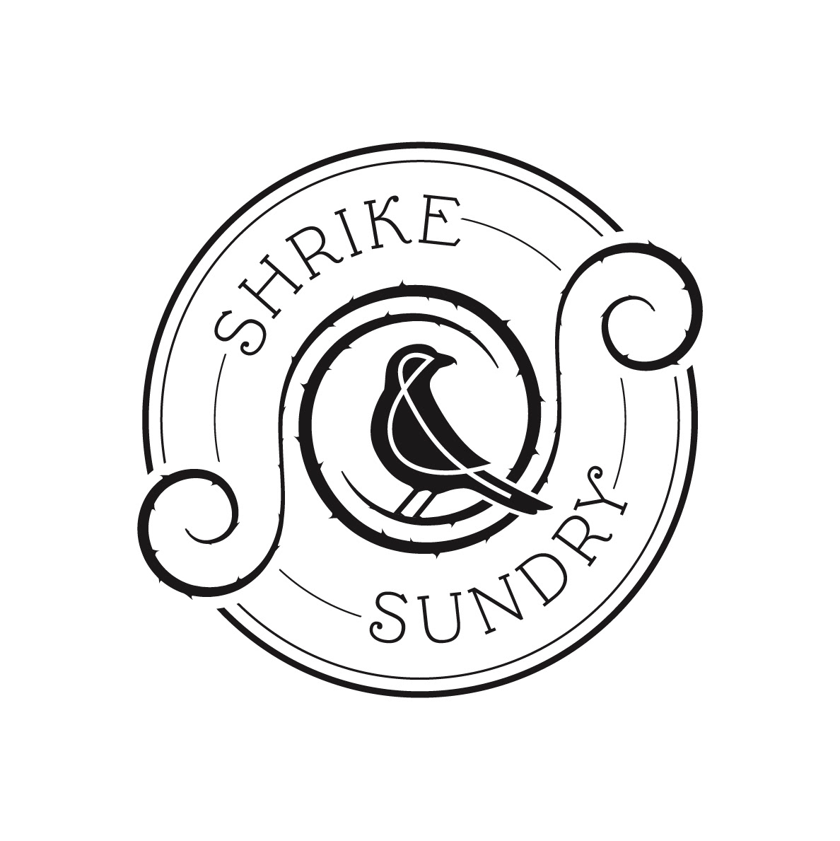
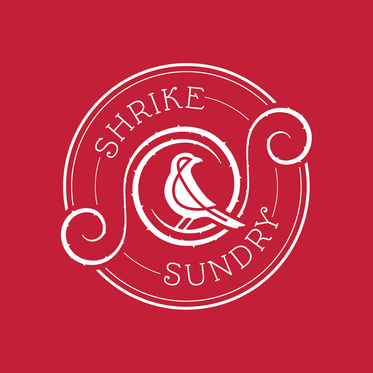
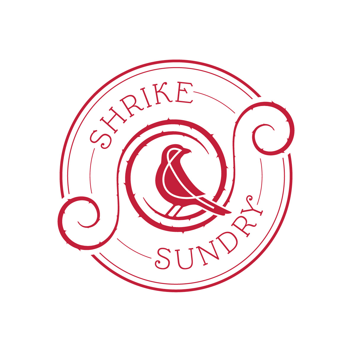
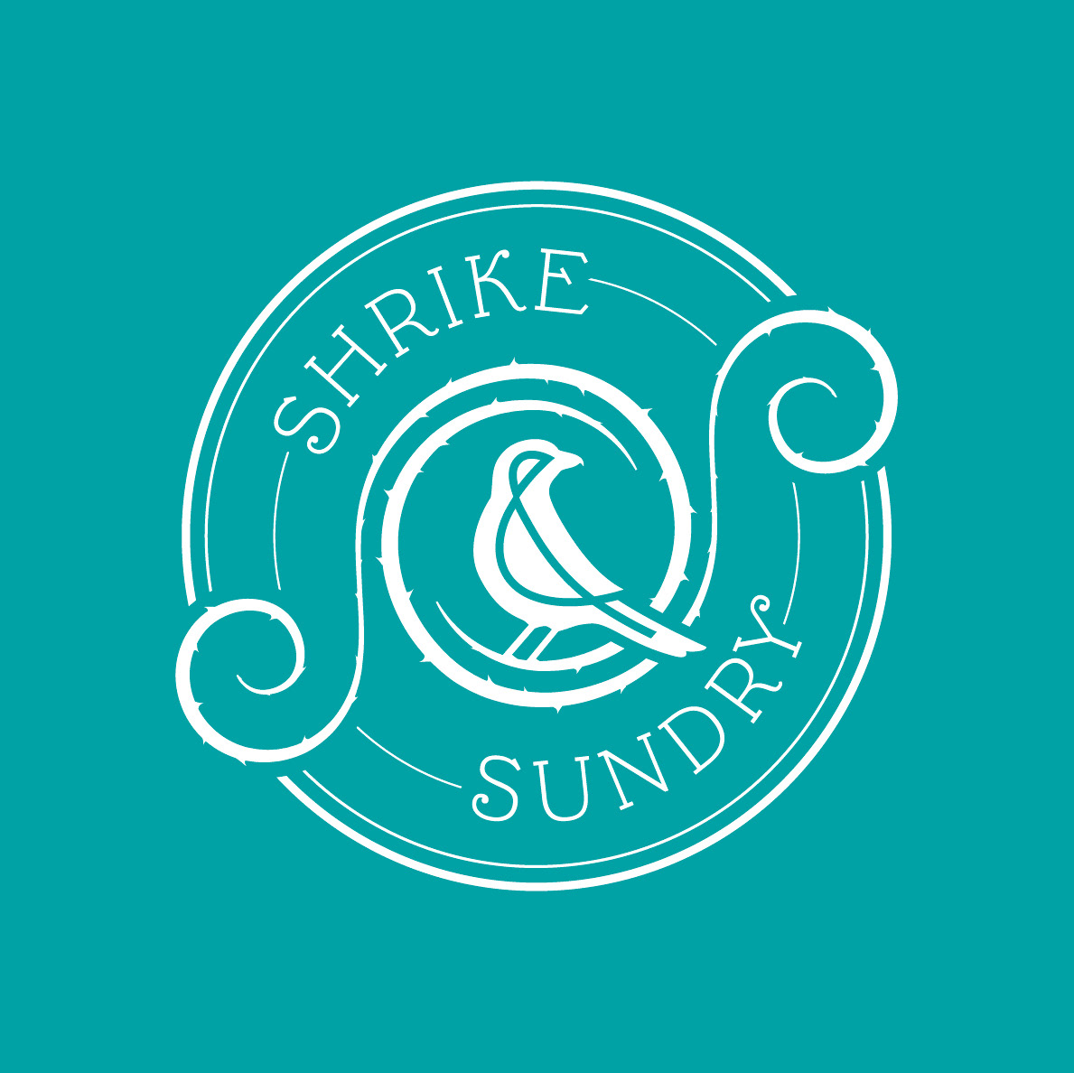
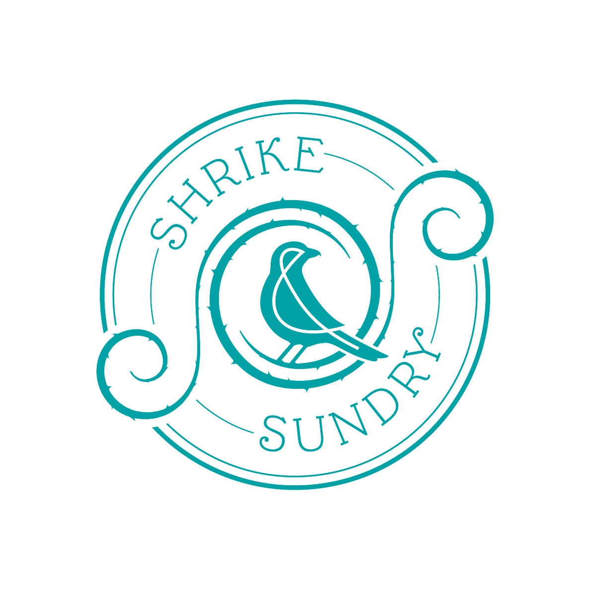
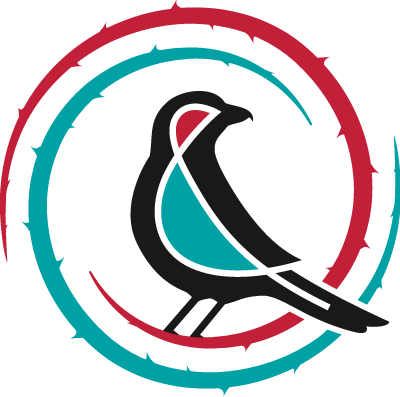
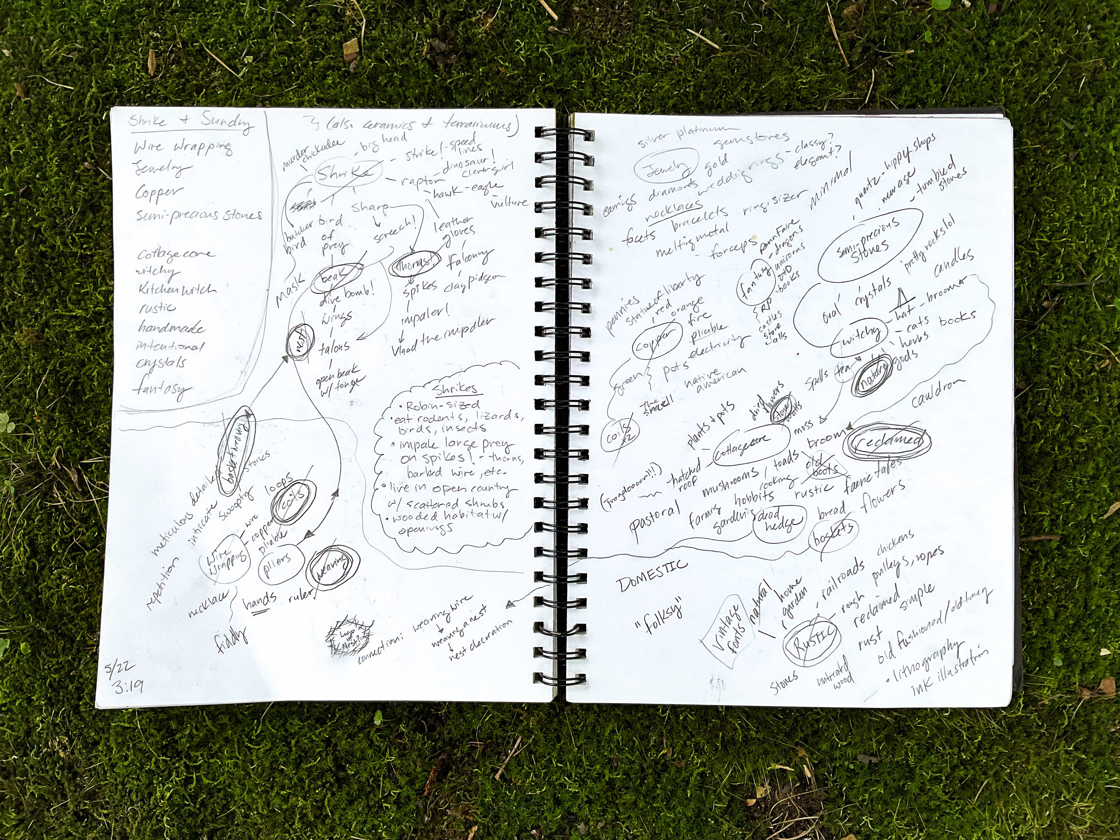
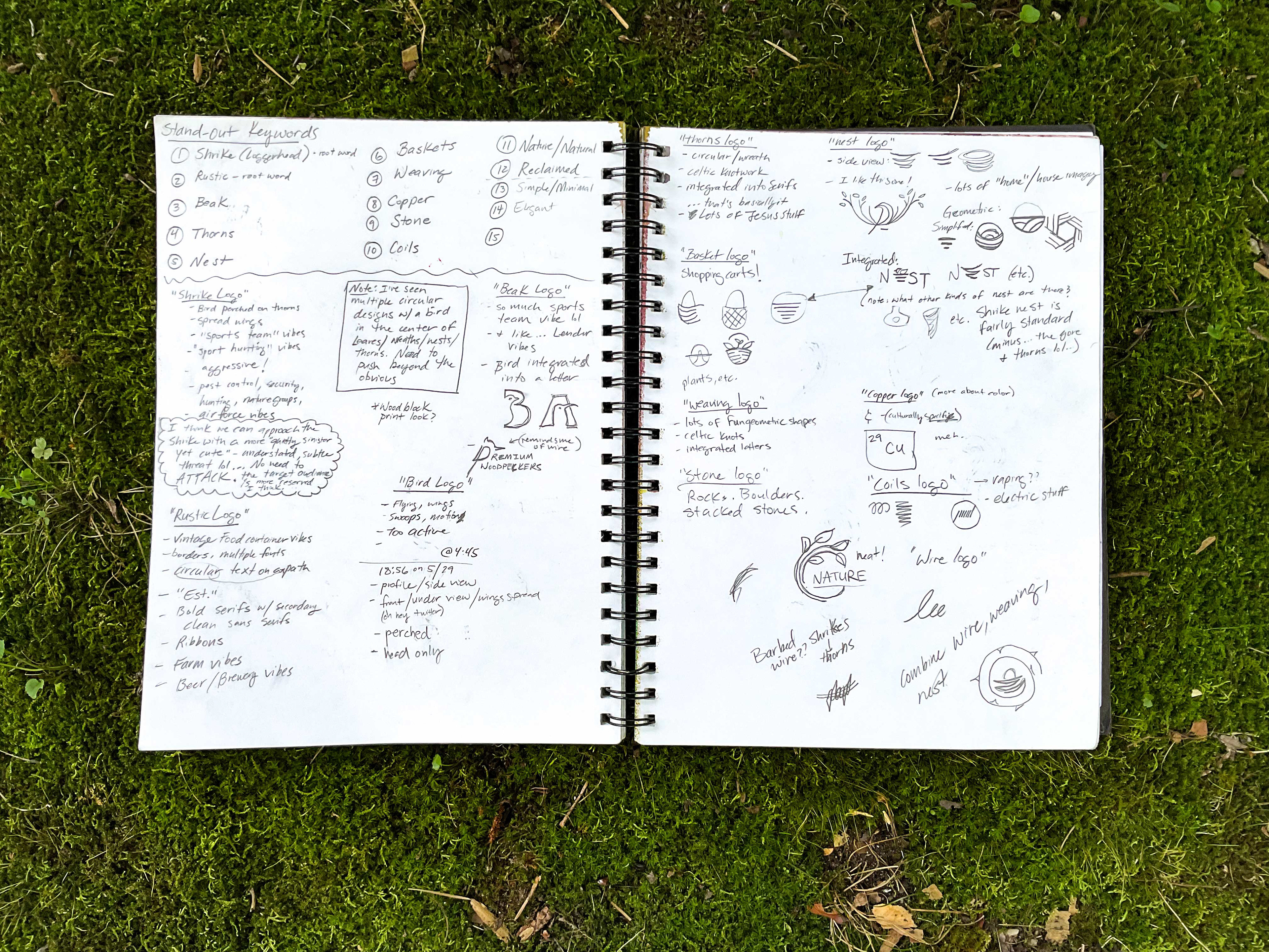
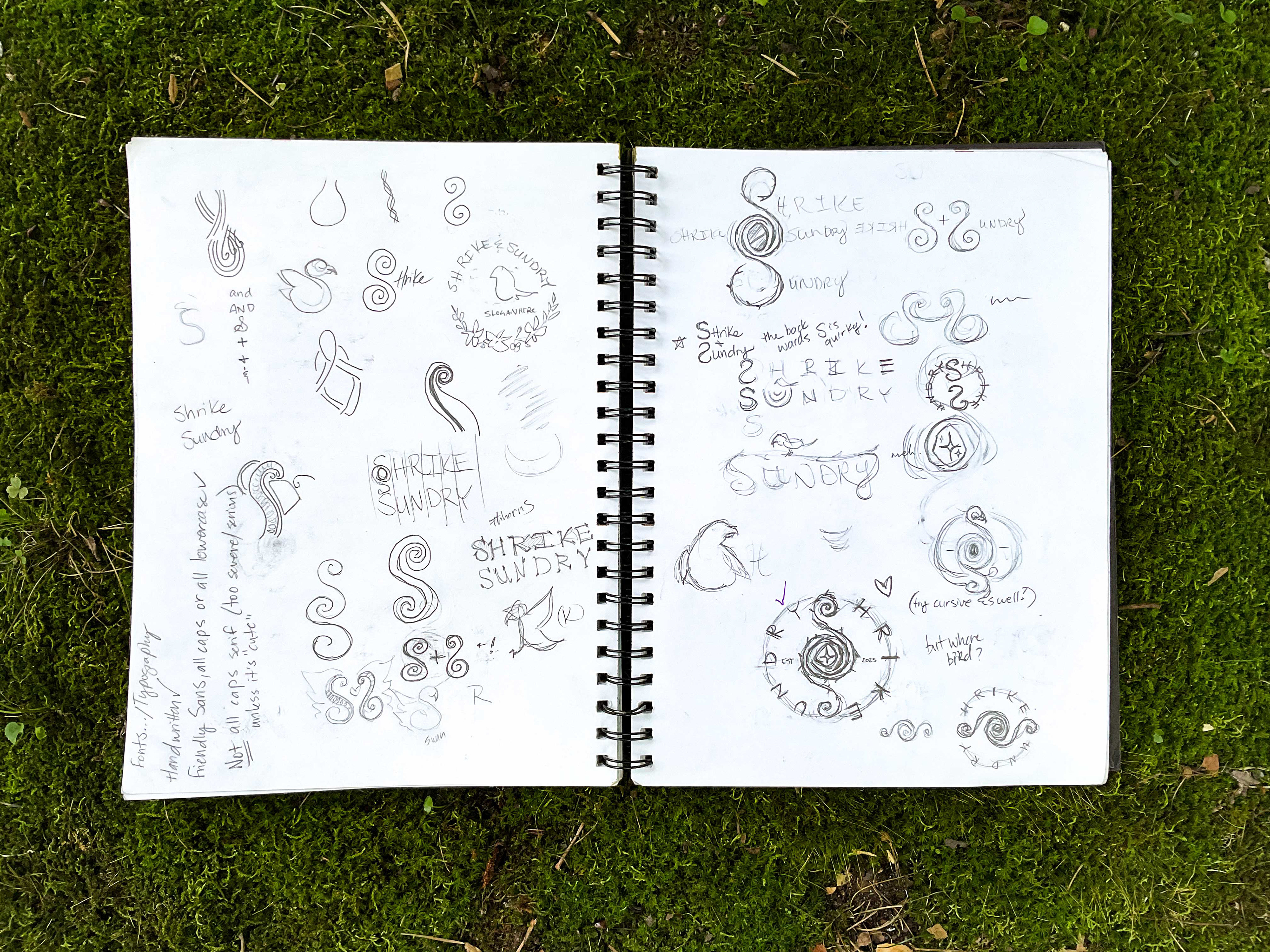
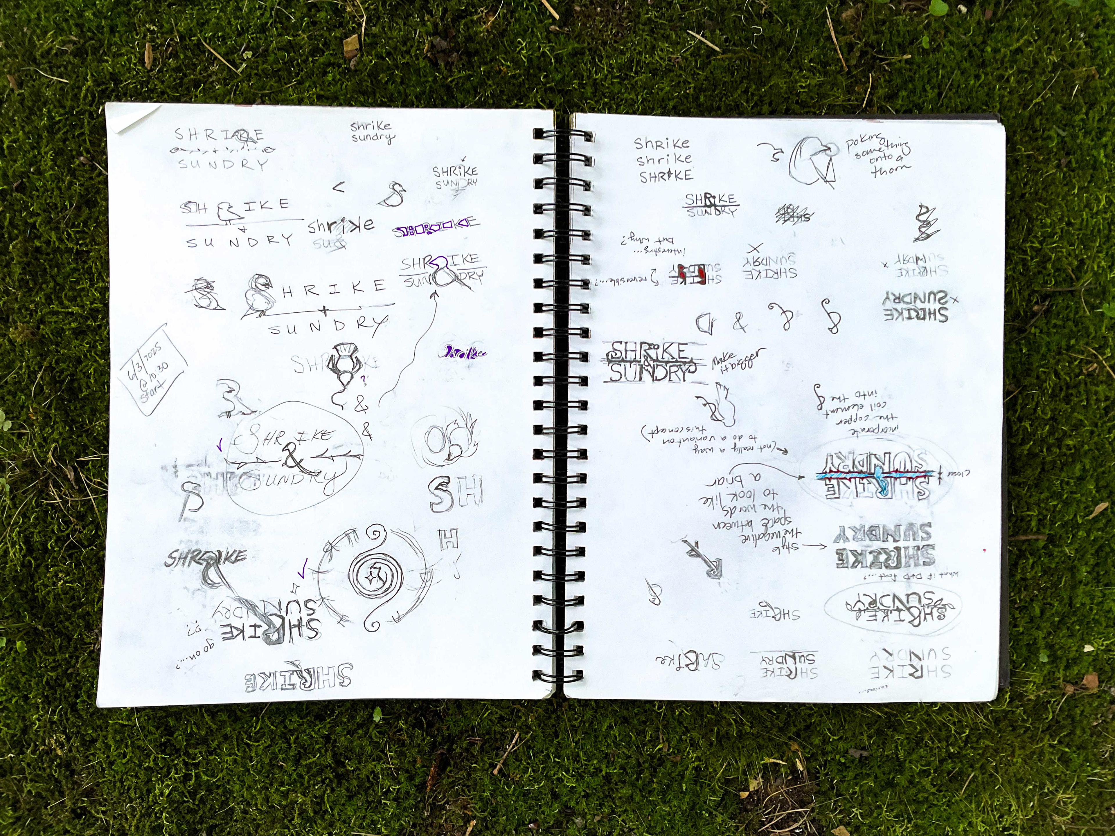
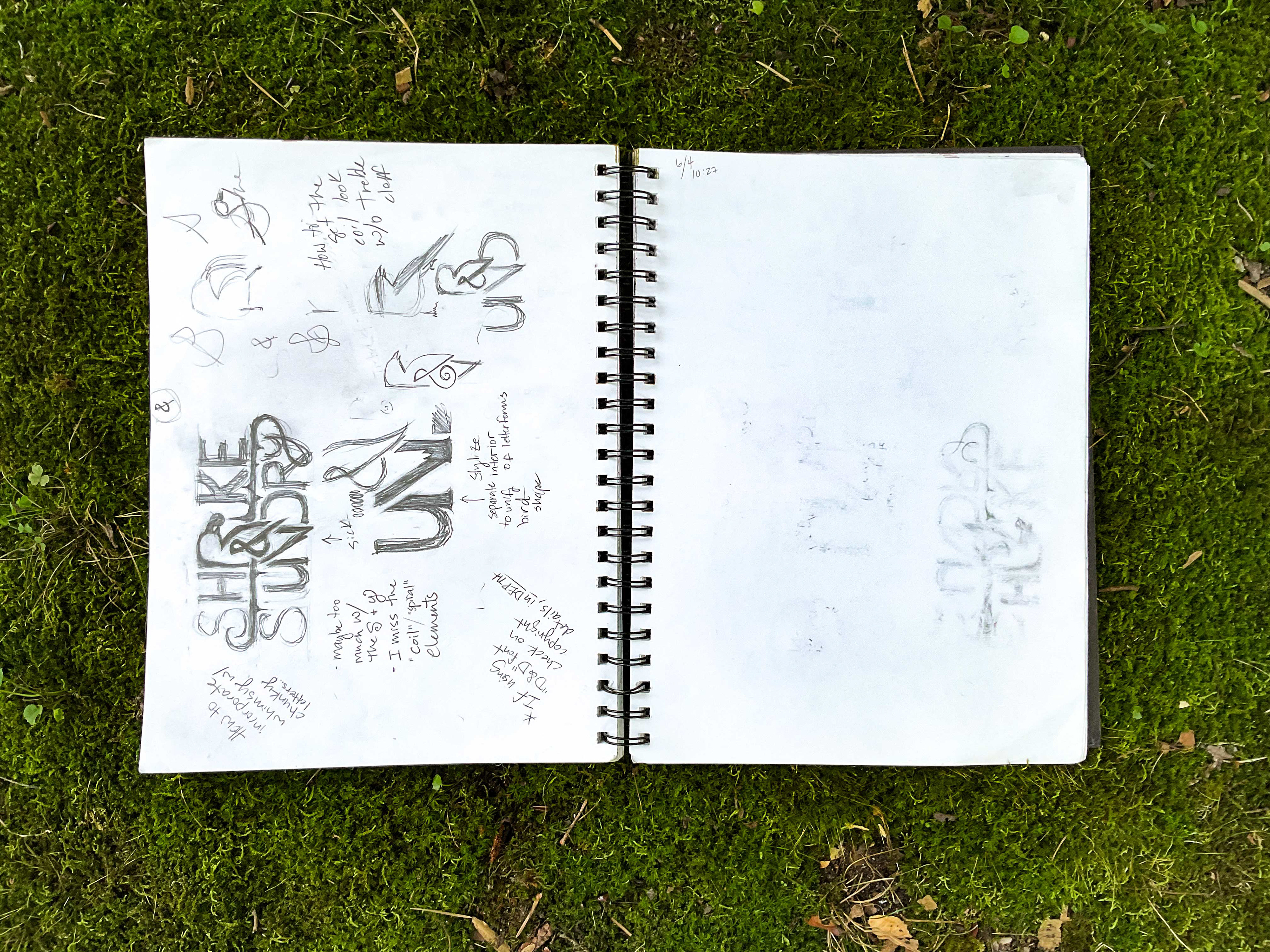
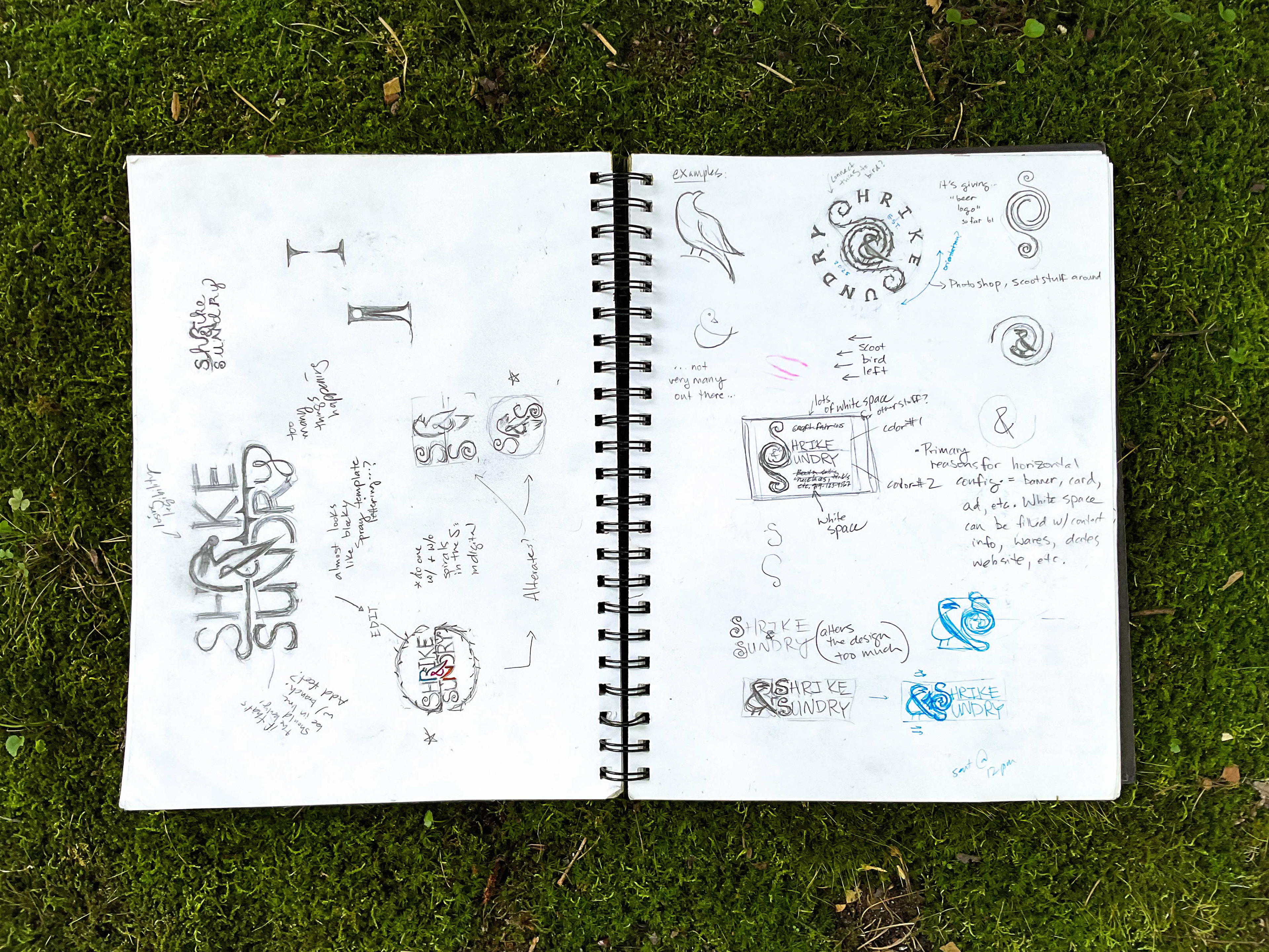
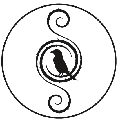
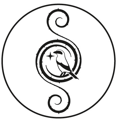
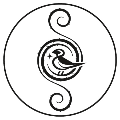
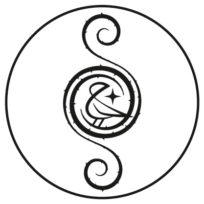
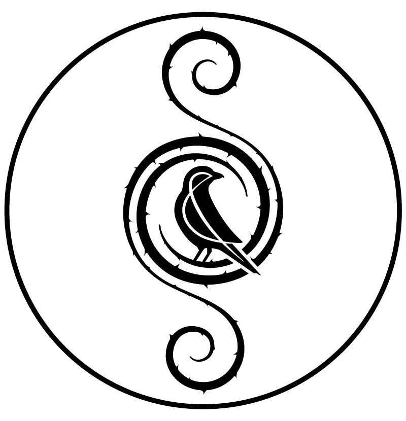
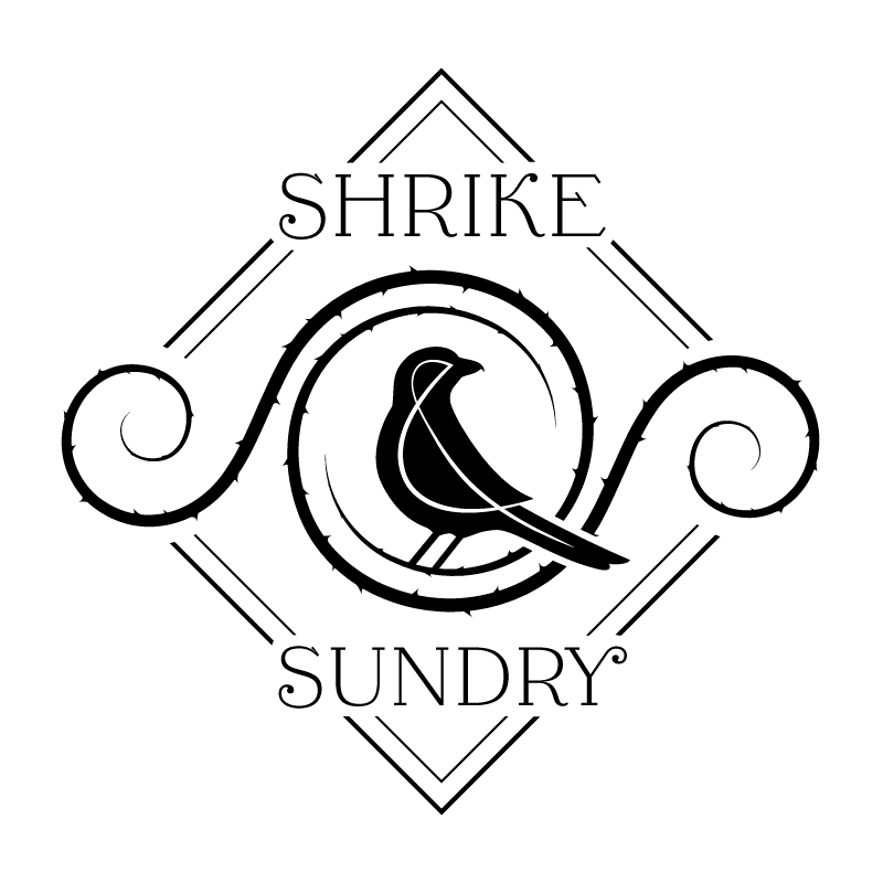
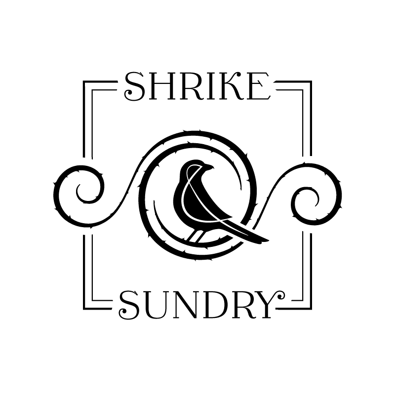
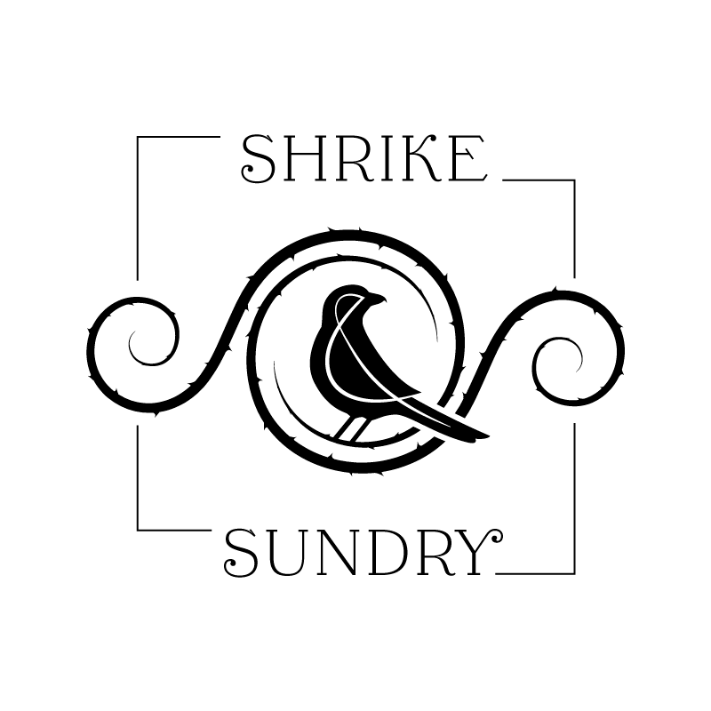
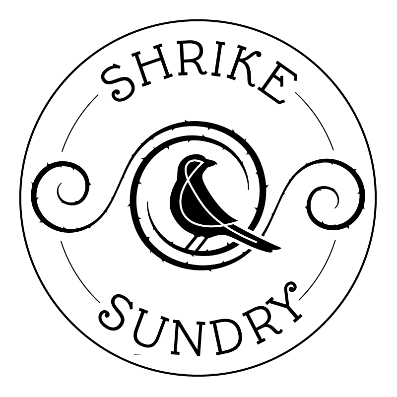
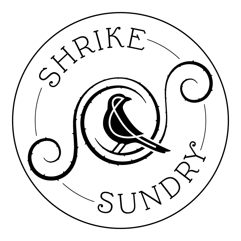
Shrike & Sundry is a jewelry (and sundry) brand founded by artist Sarah Wellish. She creates pendants, earrings, and other gorgeous trinkets by intricately wrapping copper, brass, and silver wire around semiprecious stones, bone, shell, and other natural materials. She came to me with an idea: A shrike perched on the words "Shrike & Sundry", with thorns somewhere in the design. The target audience was described as eclectic, cottage-core, "kitchen witch" crystal enthusiast folks who like jewelry and have a rustic sense of style and enjoy handmade, intentional work.
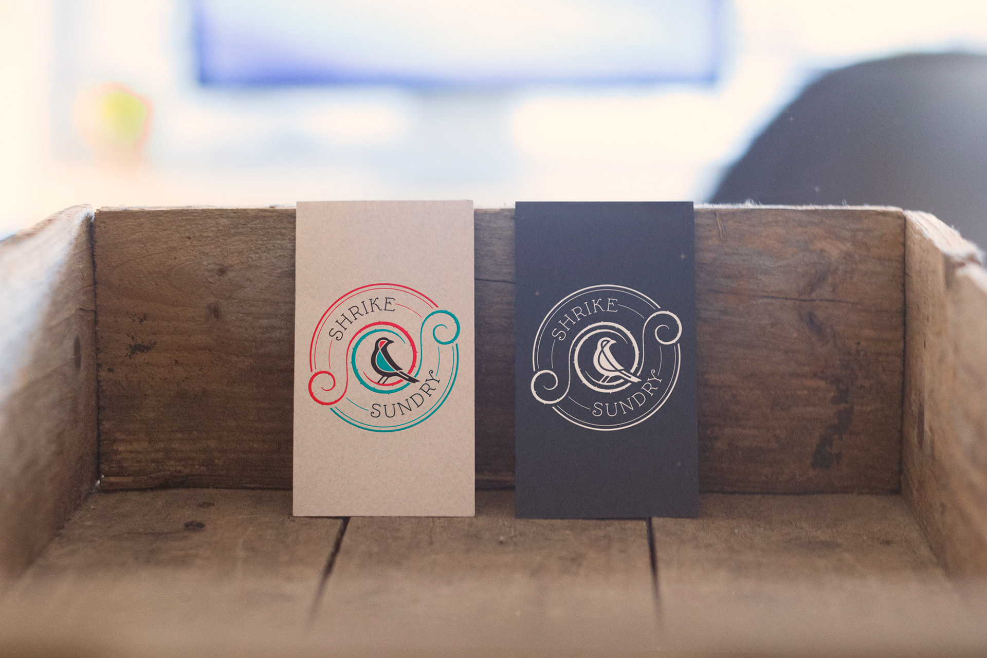
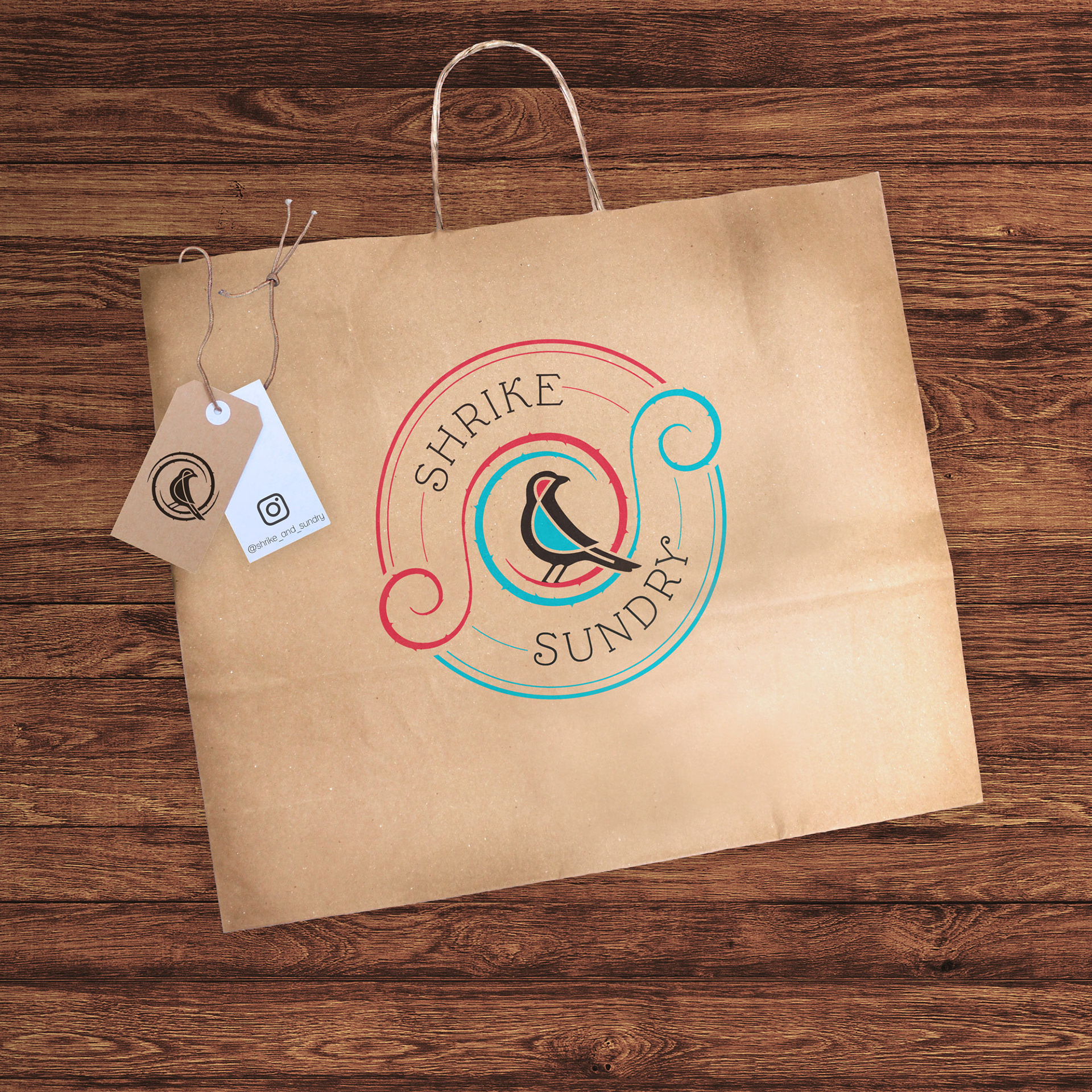
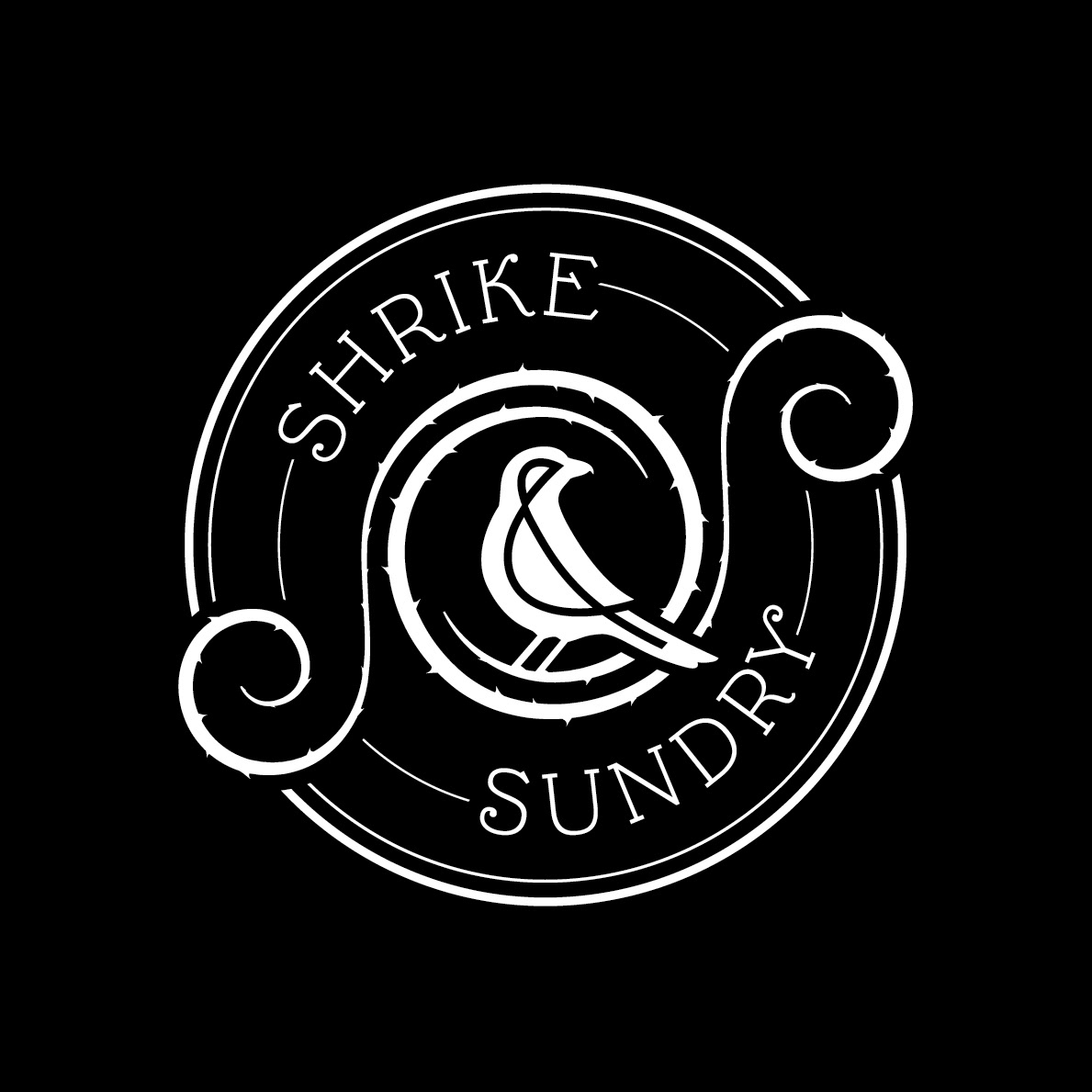
After some research into shrikes and the world of rustic handmade crafts, I took the initial concept further by incorporating the theme of coiled wire into the letterforms for "Shrike" and "Sundry", and in the twisting, intertwined S shapes that form the symmetrical frame of thorns around the bird. To reinforce the symmetry and further integrate the text with the graphics, I designed a jaunty shrike's silhouette to perfectly encapsulate the shape of the ampersand within its body, which works well on its own as an iconic submark for the brand. The offset angle of the words and the frame lend an air of quirky whimsy to the overall look of the logo.
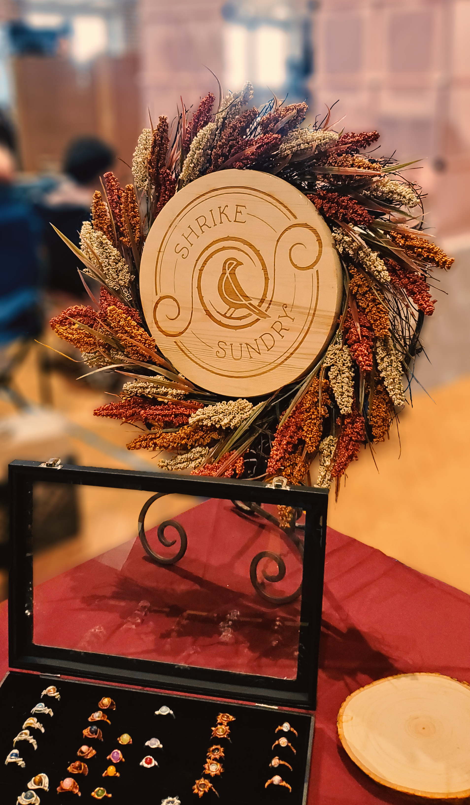
The logo has since been applied to business cards, a stamp, a laser-etched wooden sign for their vending table, their social media profile picture, and more!
Concept Sketches & Drafts
How did they like it?
"Adrian has fantastic design instincts and if you're willing to give him creative freedom to do his best work, he's very likely to come up with something better than your original vision. All of the references I gave him were for simple rectangular format logos, the sort of thing anyone could do with MS Paint and a bit of time, and he came up with a polished circular logo that's infinitely more visually interesting and memorable."
Sarah Wellish
Founder of Shrike & Sundry
Founder of Shrike & Sundry
_________________________________________________________
Logo Design & Website
Graphic Design, Web Design, SEO
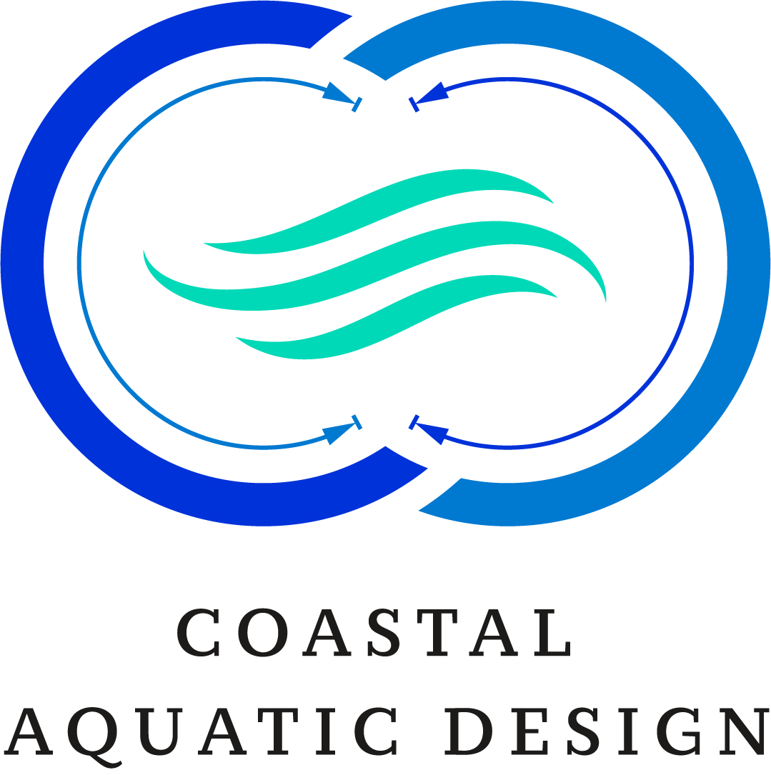
When Coastal Aquatic Design first launched their business, they asked me to help build their brand with a custom logo and a simple website. They provided info about their target audience, competitors, brand colors, and a vague idea of what they wanted for a logo: "Something with a swirl or a wave, but we are open to suggestions." I asked them to tell me a bit about what they do:
"As a professional engineer, Jeff currently stamps pool plans drawn by others. We want to add pool design as an additional service. This will cover commercial semi-public pool plans for construction by others throughout the state of NC to ensure the plans follow local and state requirements, as well as ADA accessibility and drain safety requirements. We will handle the compliance paperwork required by the county environmental health inspections offices."
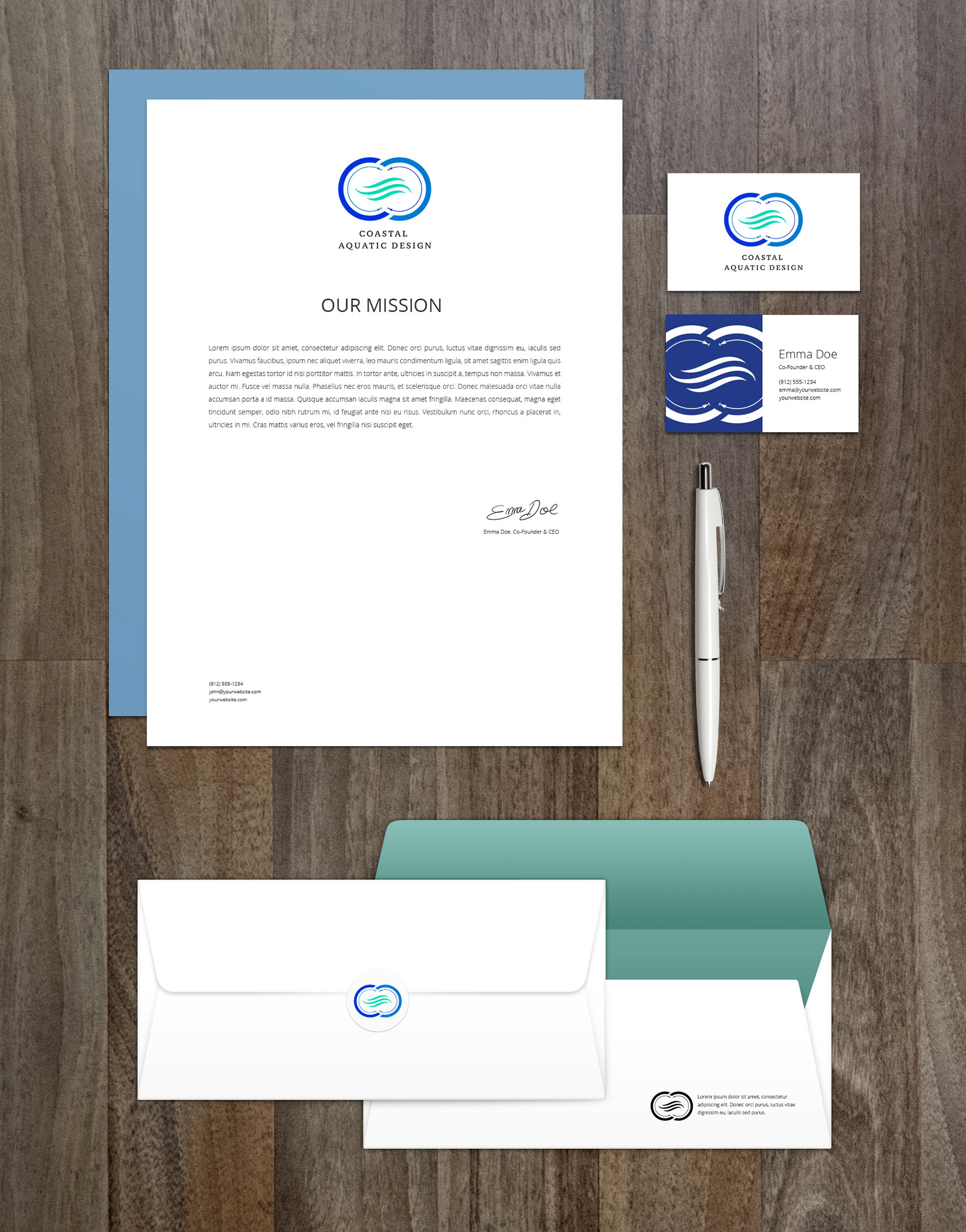
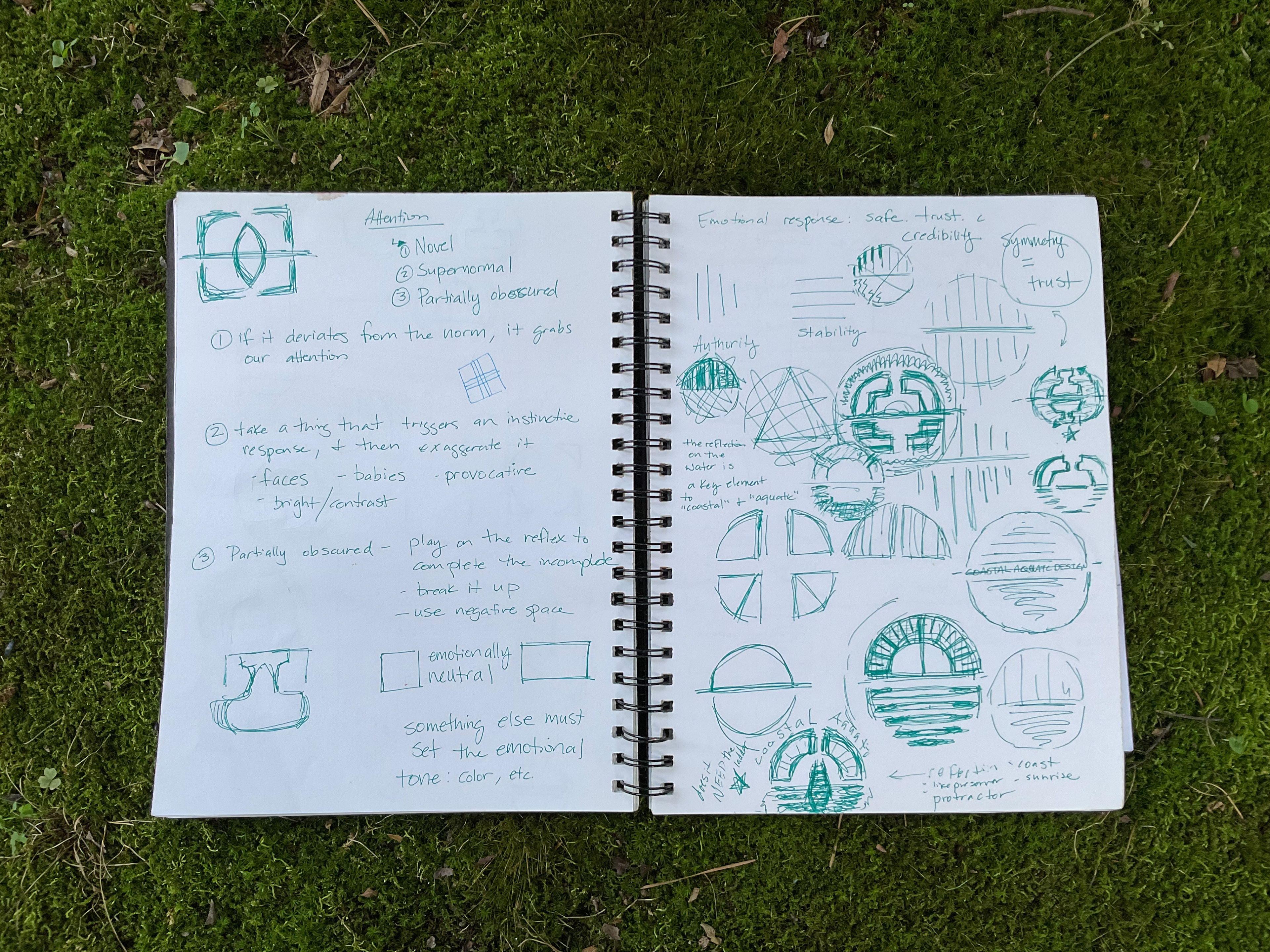
With this in mind, I decided to pursue the drafting aspect of design and engineering: basic tools like the compass, protractor, and ruler combined with dimension lines and a pool blueprint. And, of course, a wave. I loved the fact that their brand initials were "CAD" - a nod to the industry standard drafting program used by engineers and designers, so I leaned into that idea, simplifying the letterforms to circular shapes that hint at the letters C and D, and a horizontal wave symbol to represent the crossbar in the A of "Aquatic". The dimension lines are offset from one another to lead the eye in a swirling infinity loop to create a sense of flow, and the wave is comprised of three repeating shapes to echo the triad of the three letters.
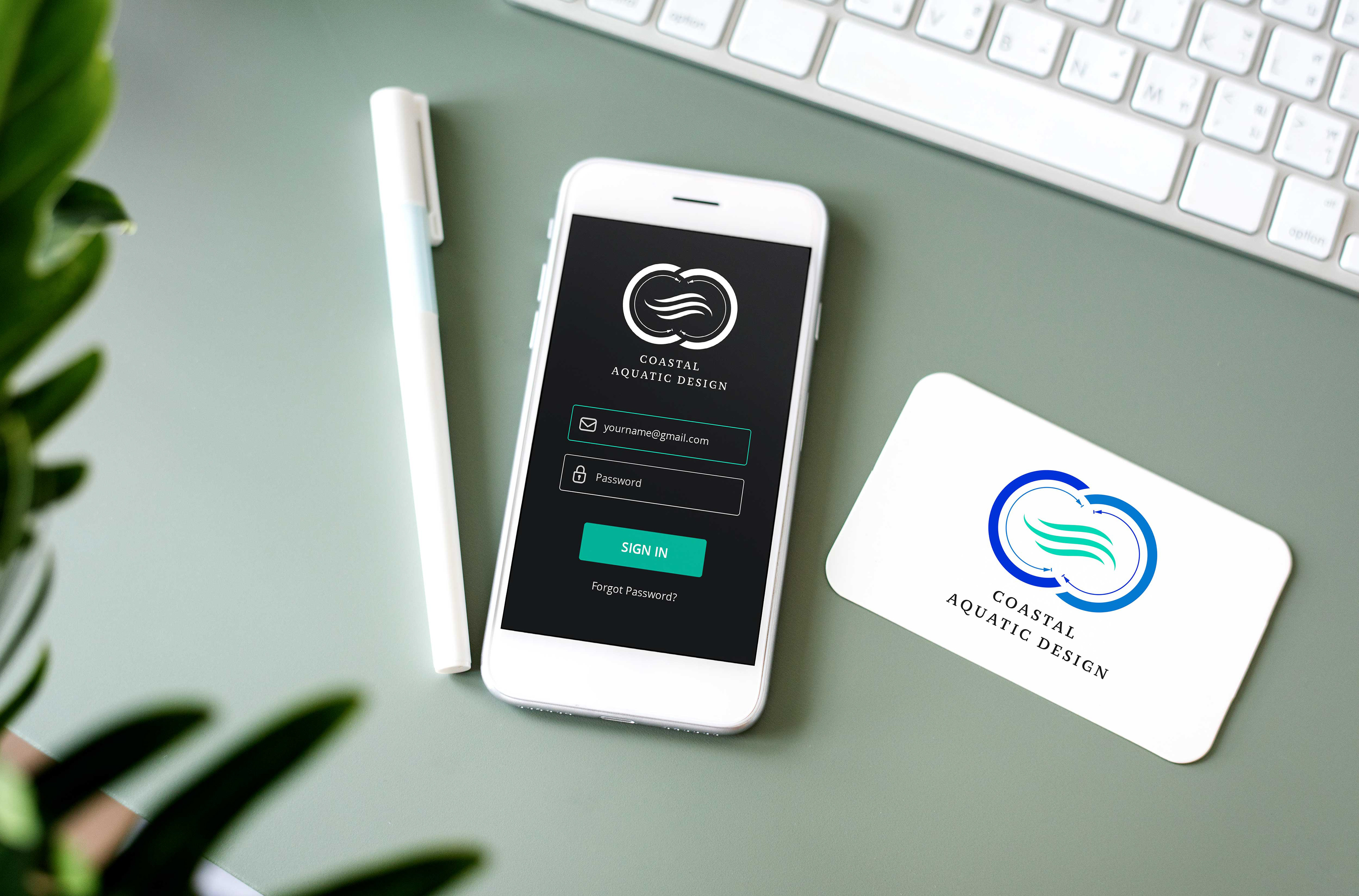
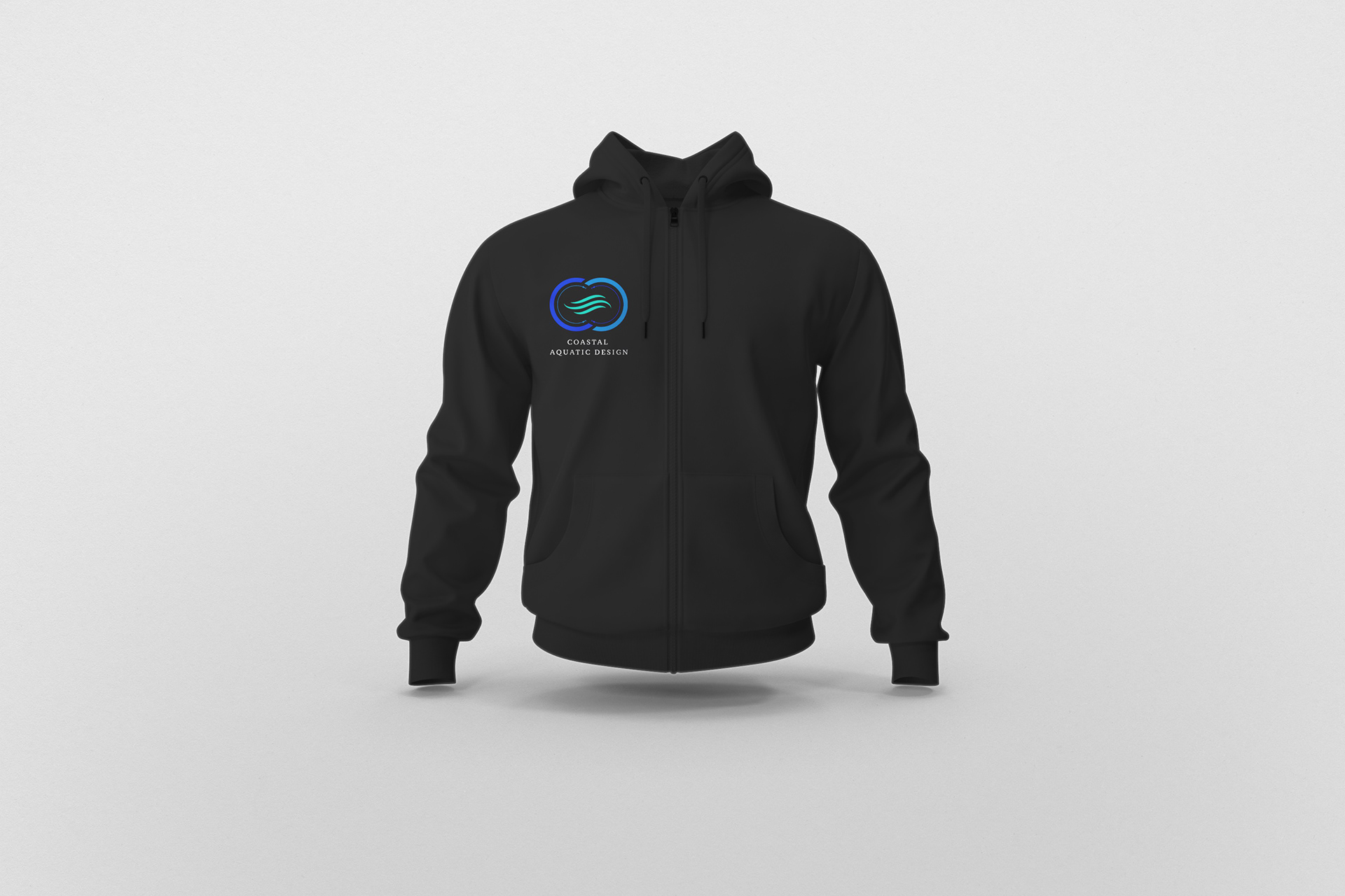
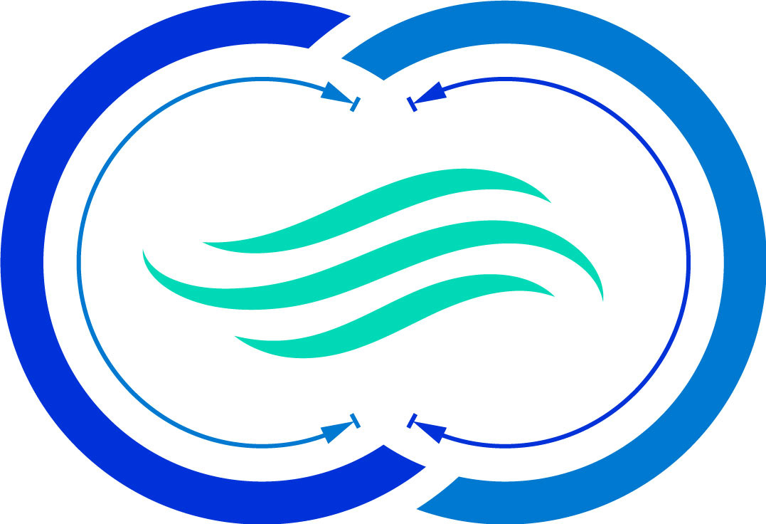
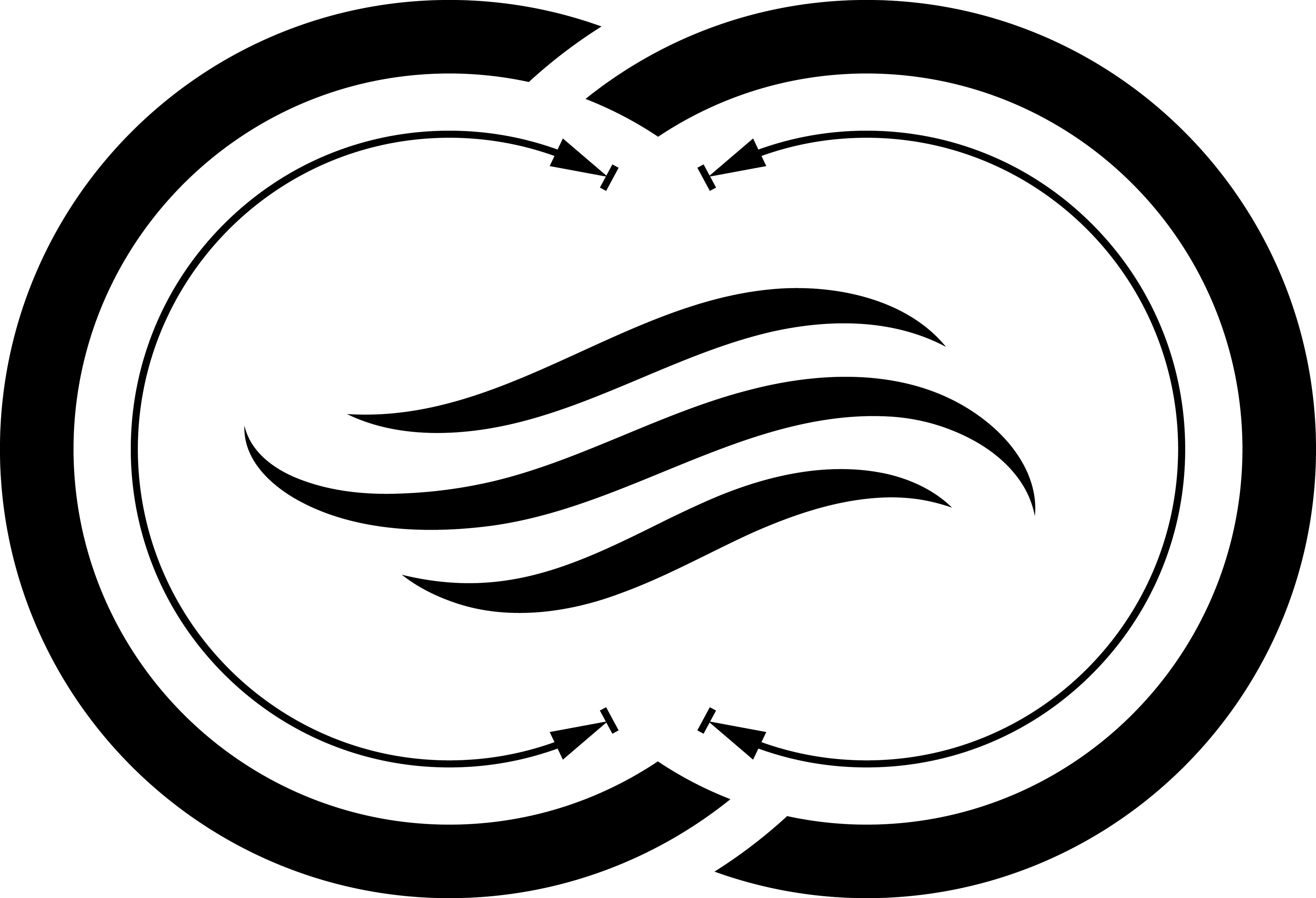
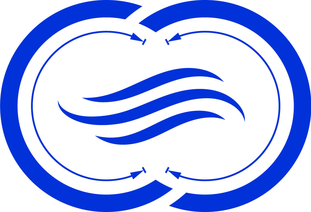
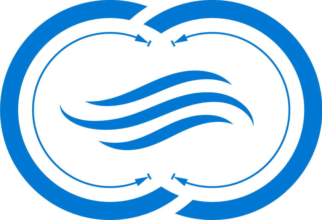
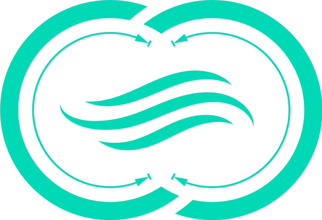
Logo Concept Sketches & Drafts
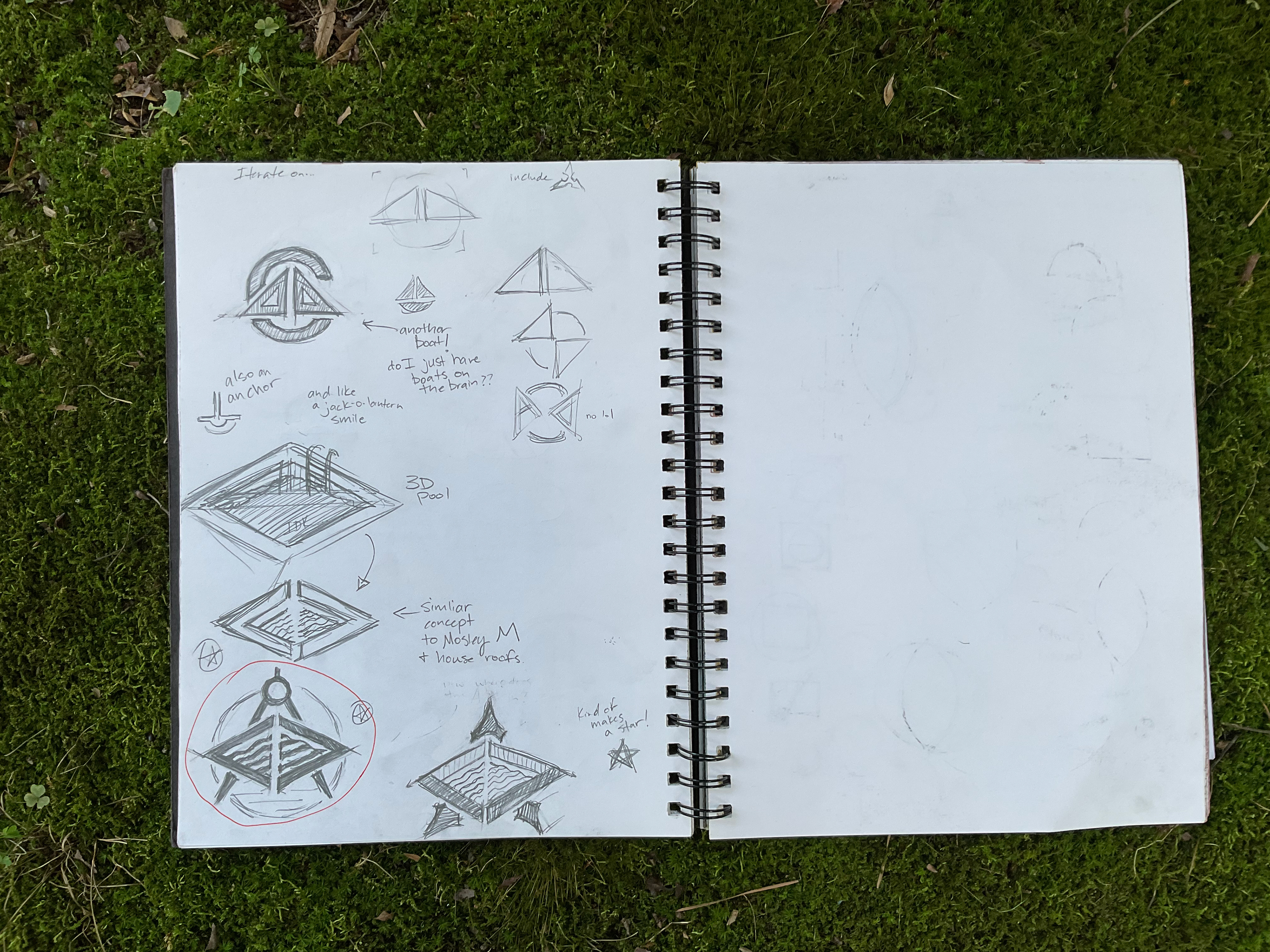
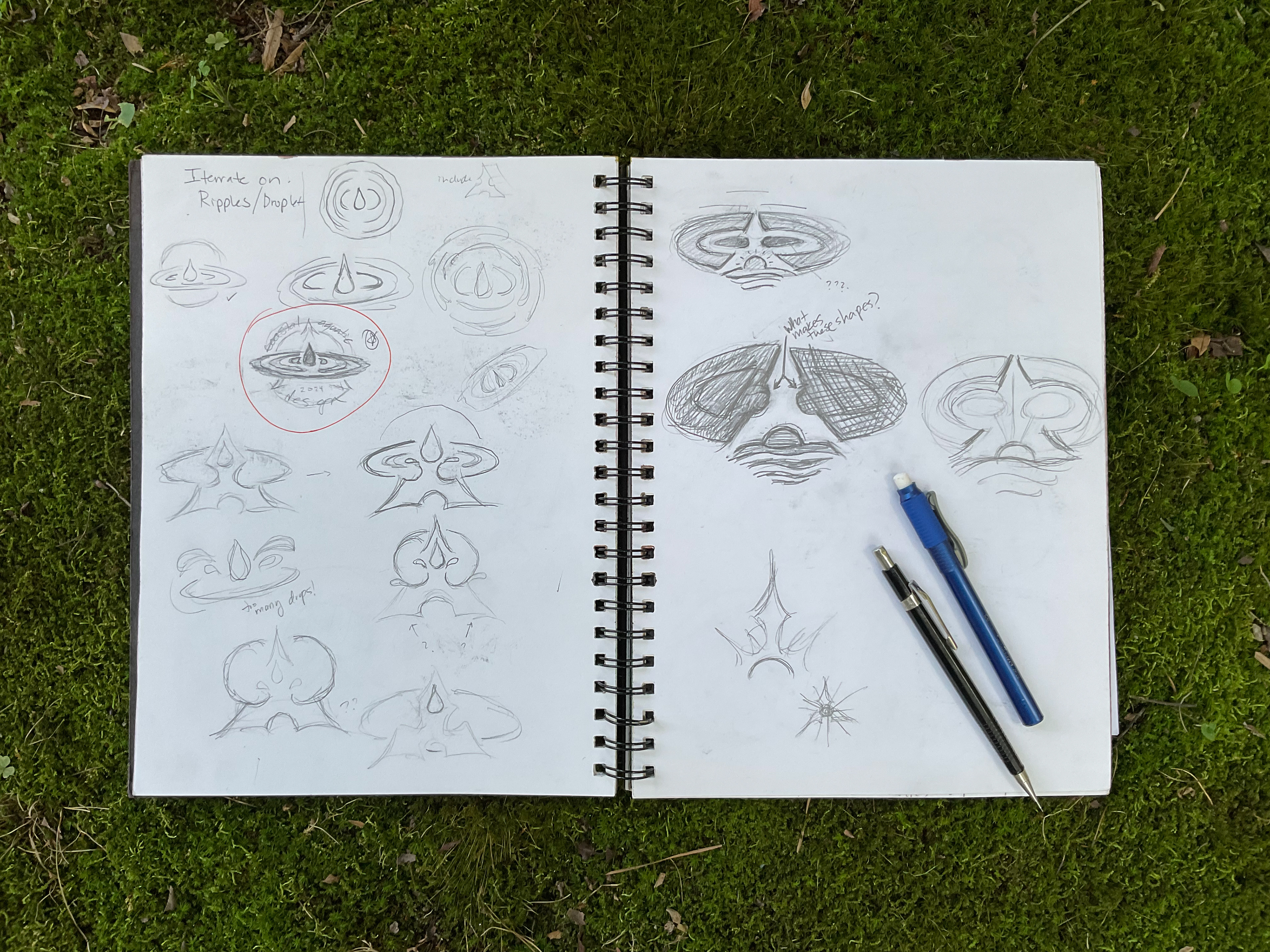
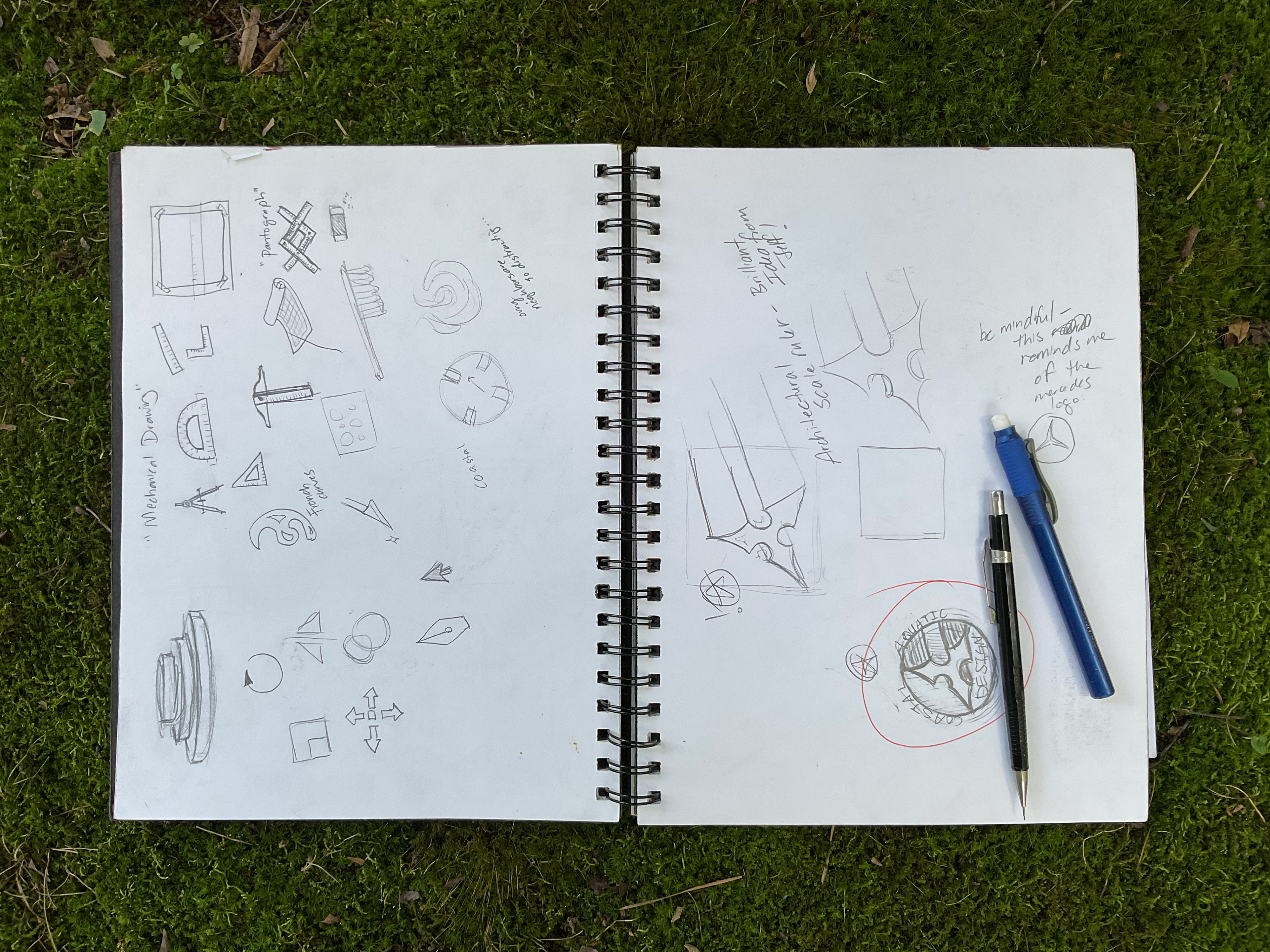
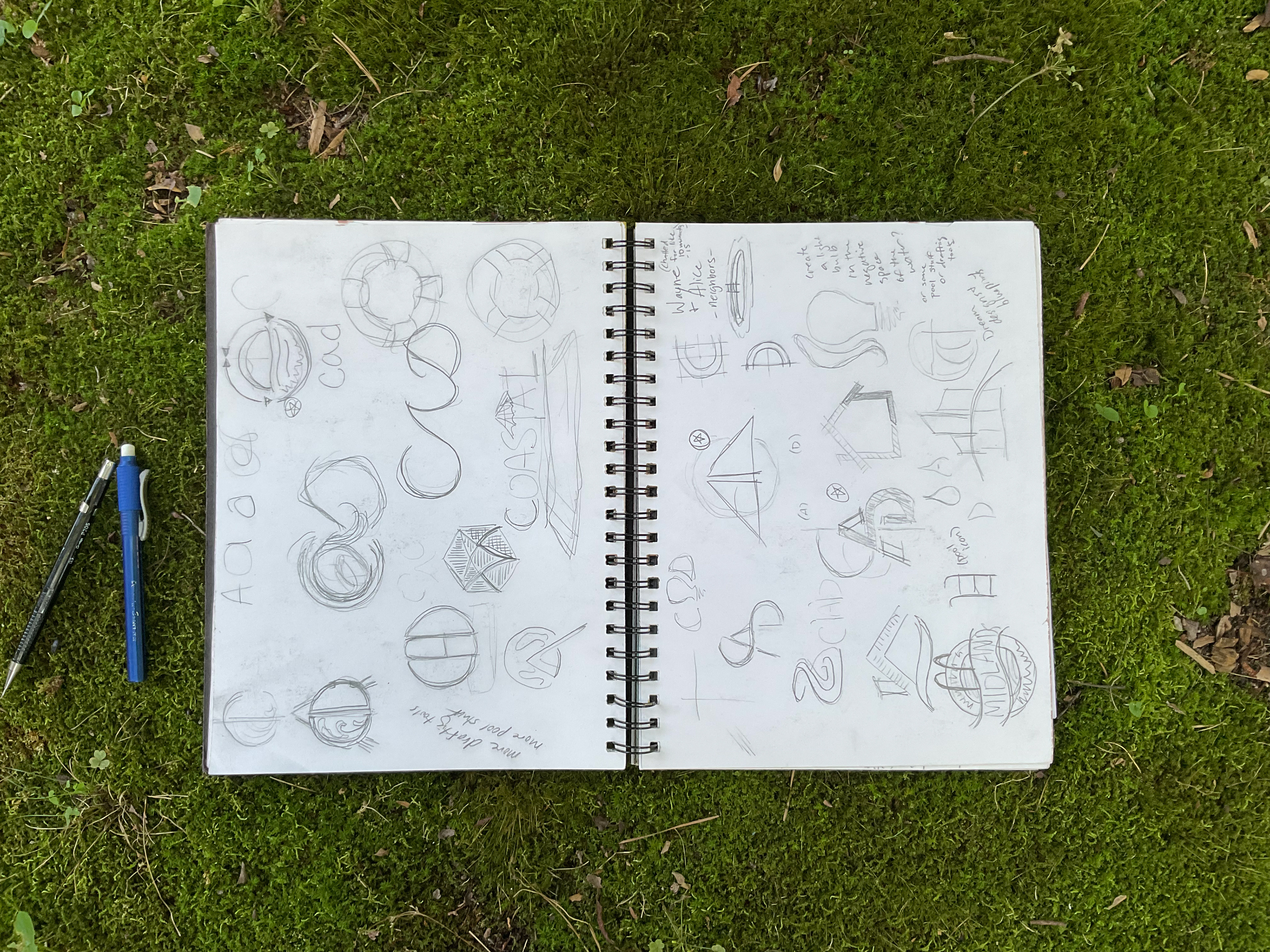
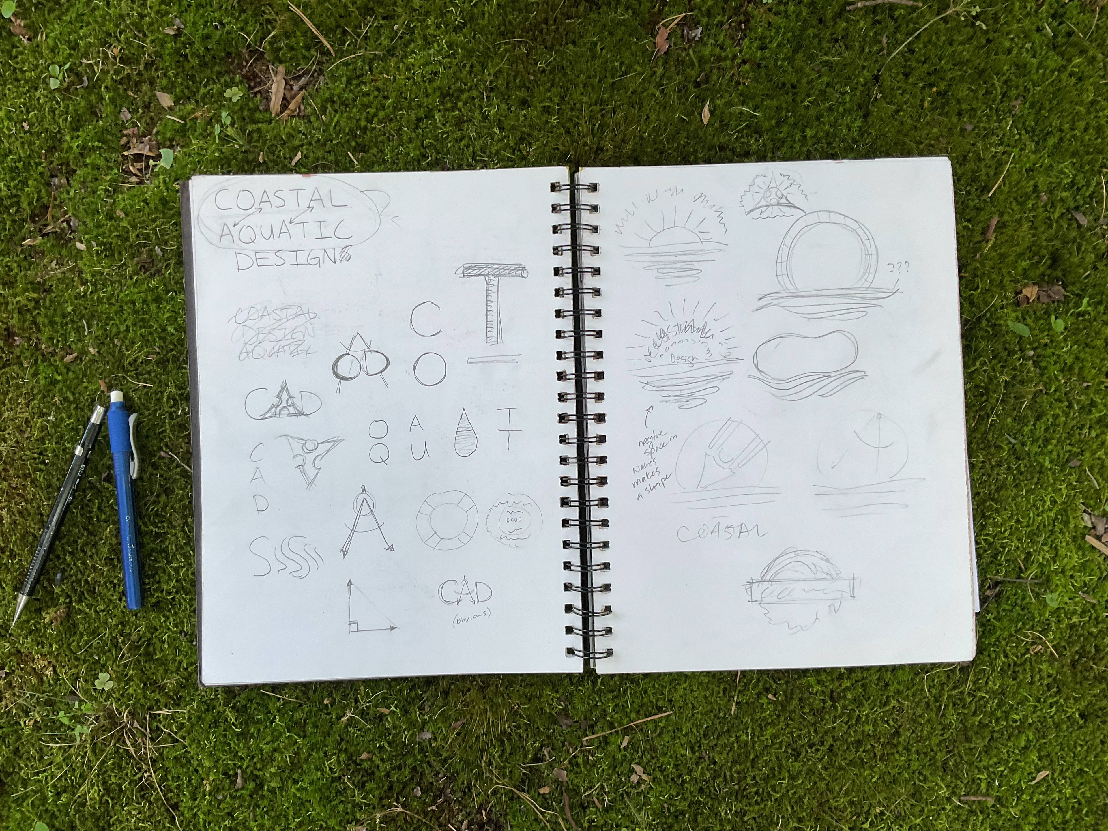
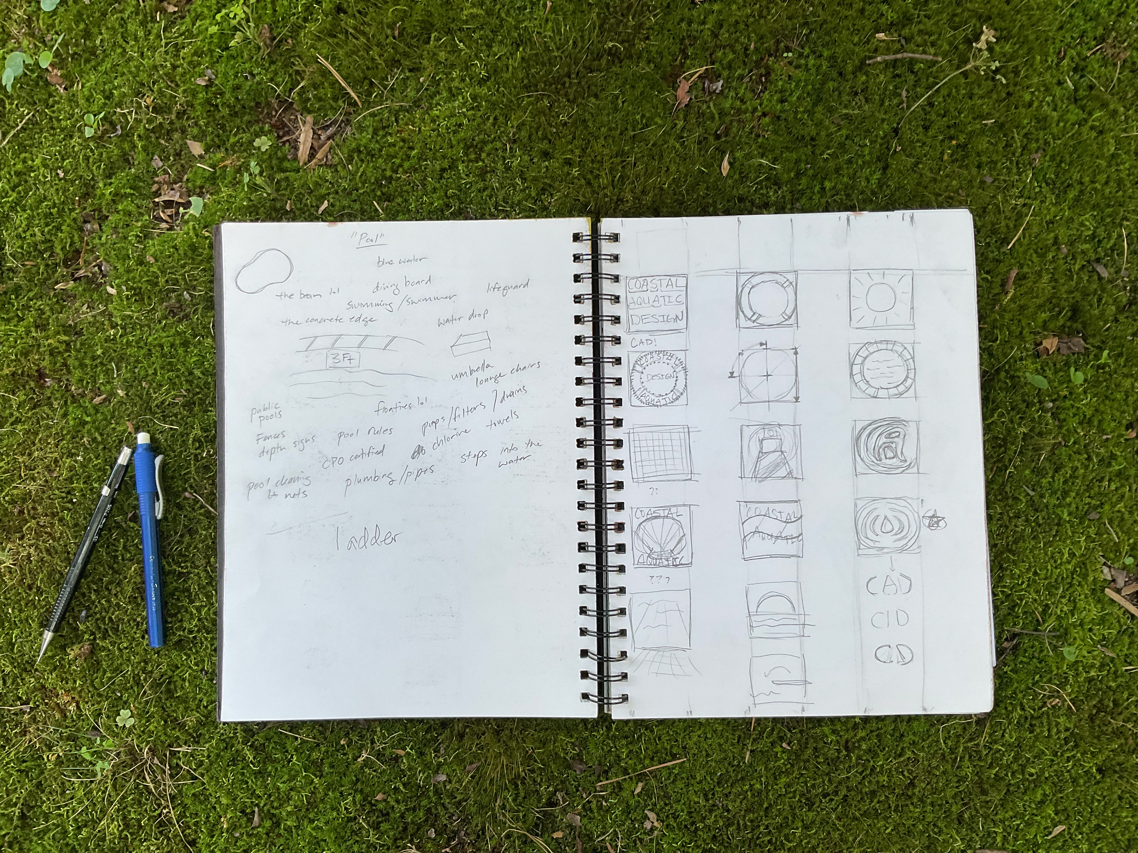
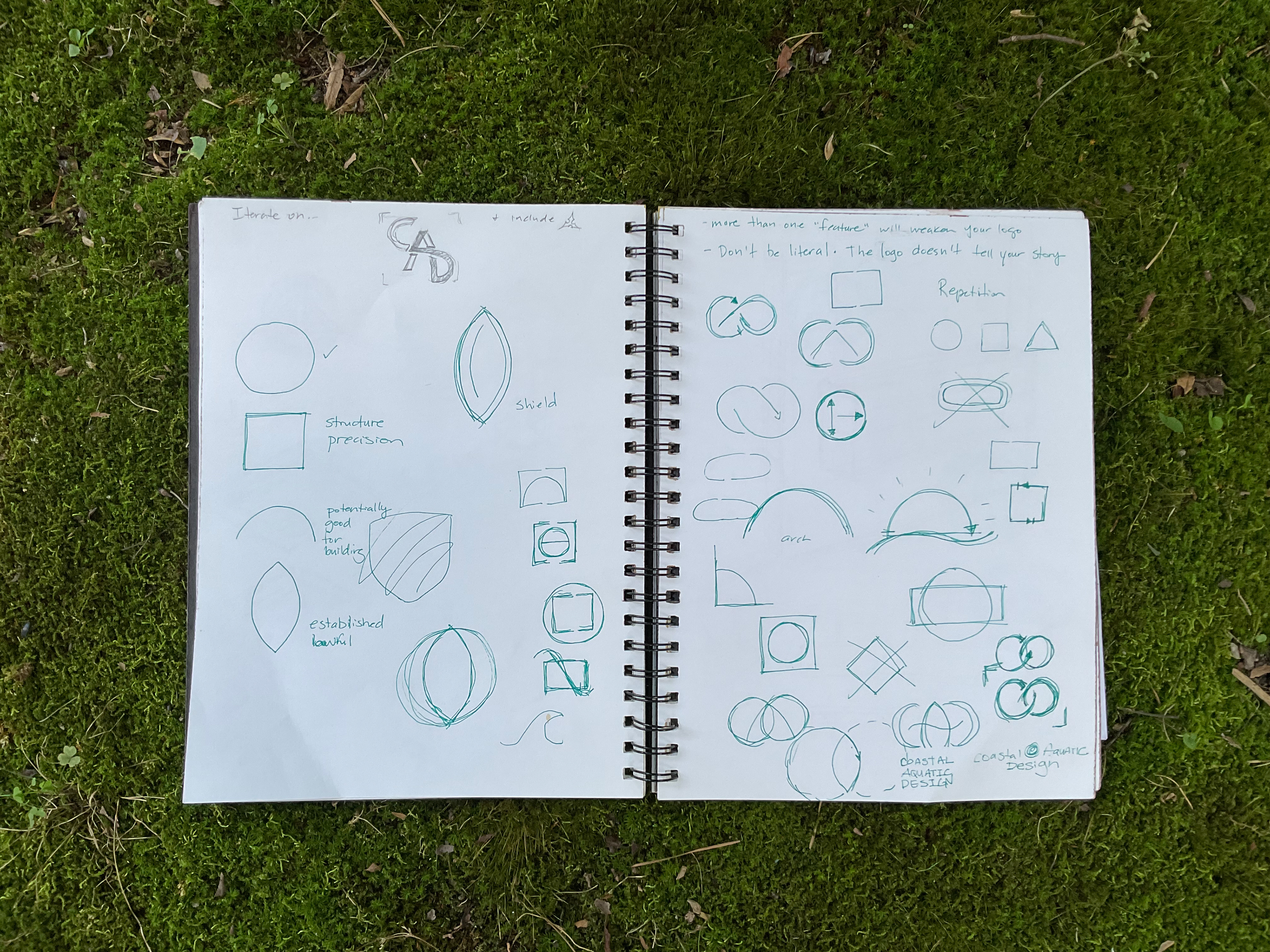
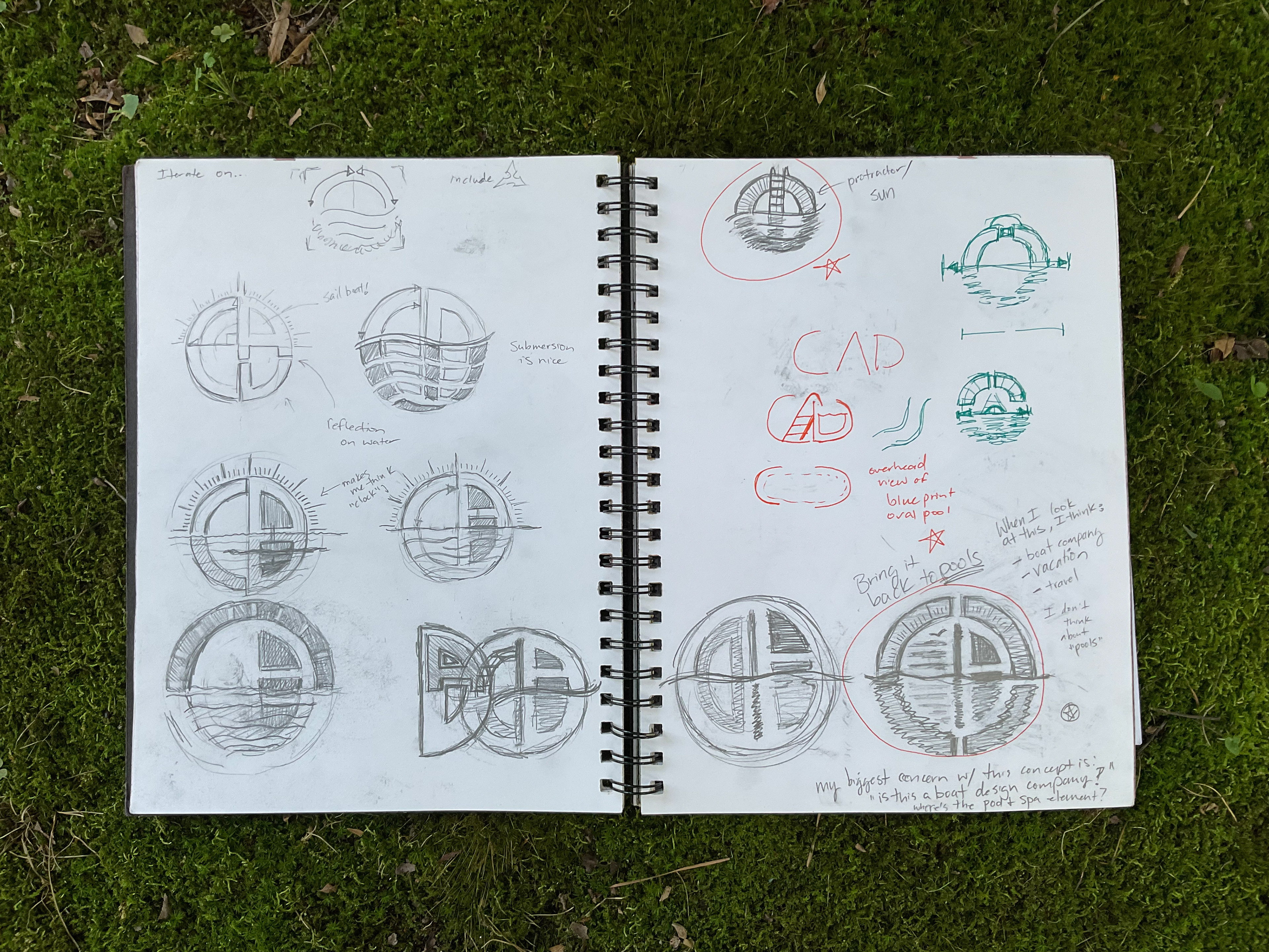
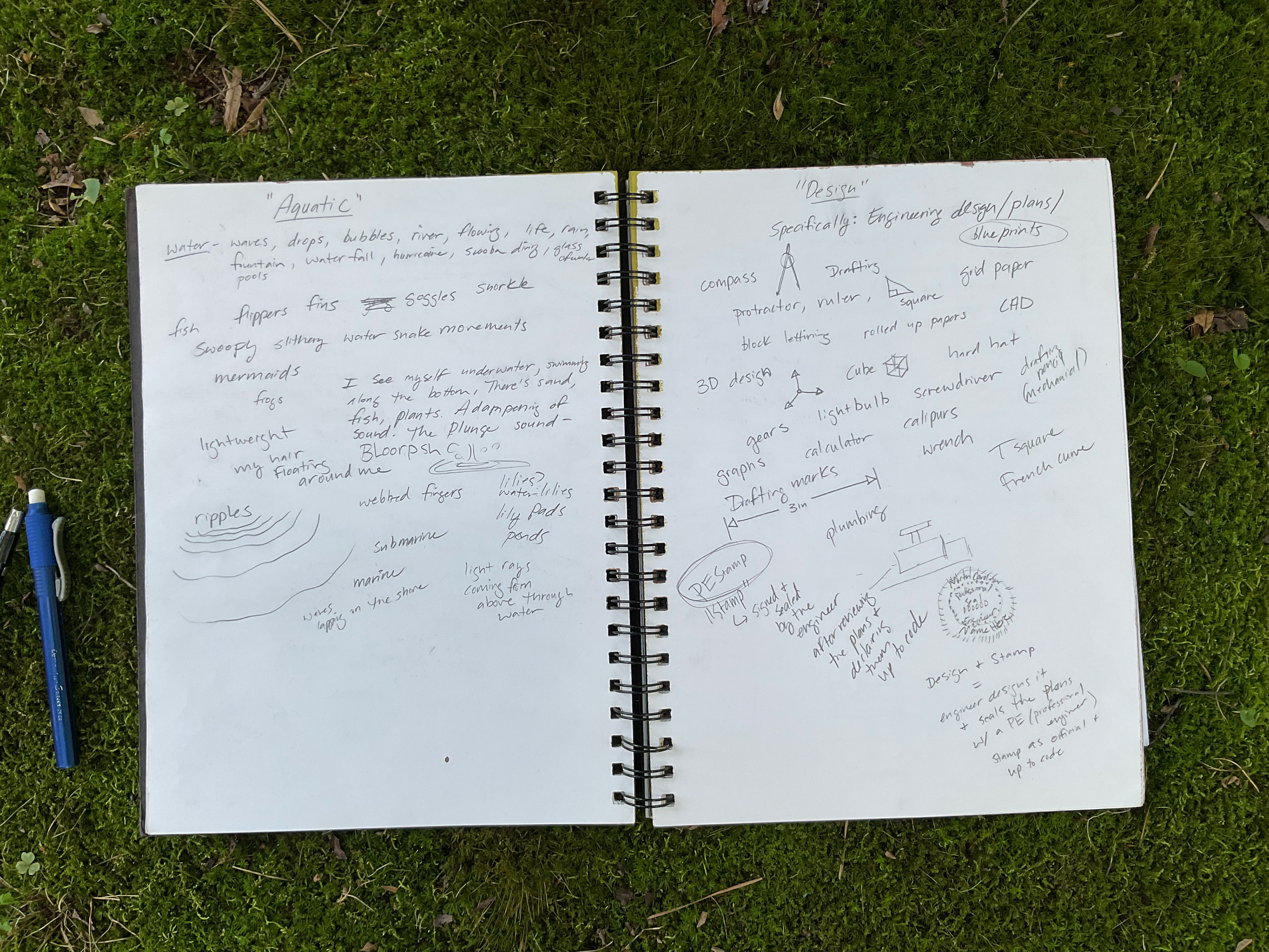
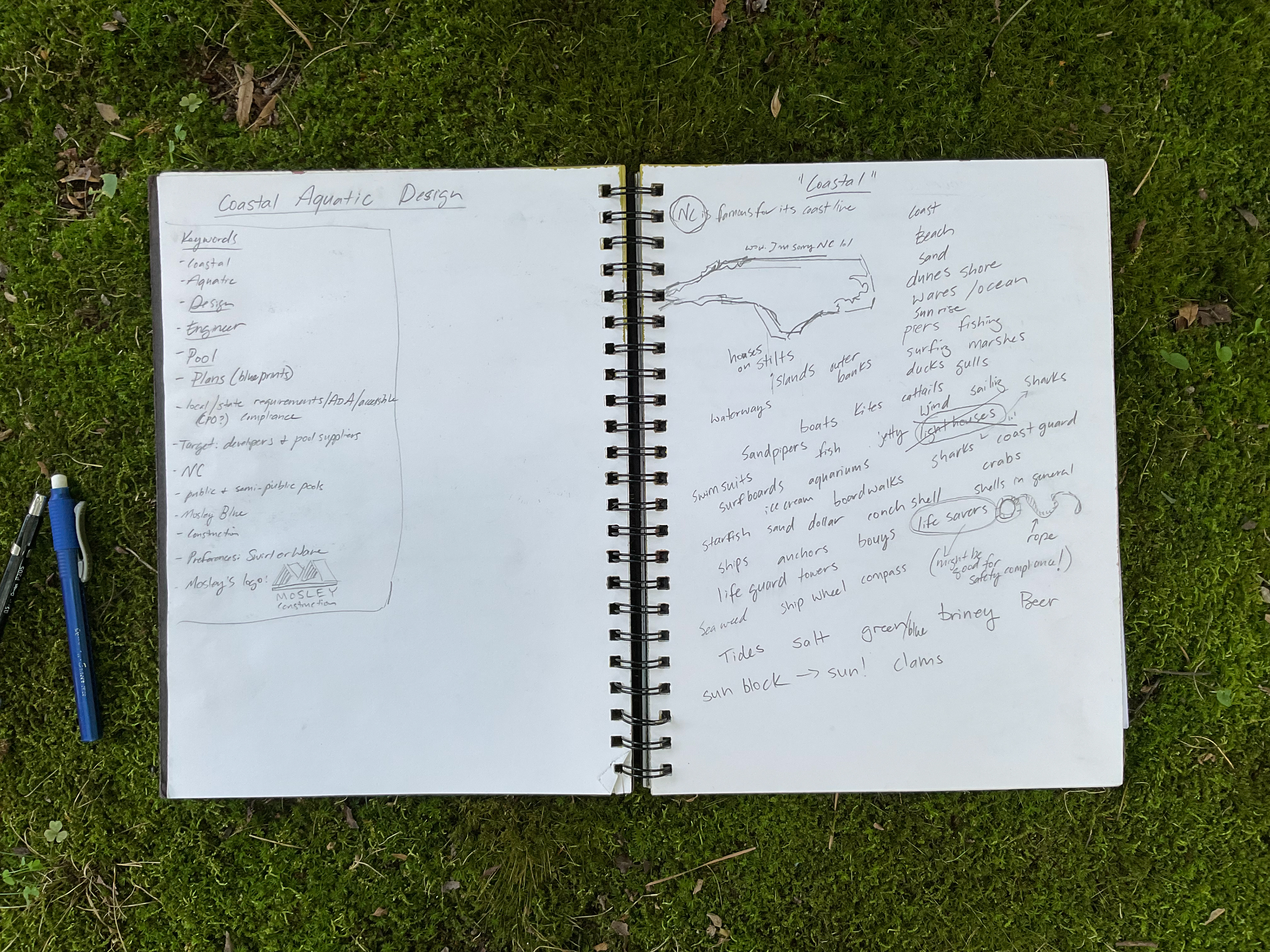
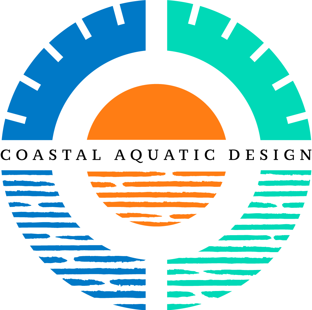

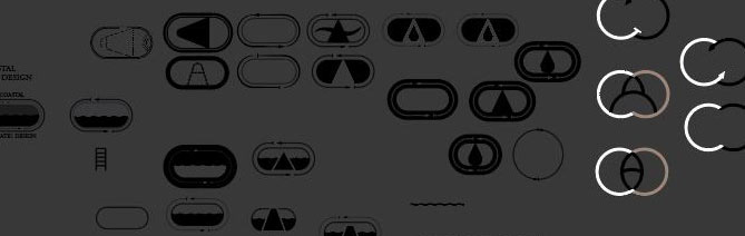
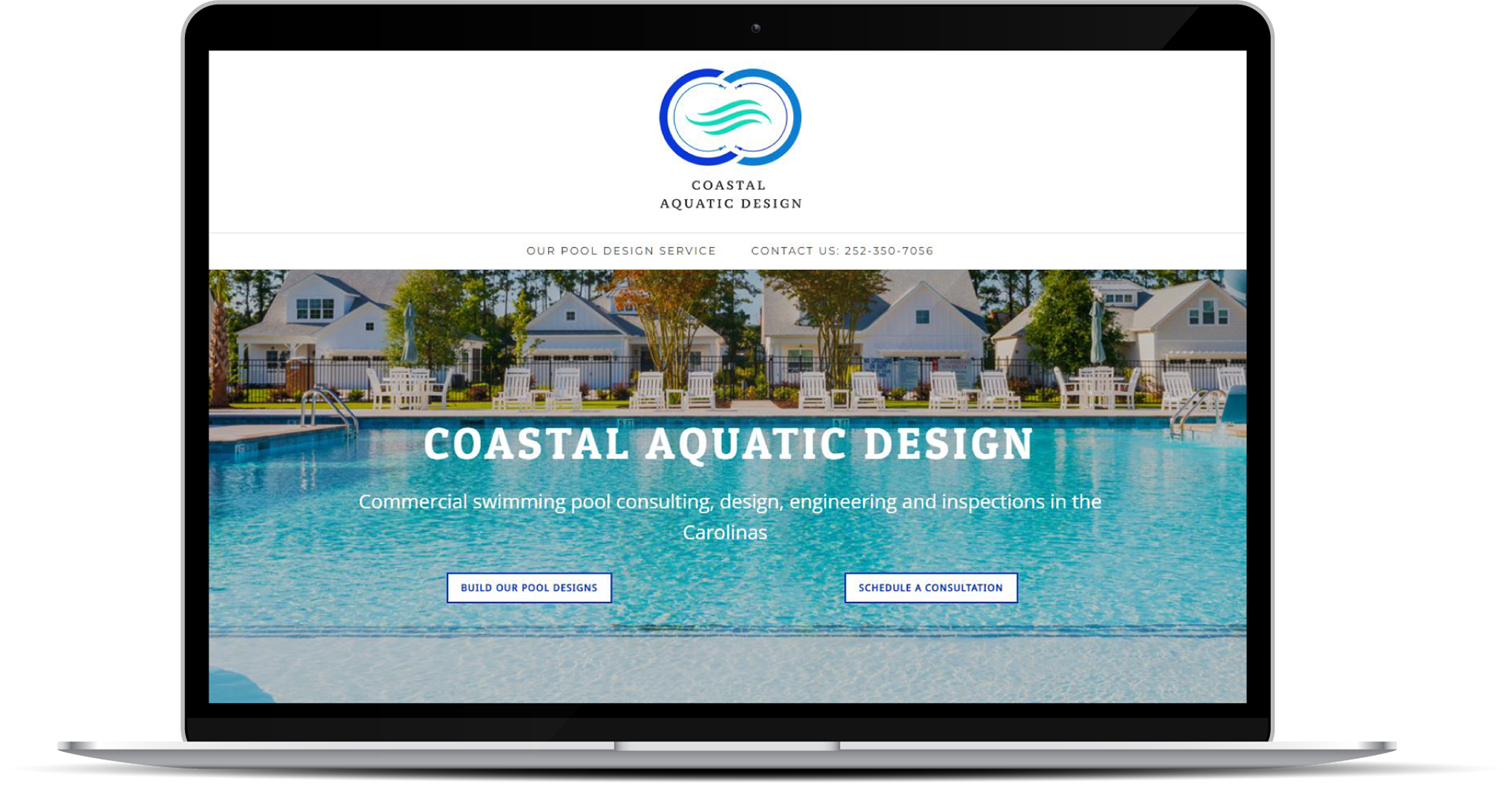
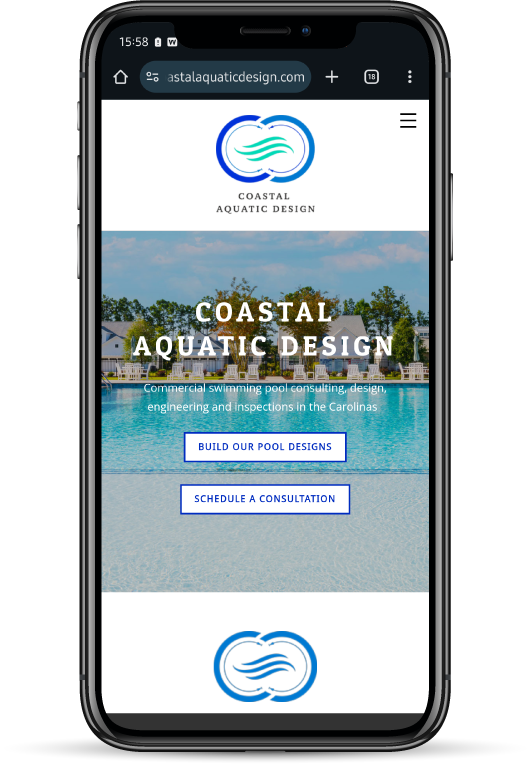
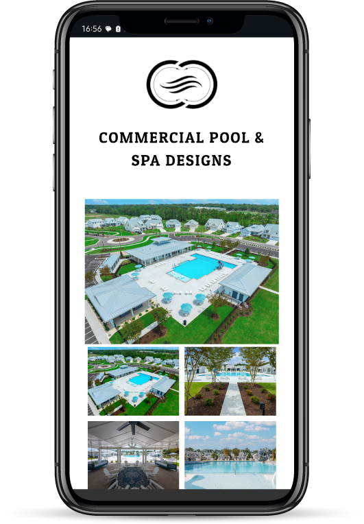
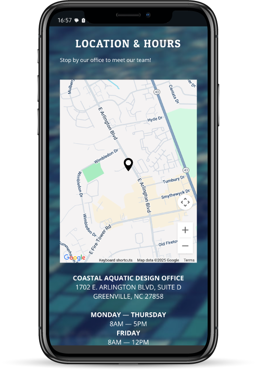
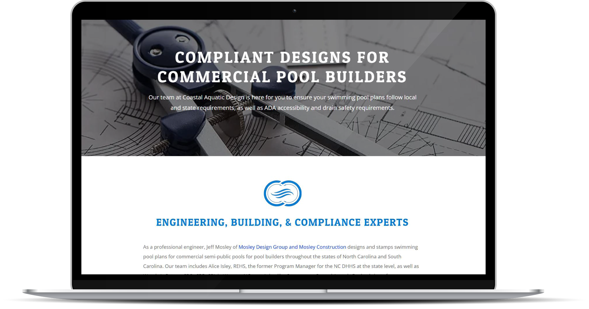
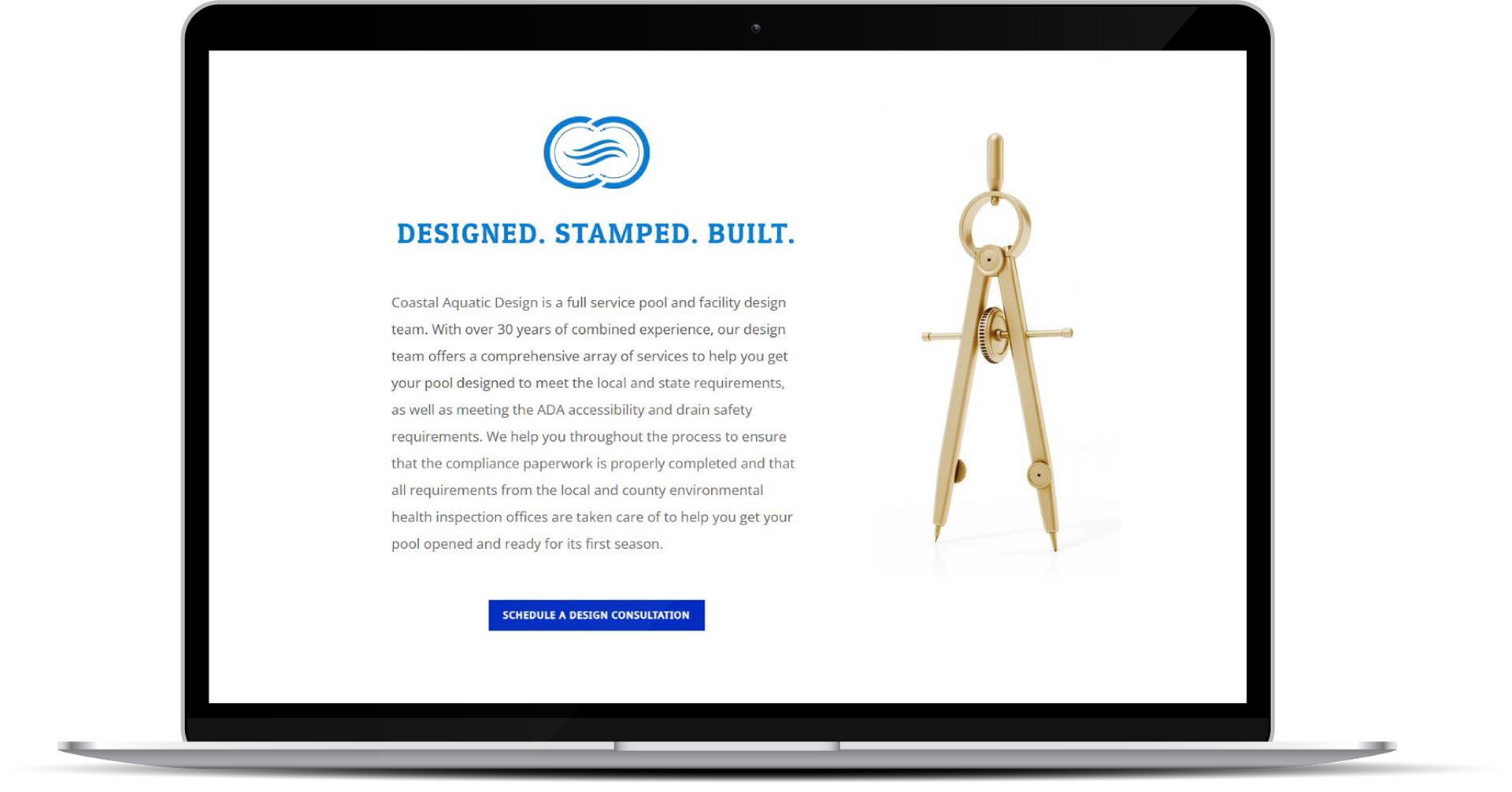
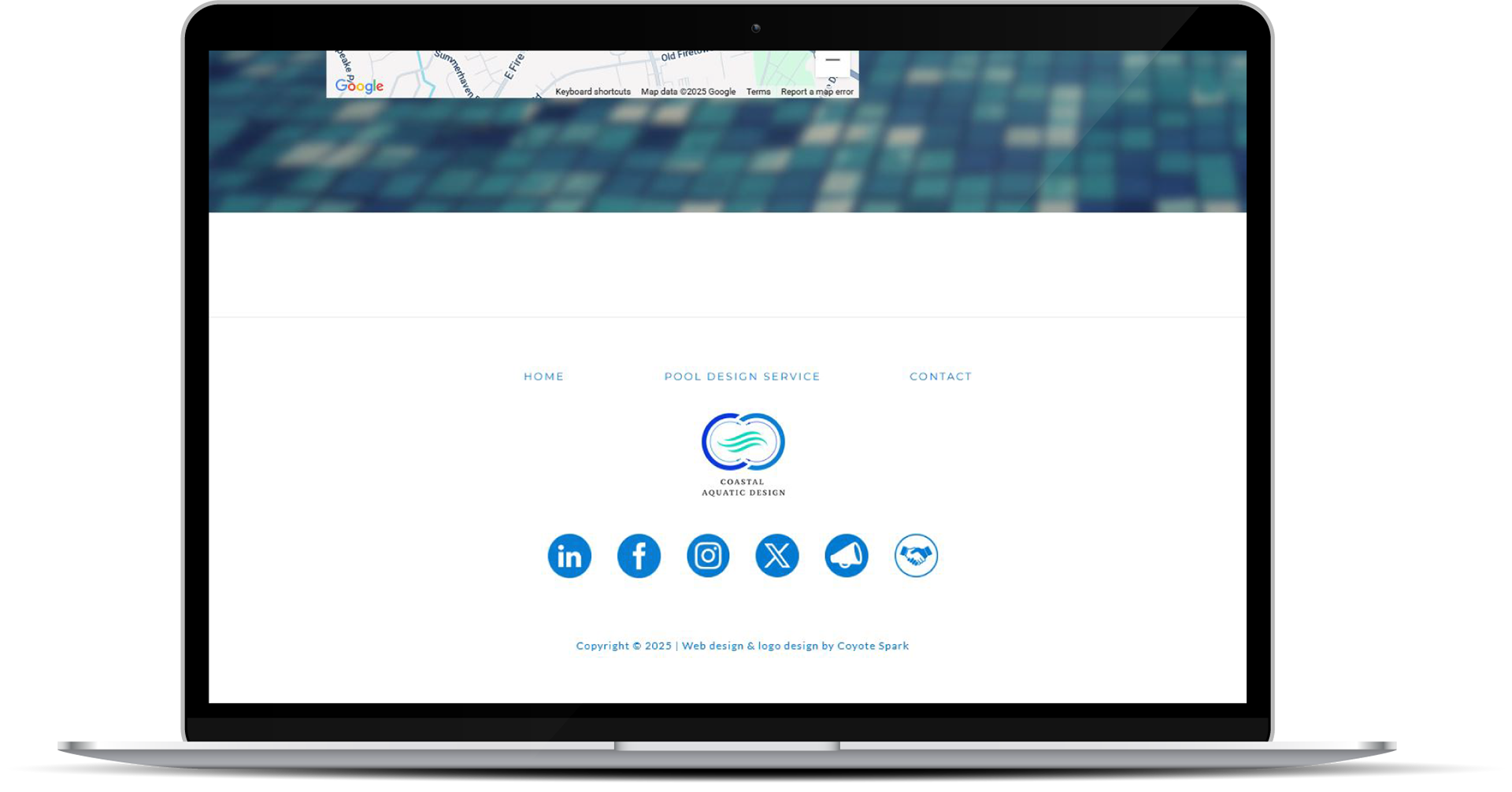
How did they like it?
"AAA+++ customer service! Adrian did a great job helping us create an online presence for our new business and strengthening our SEO. We have quickly been able to procure more leads as a result of his help. We are extremely excited about our new logo and website. They look great! Adrian was very instrumental in helping us kick off our new business. We highly recommend his creative services and we will definitely reach out for future projects."
Carla Whitfield
Project Coordinator at Coastal Aquatic Design
Project Coordinator at Coastal Aquatic Design
_________________________________________________________
More projects
I'm working on adding new projects, so feel free to check back in periodically!
I'm also working on a complete redesign of my website, which will feature animated navigation elements, parallax effects, and fully responsive breakpoint design for maximum device compatibility. Thanks for your continued support!
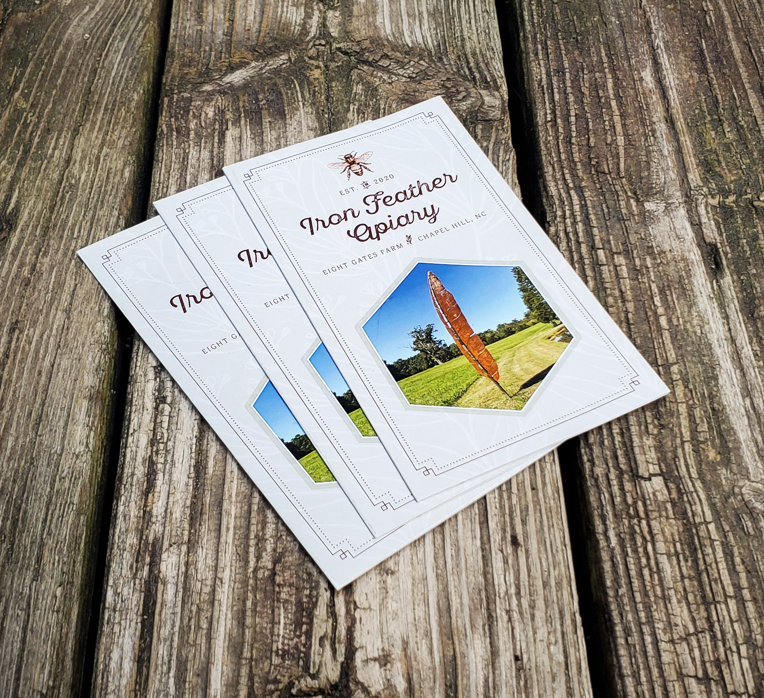
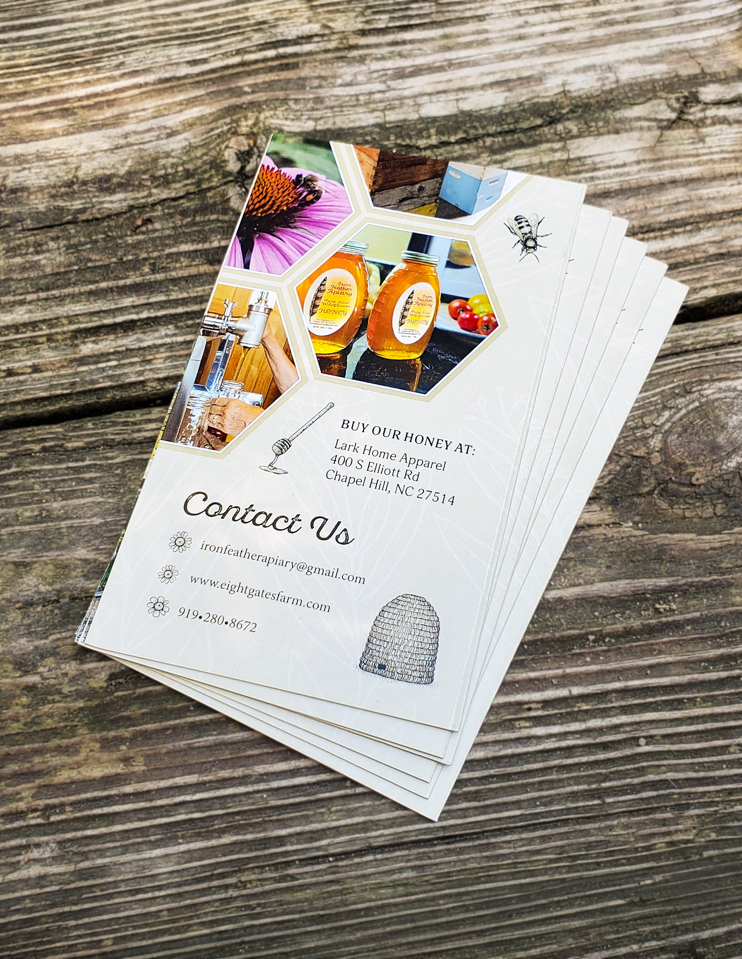
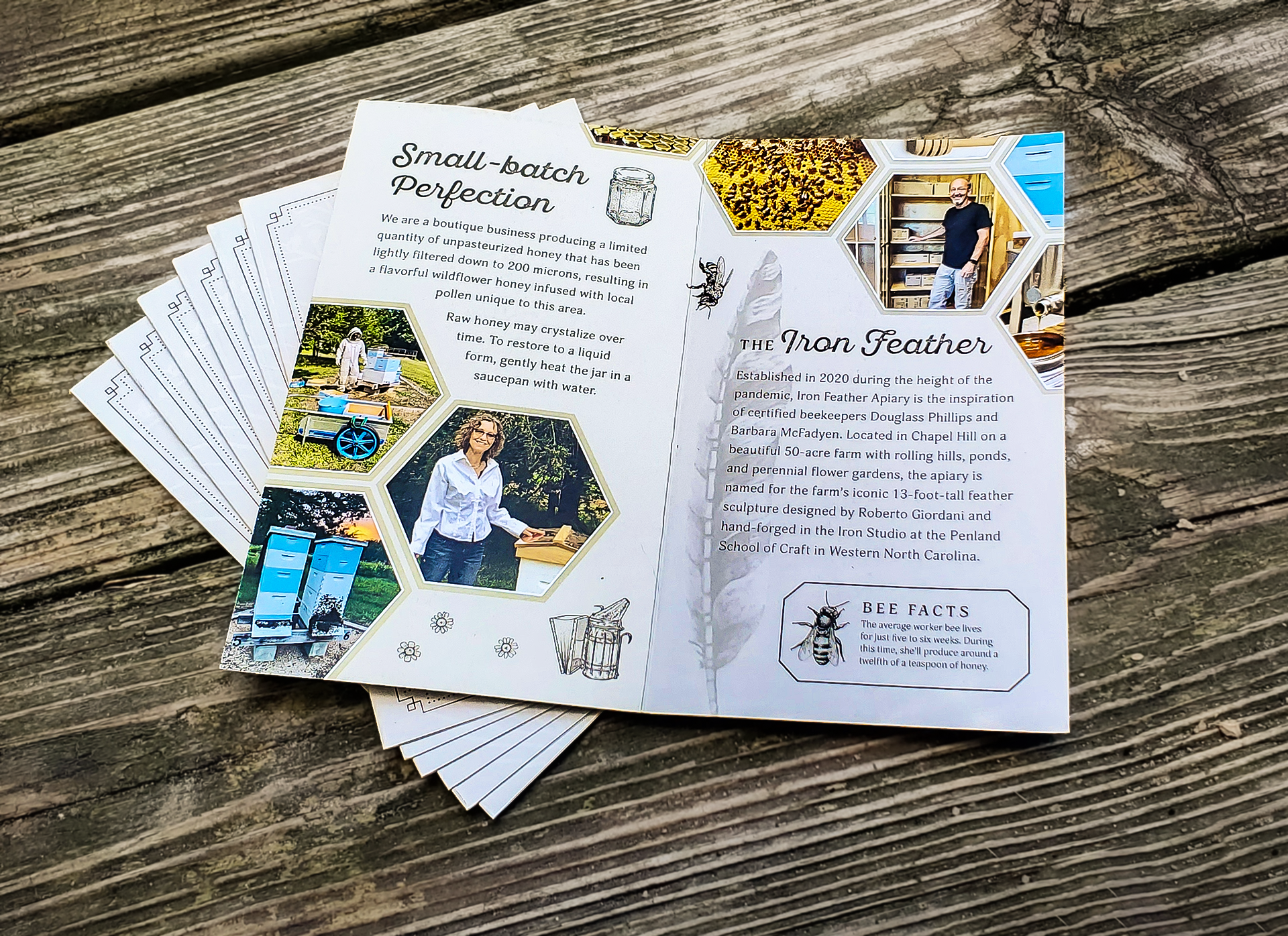
Iron Feather Apiary: Bi-Fold Brochure
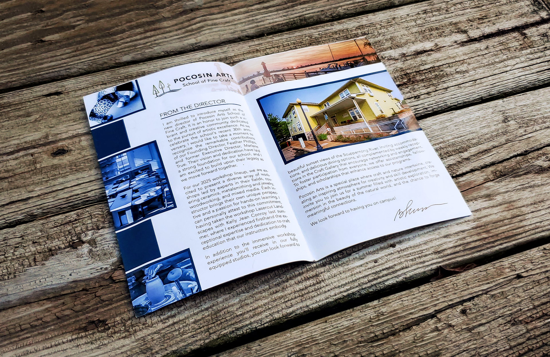
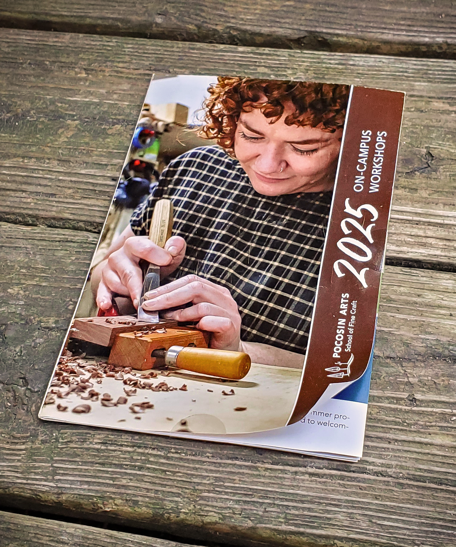
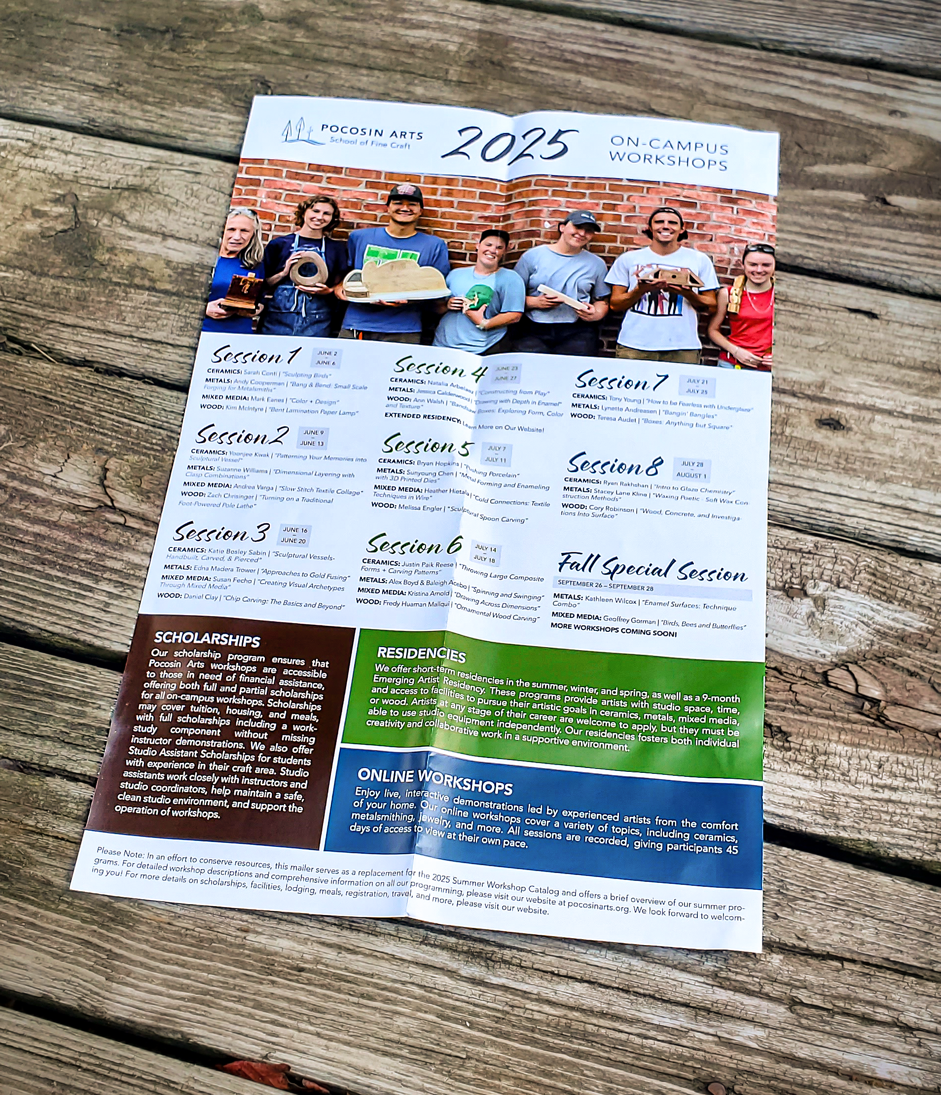
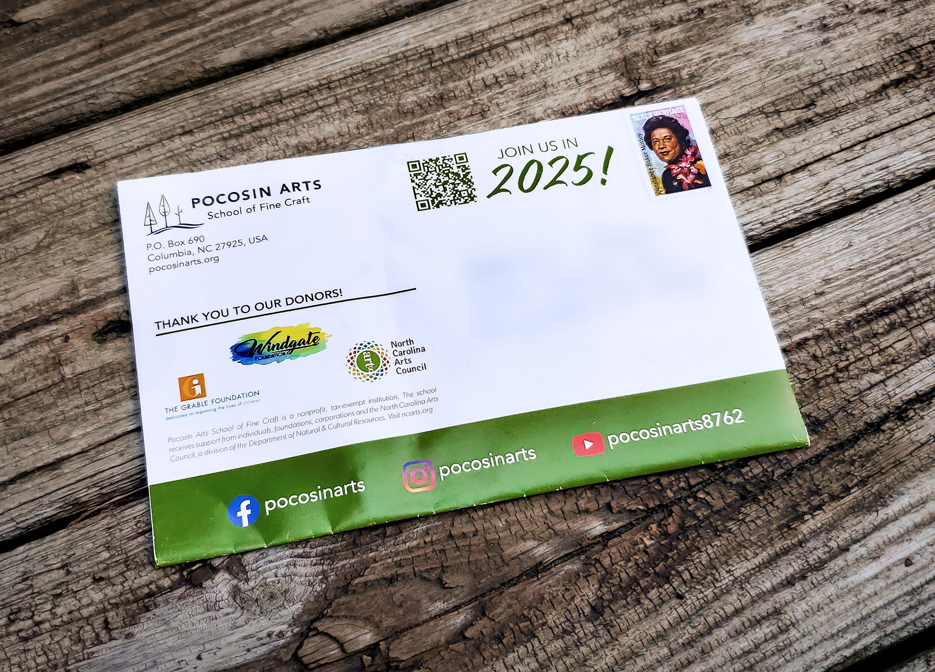
Pocosin Arts School of Fine Craft: Folding Poster Mailer
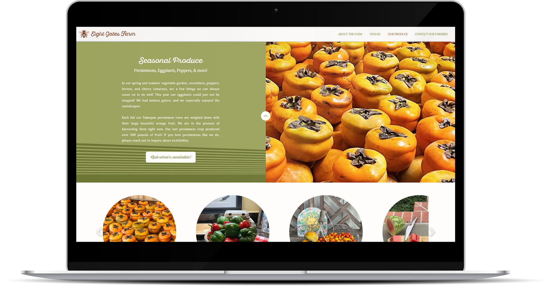
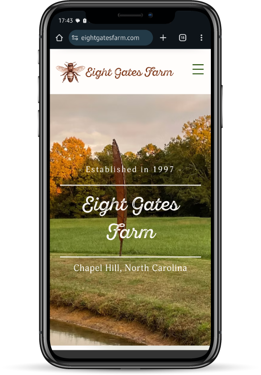
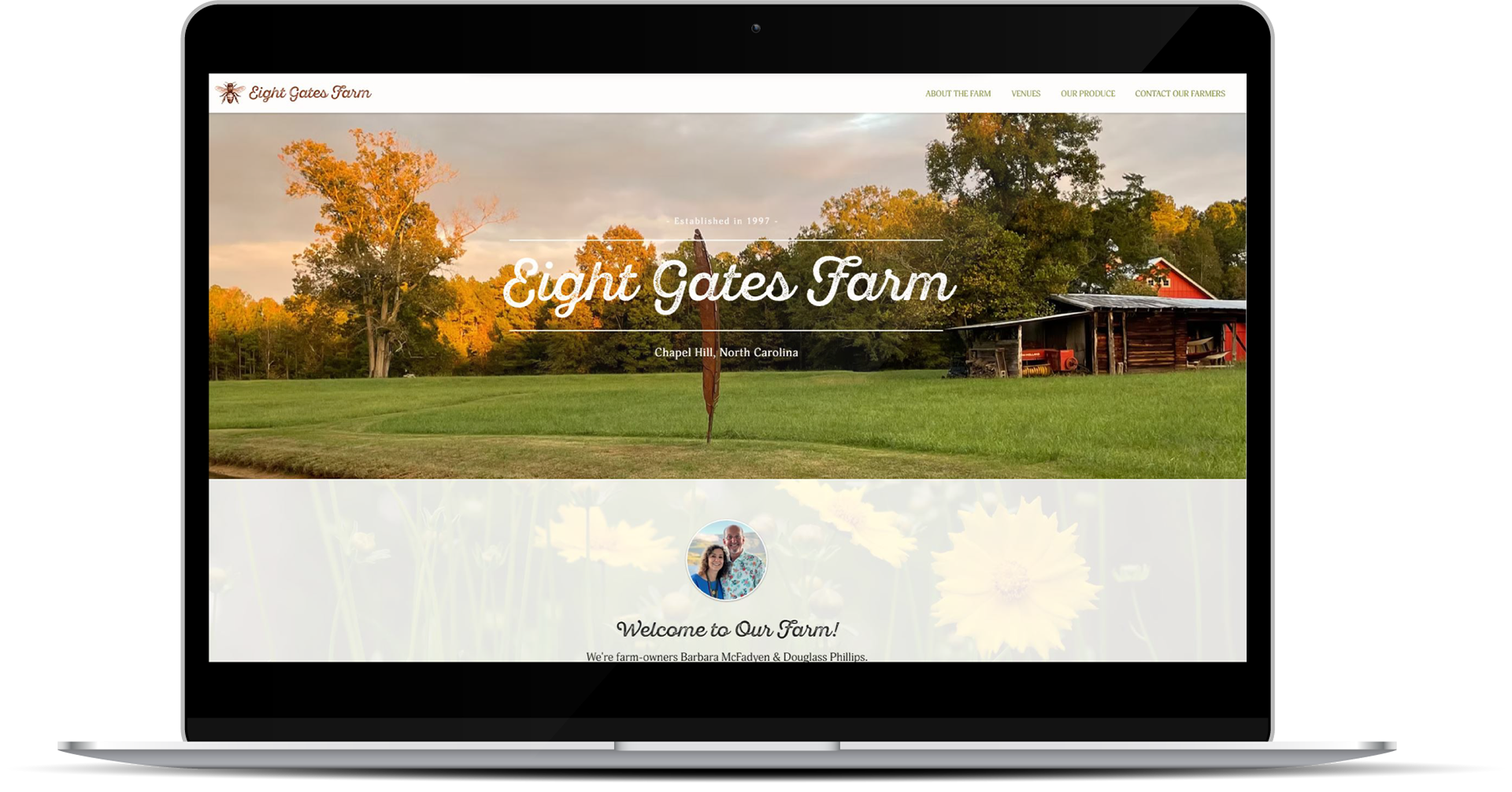
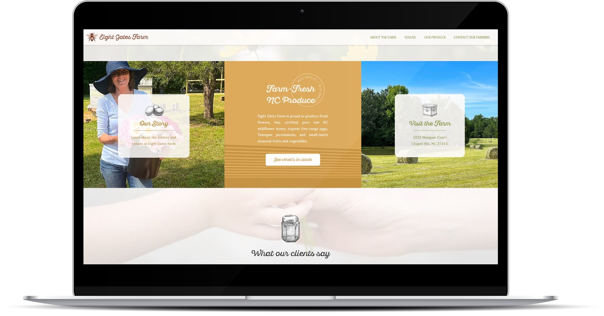
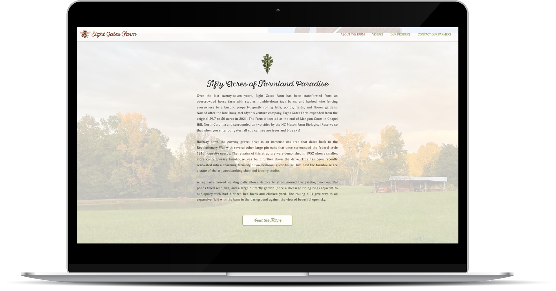
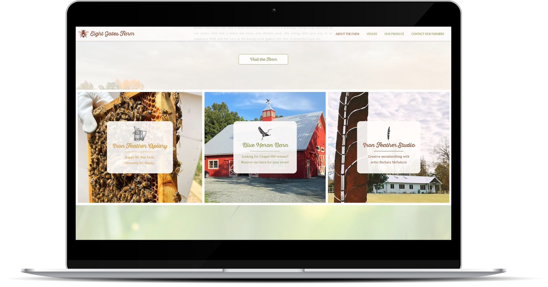
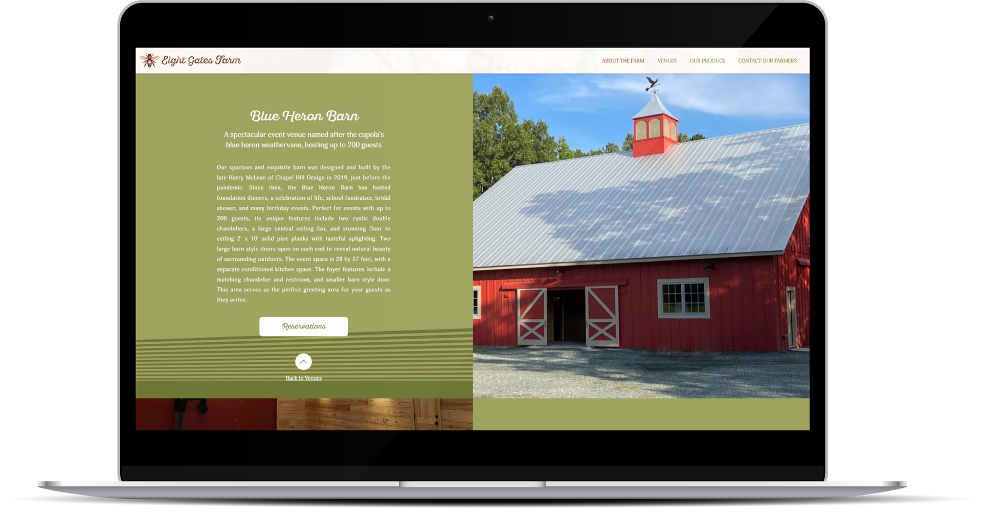
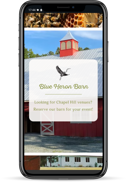
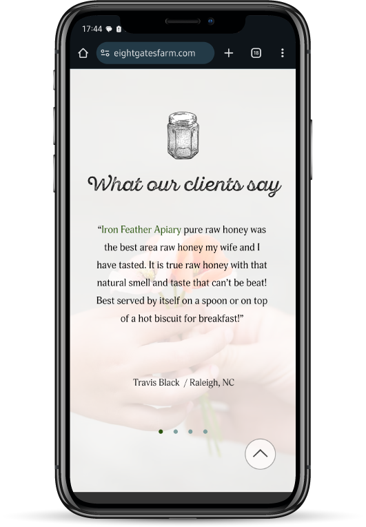
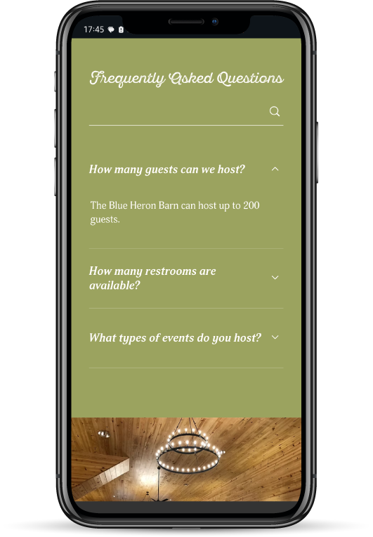
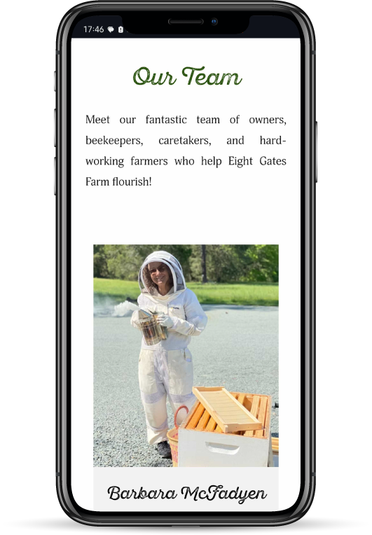
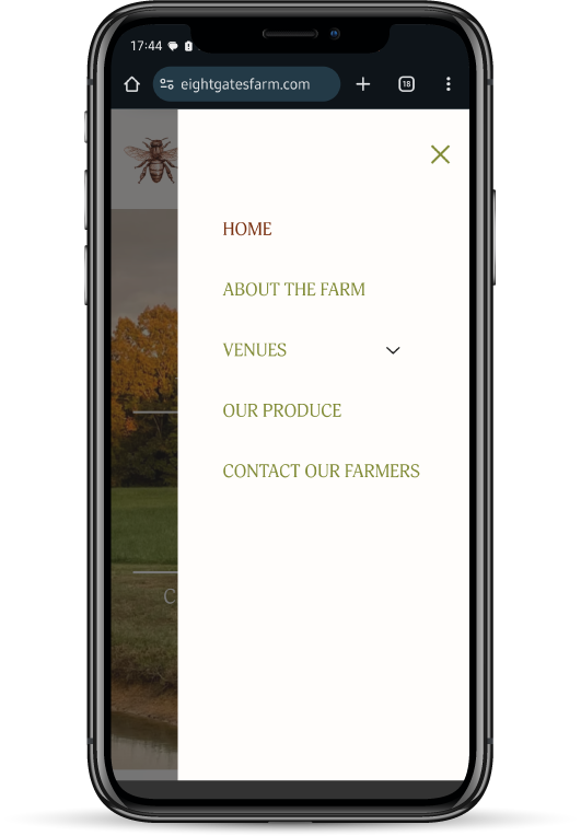
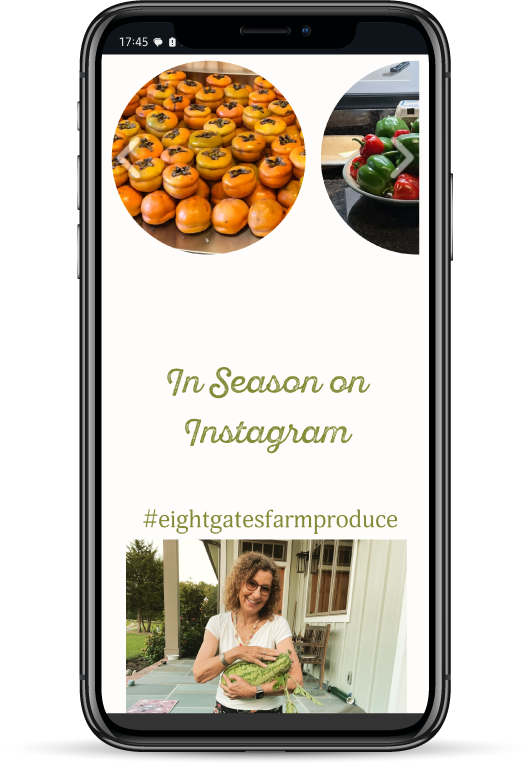
Eight Gates Farm: Web Design & SEO
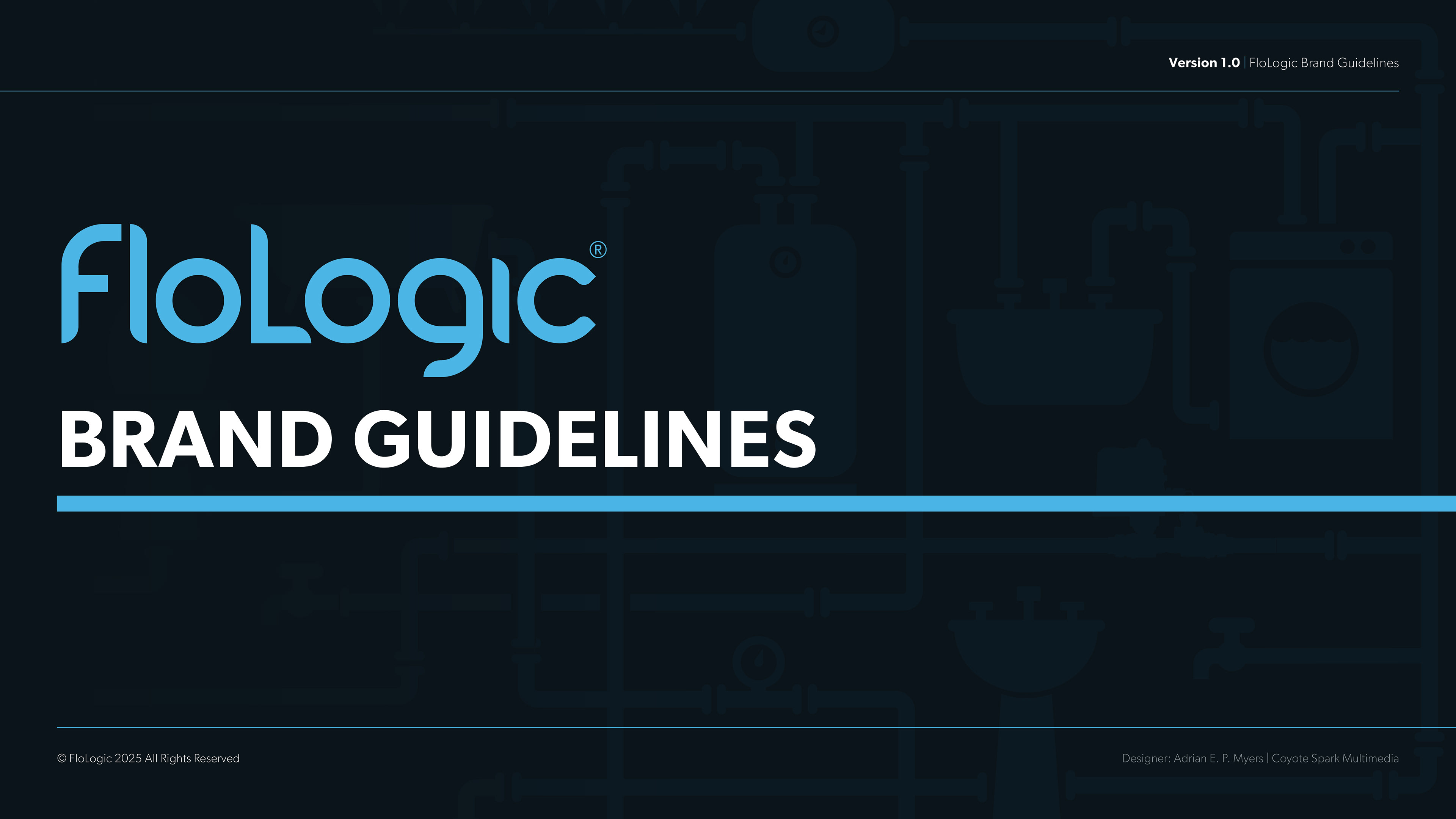
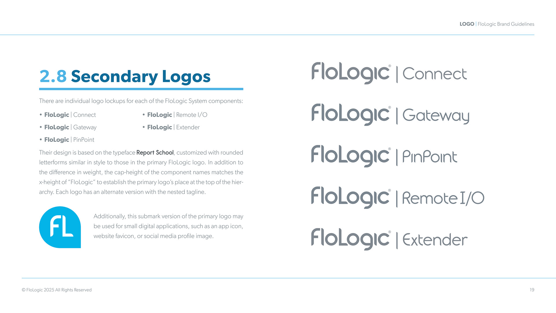
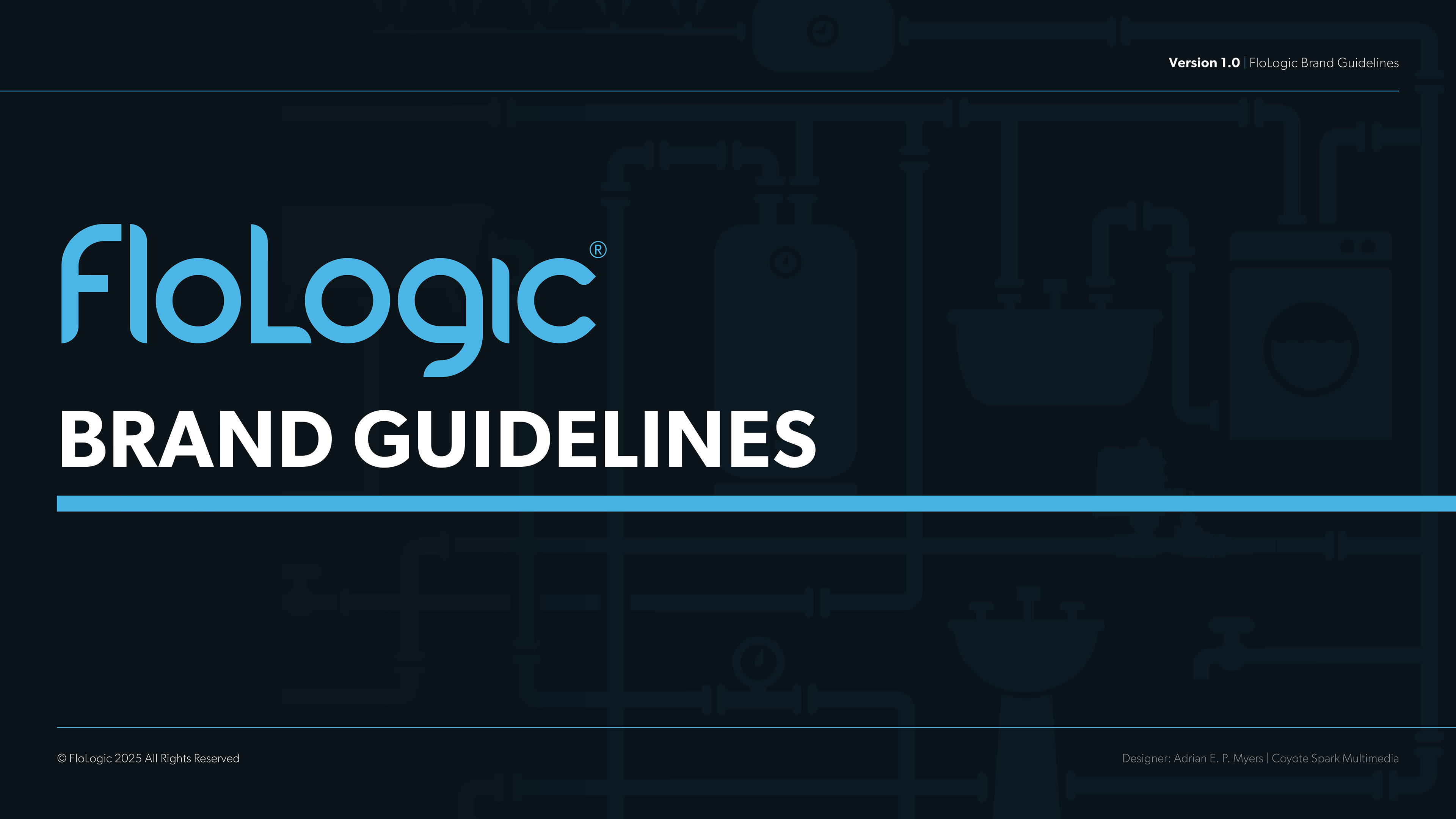
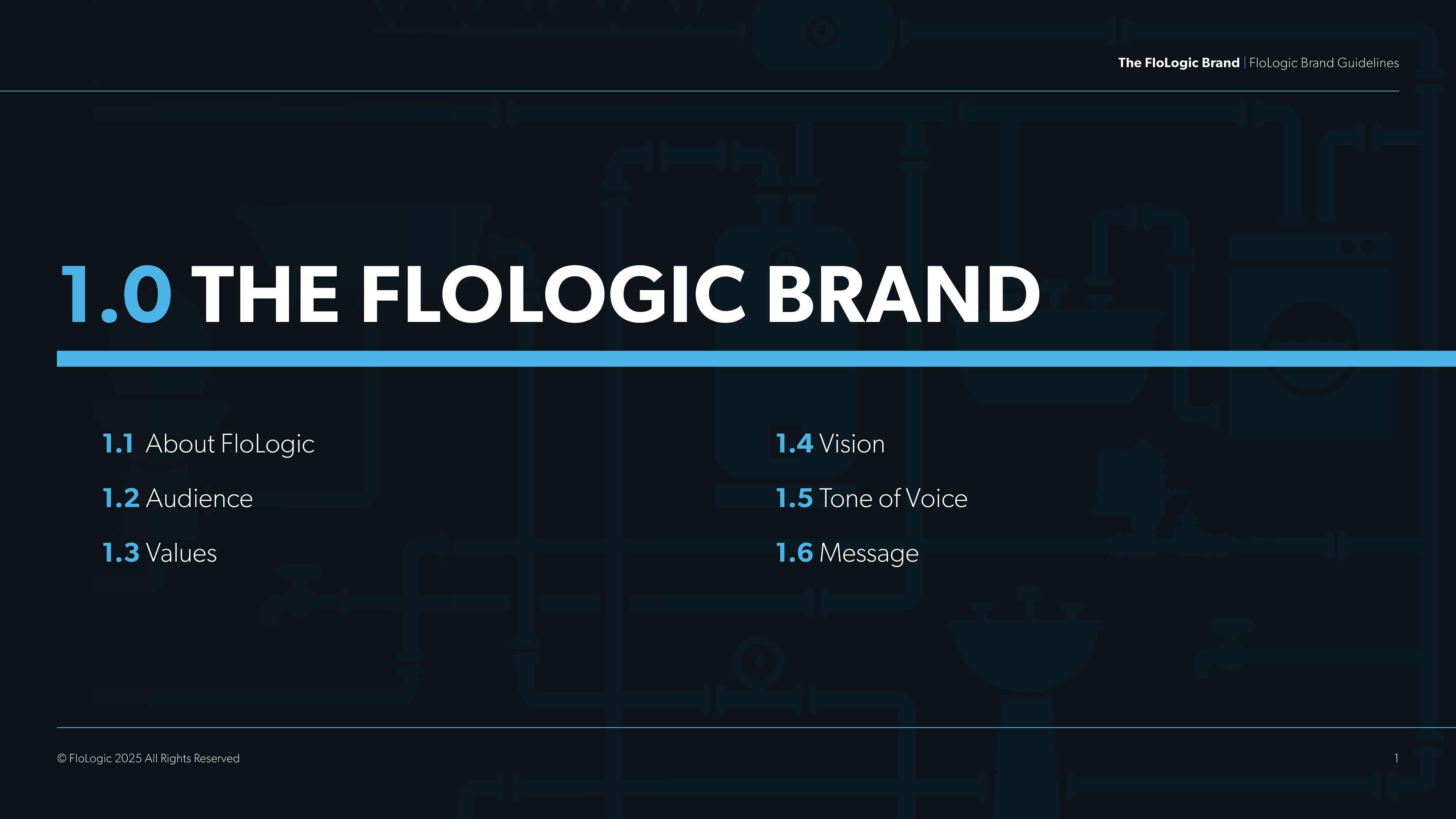
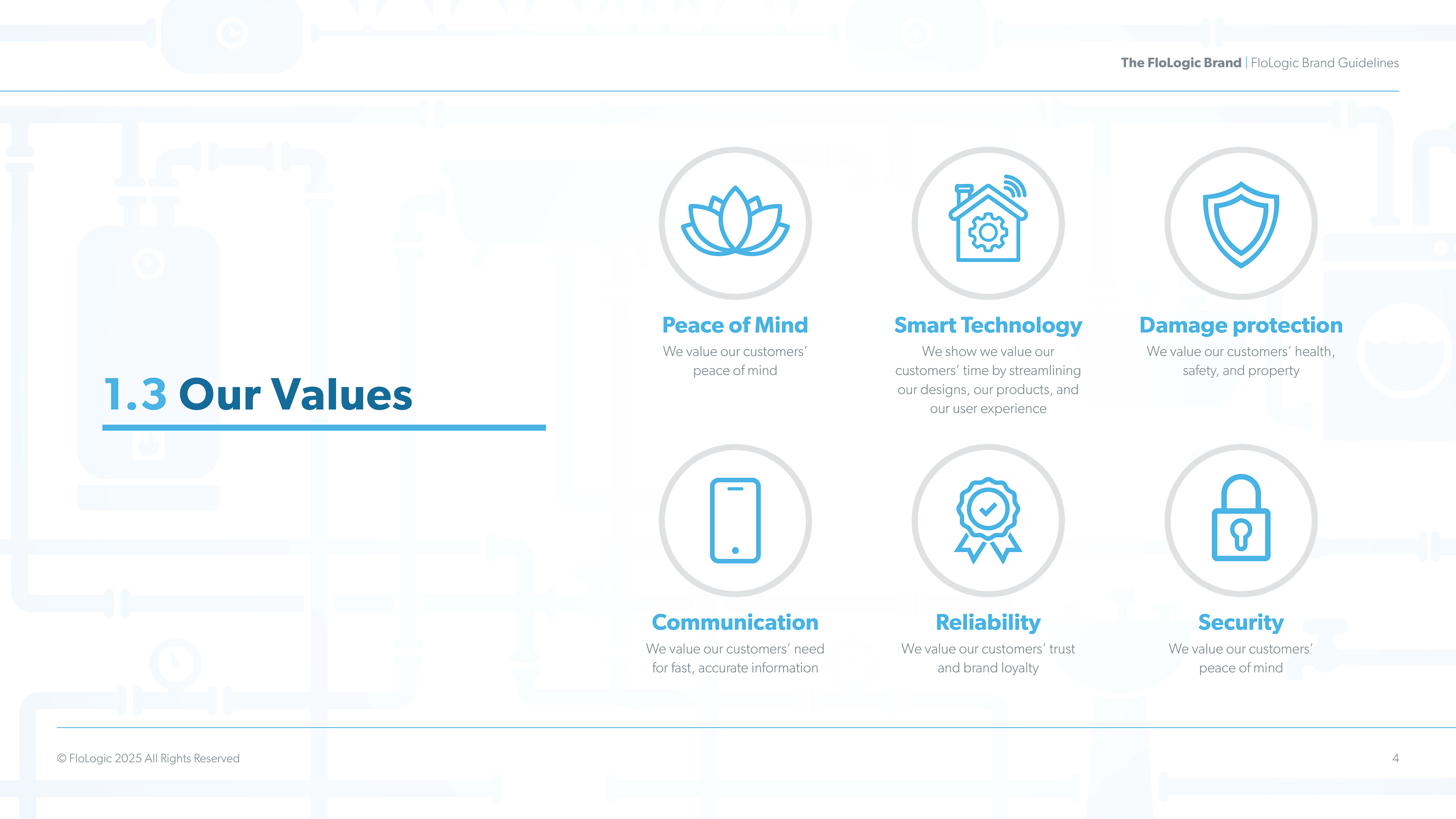
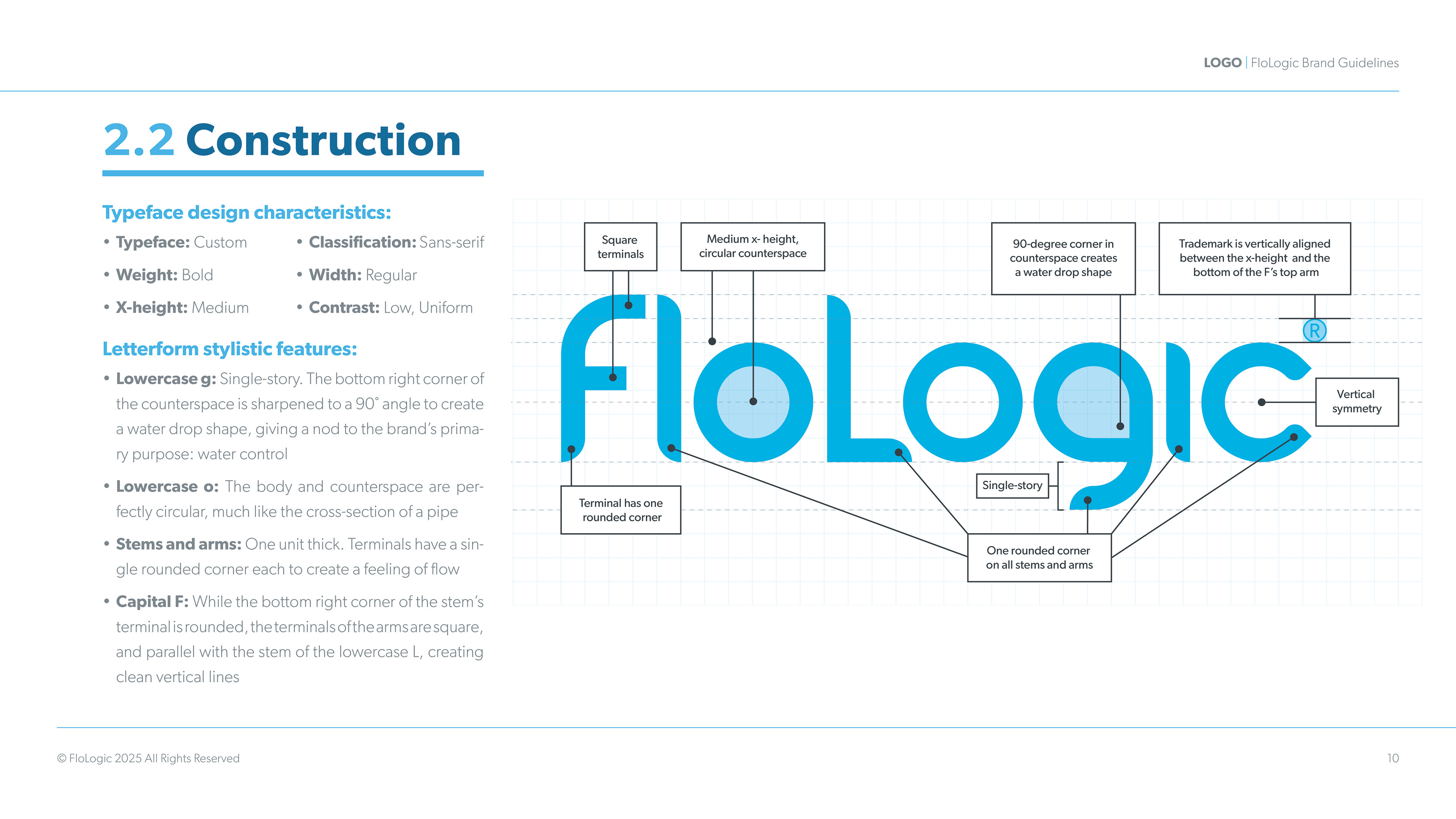
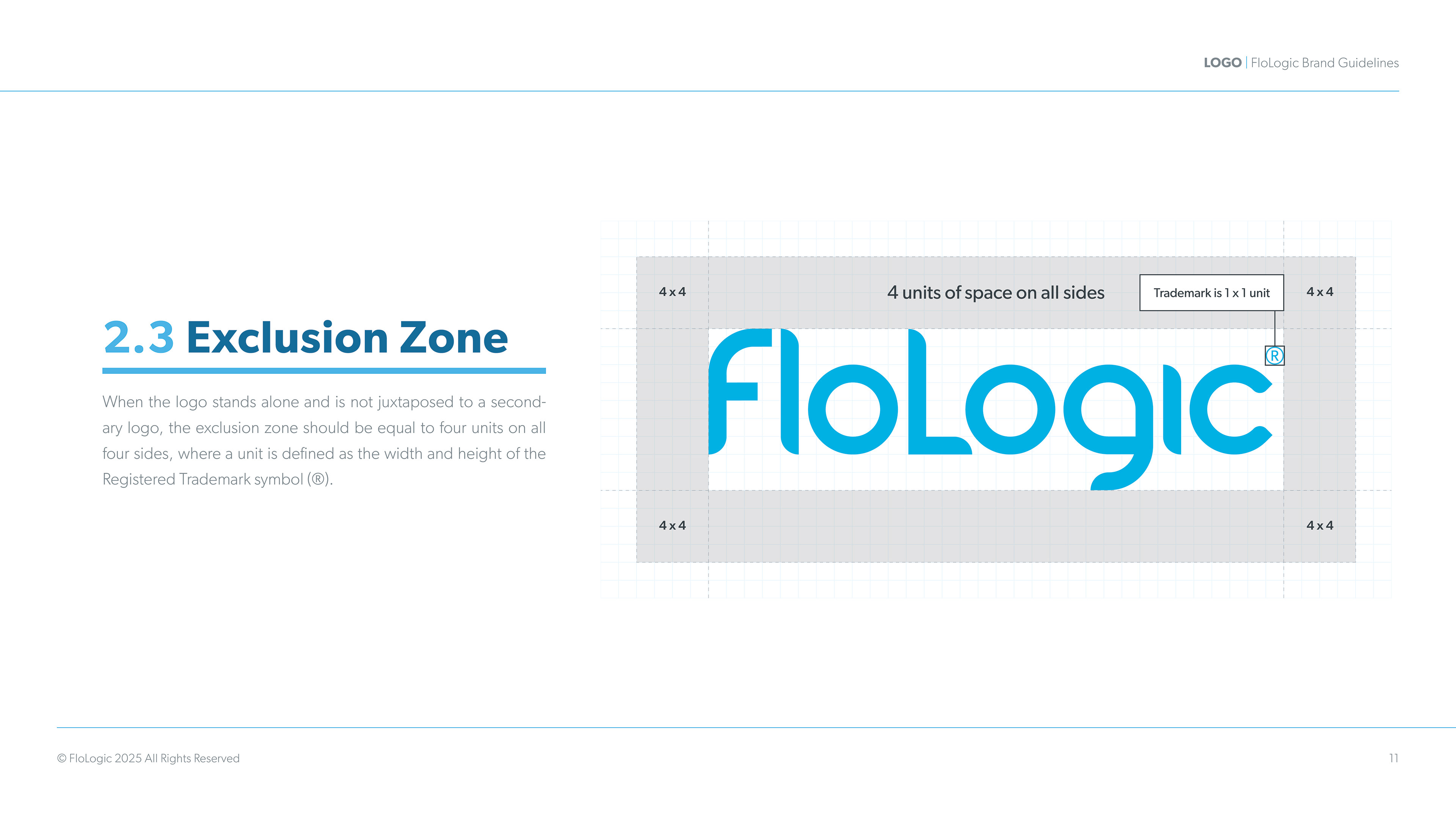
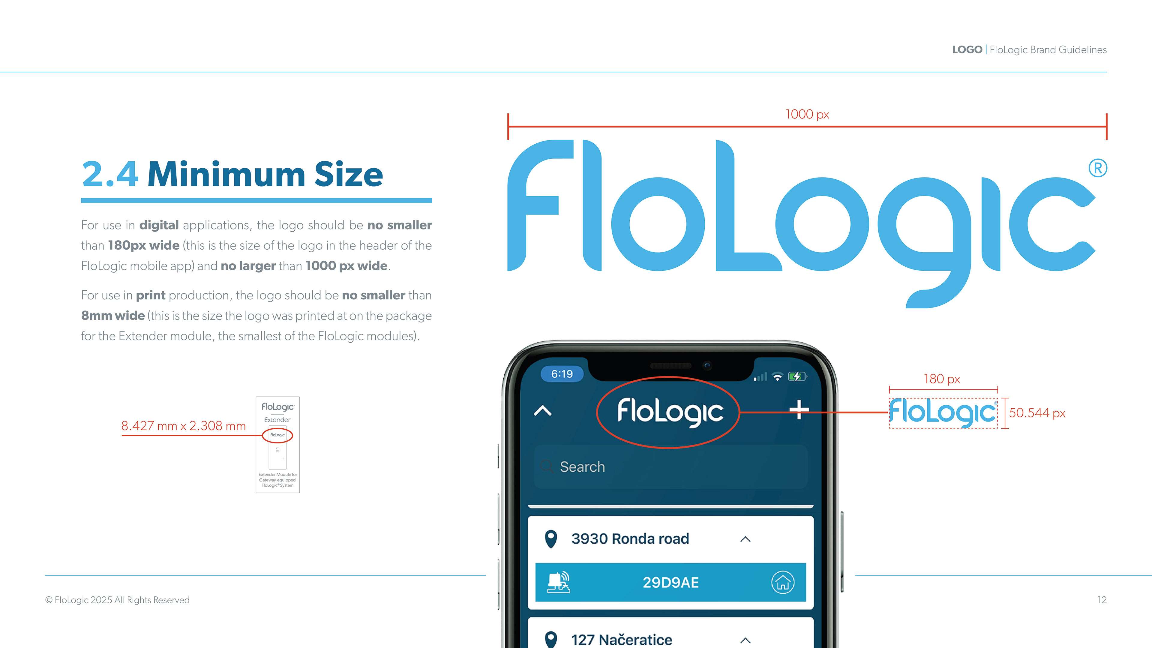
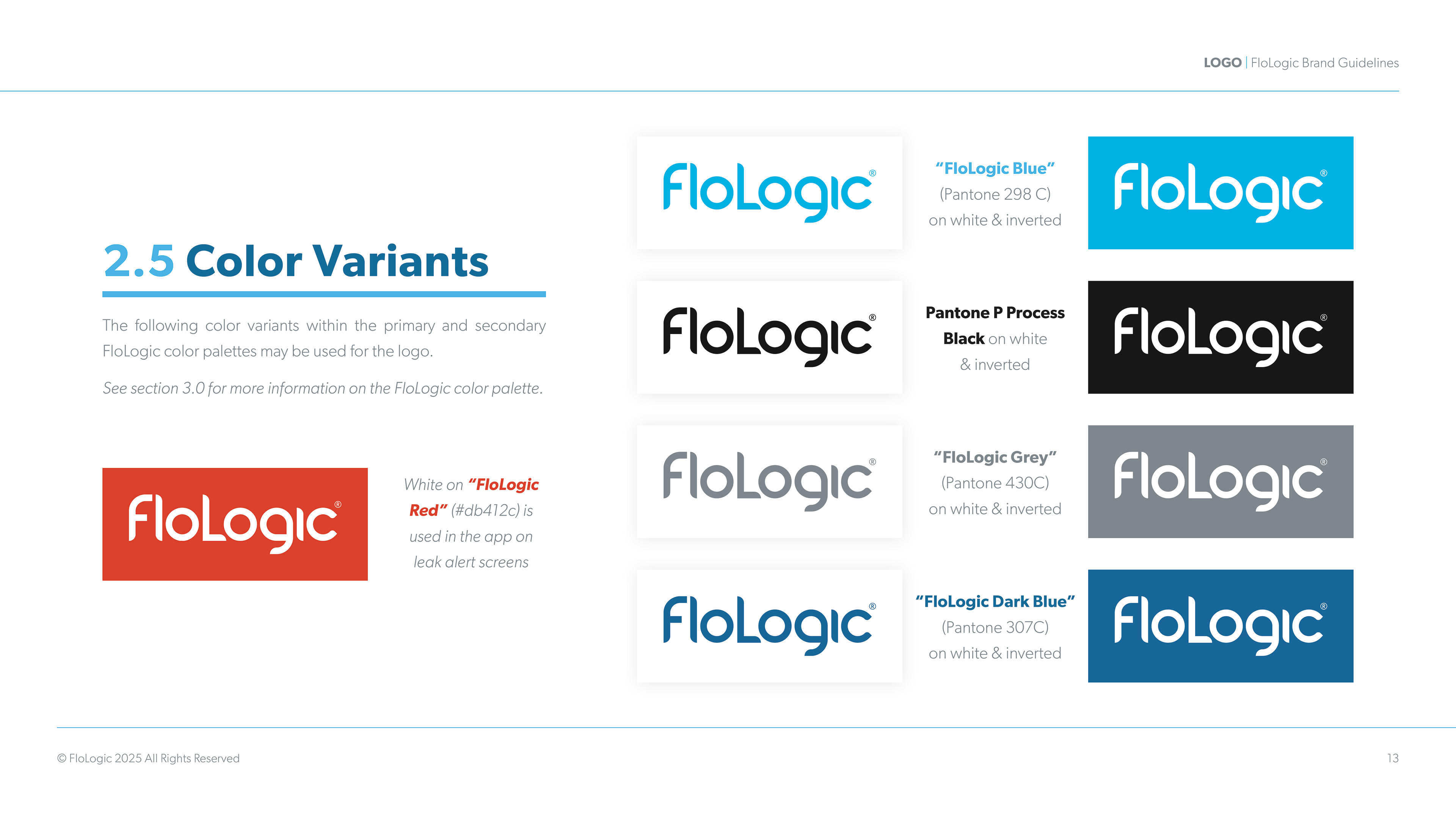
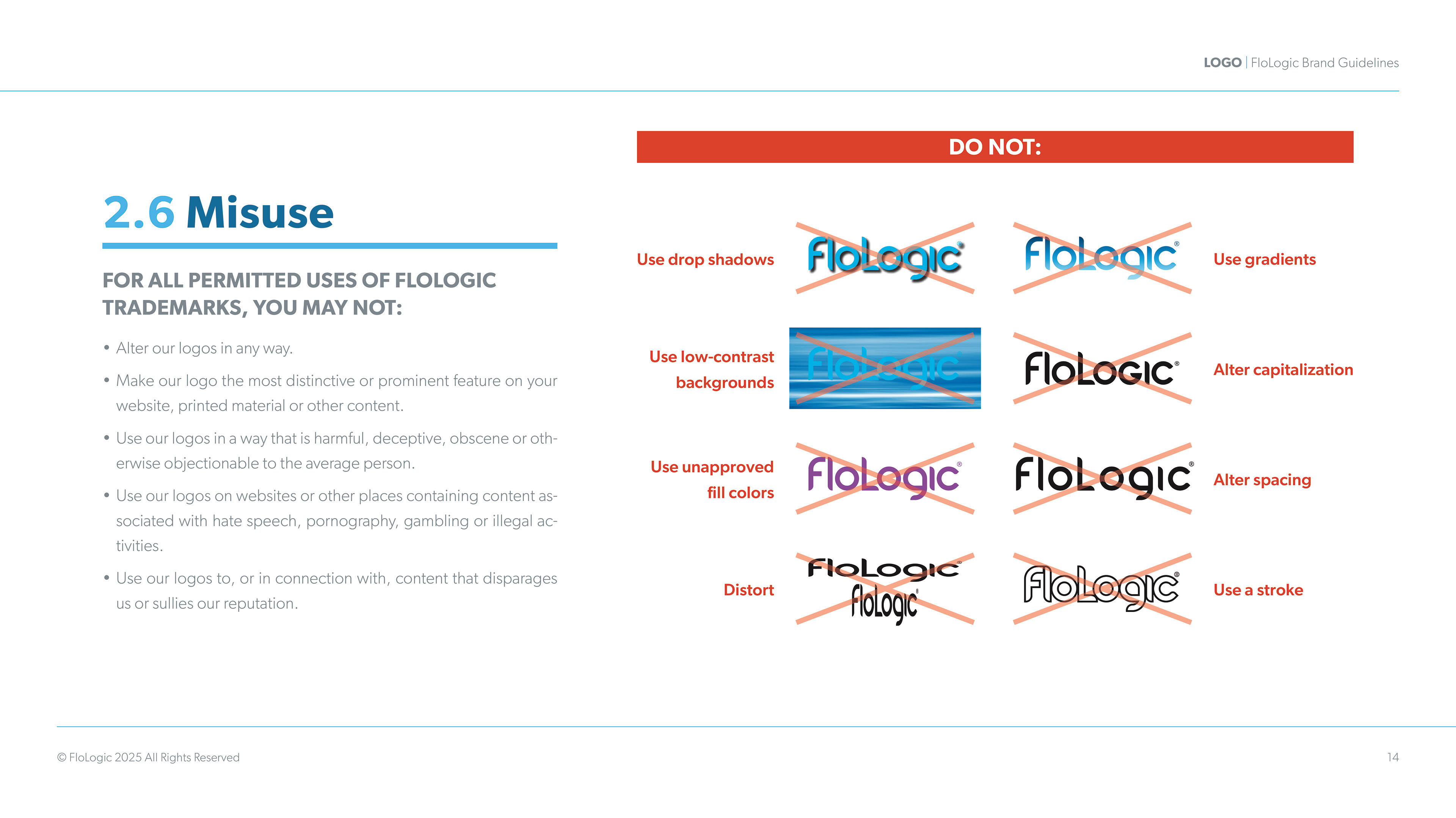
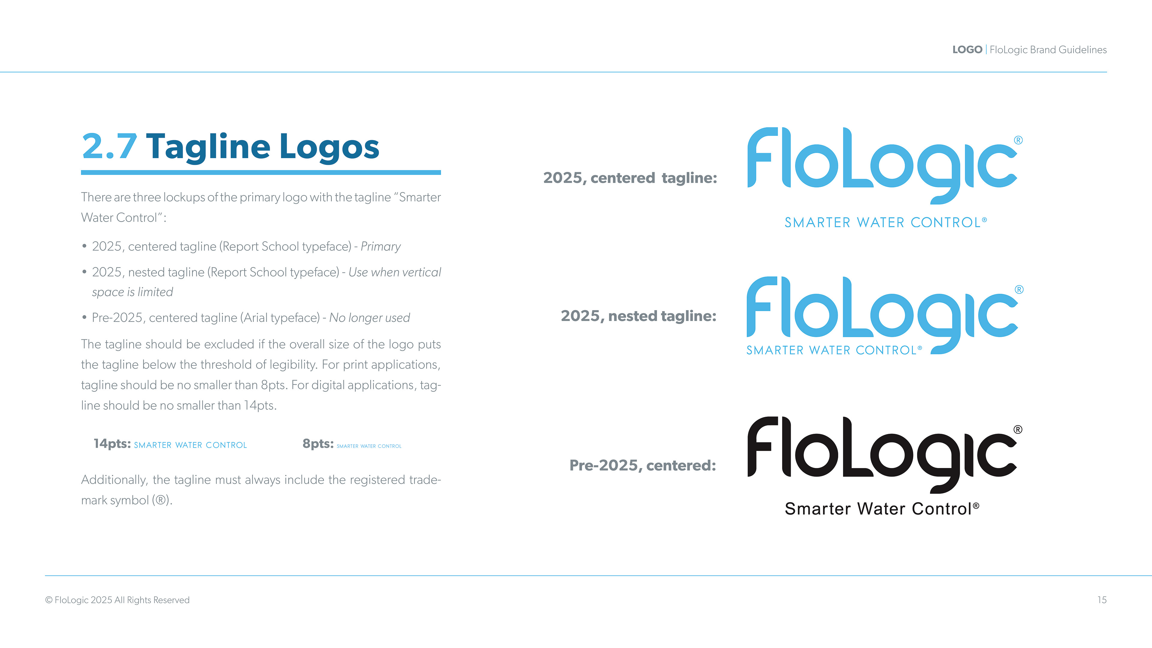
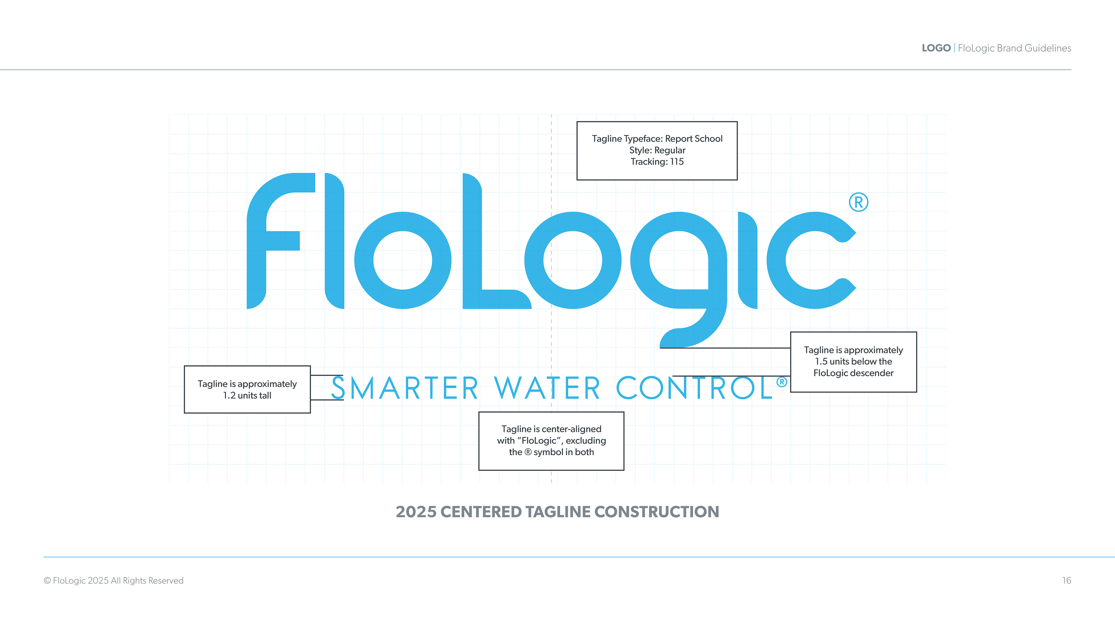
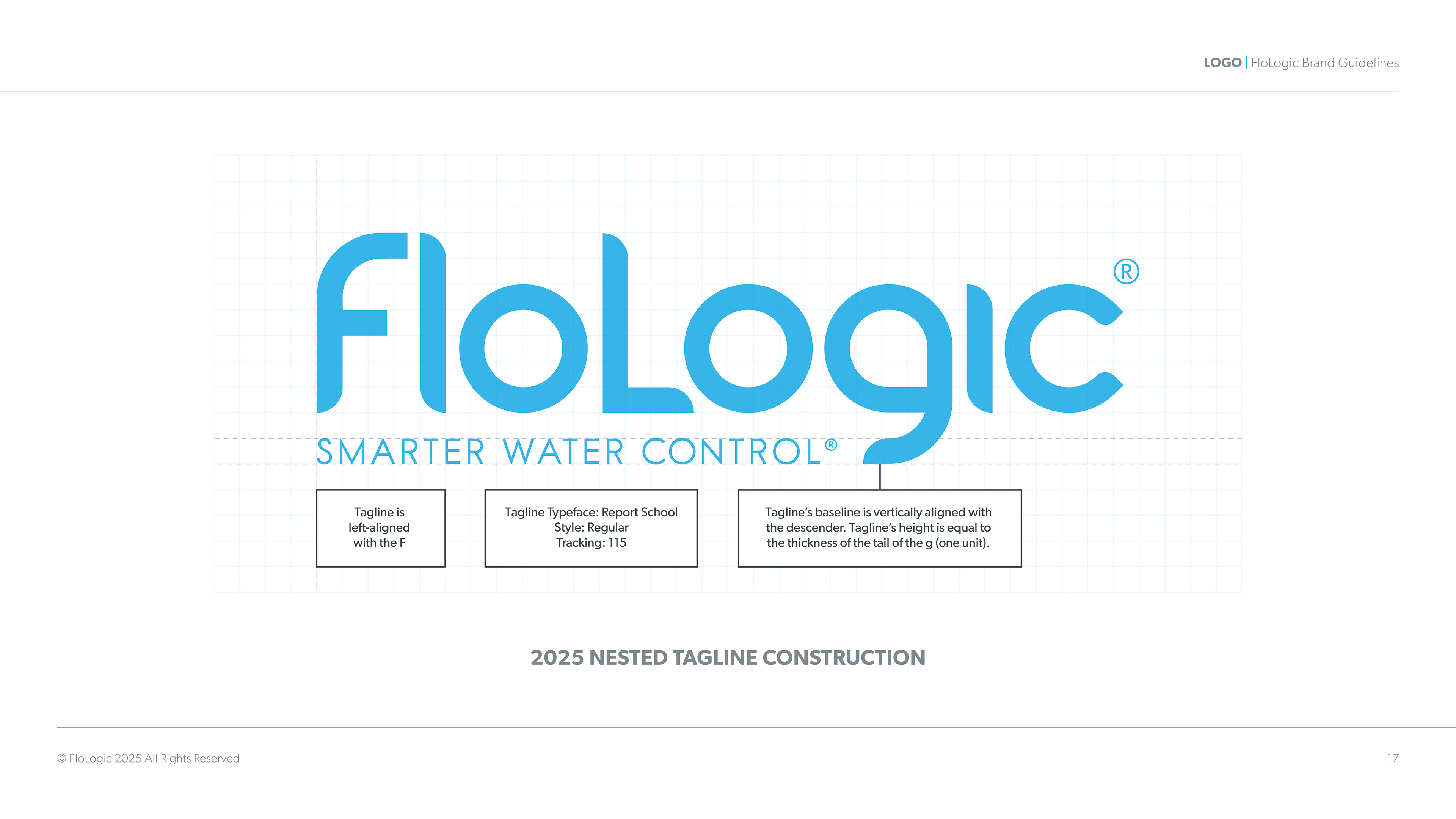
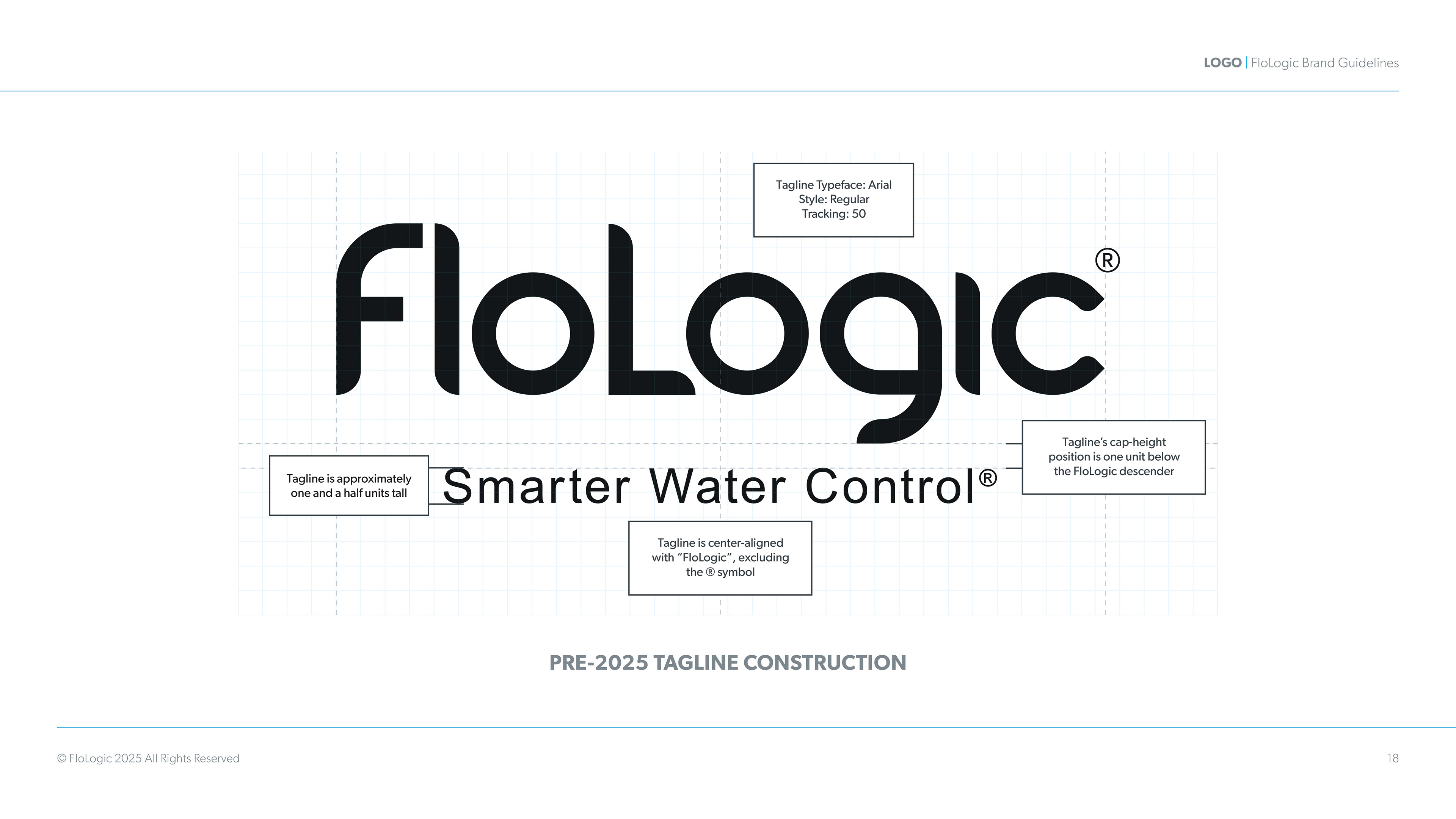
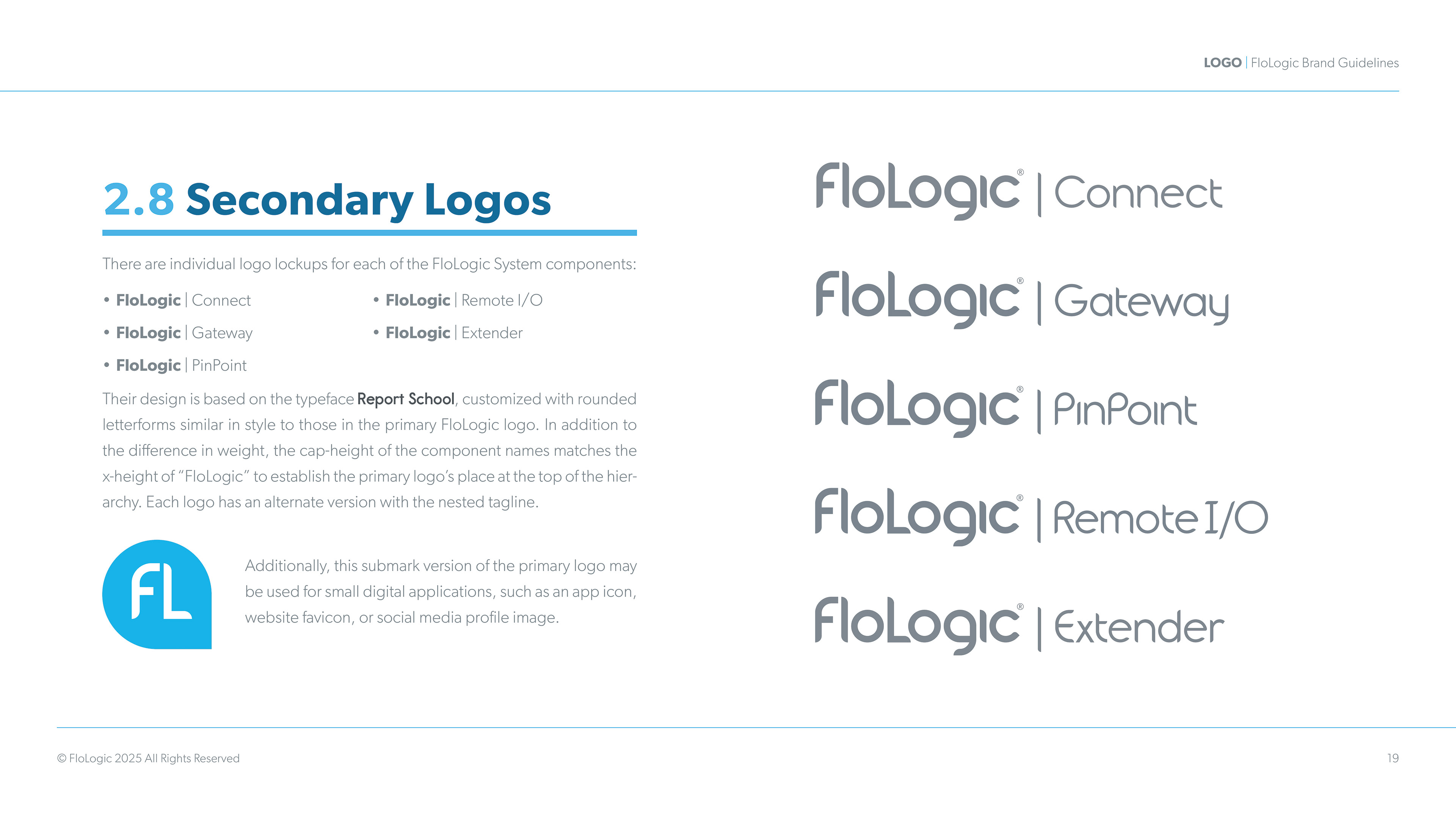
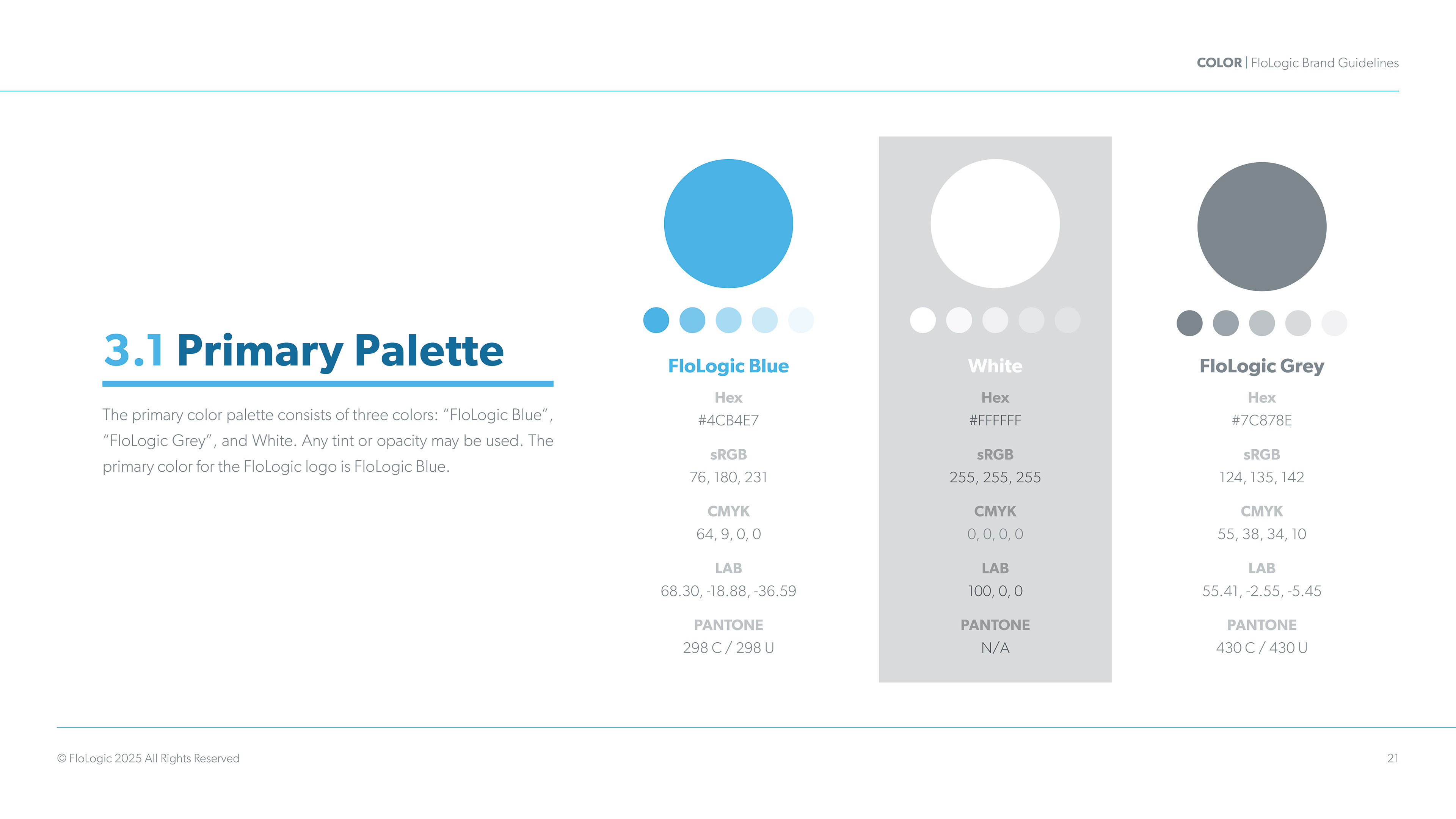
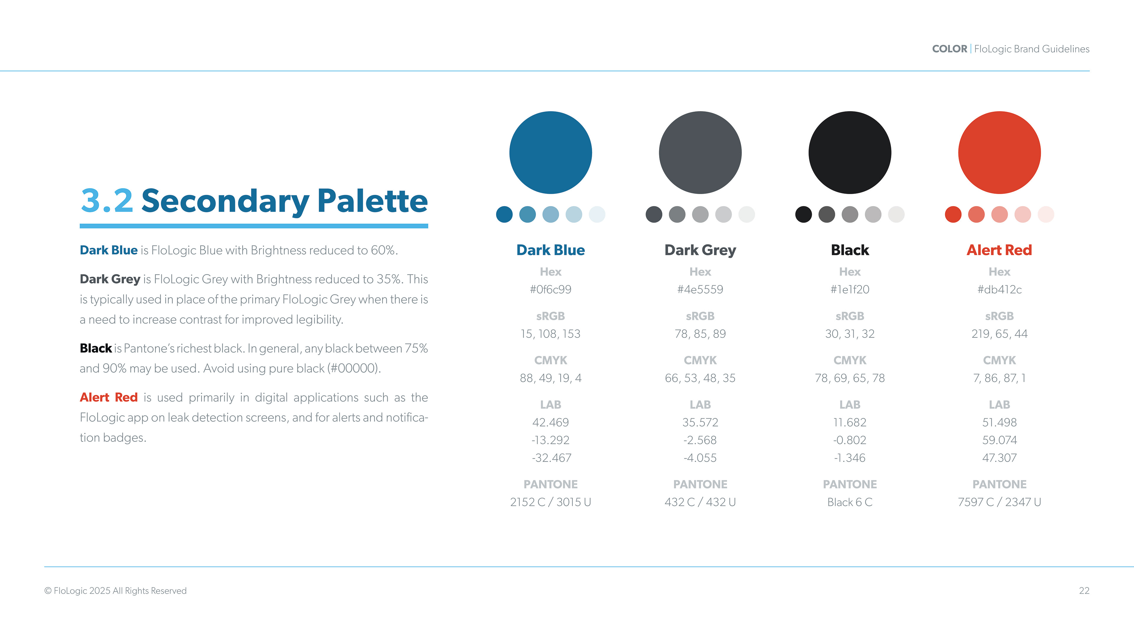
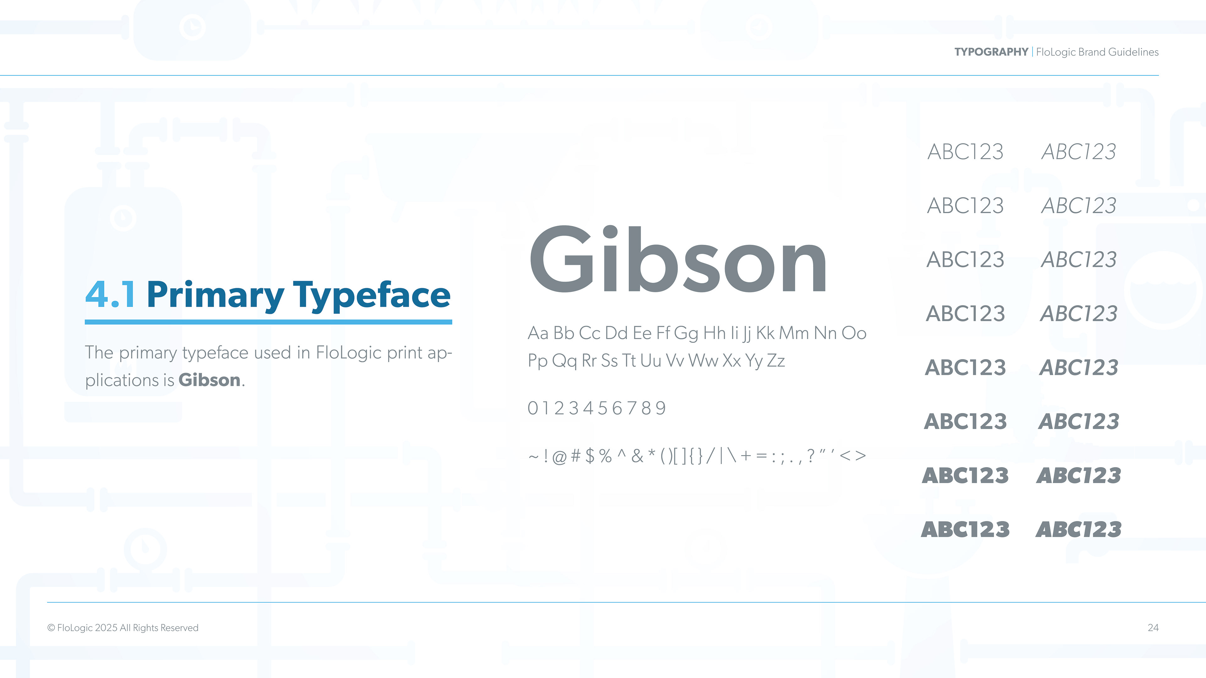
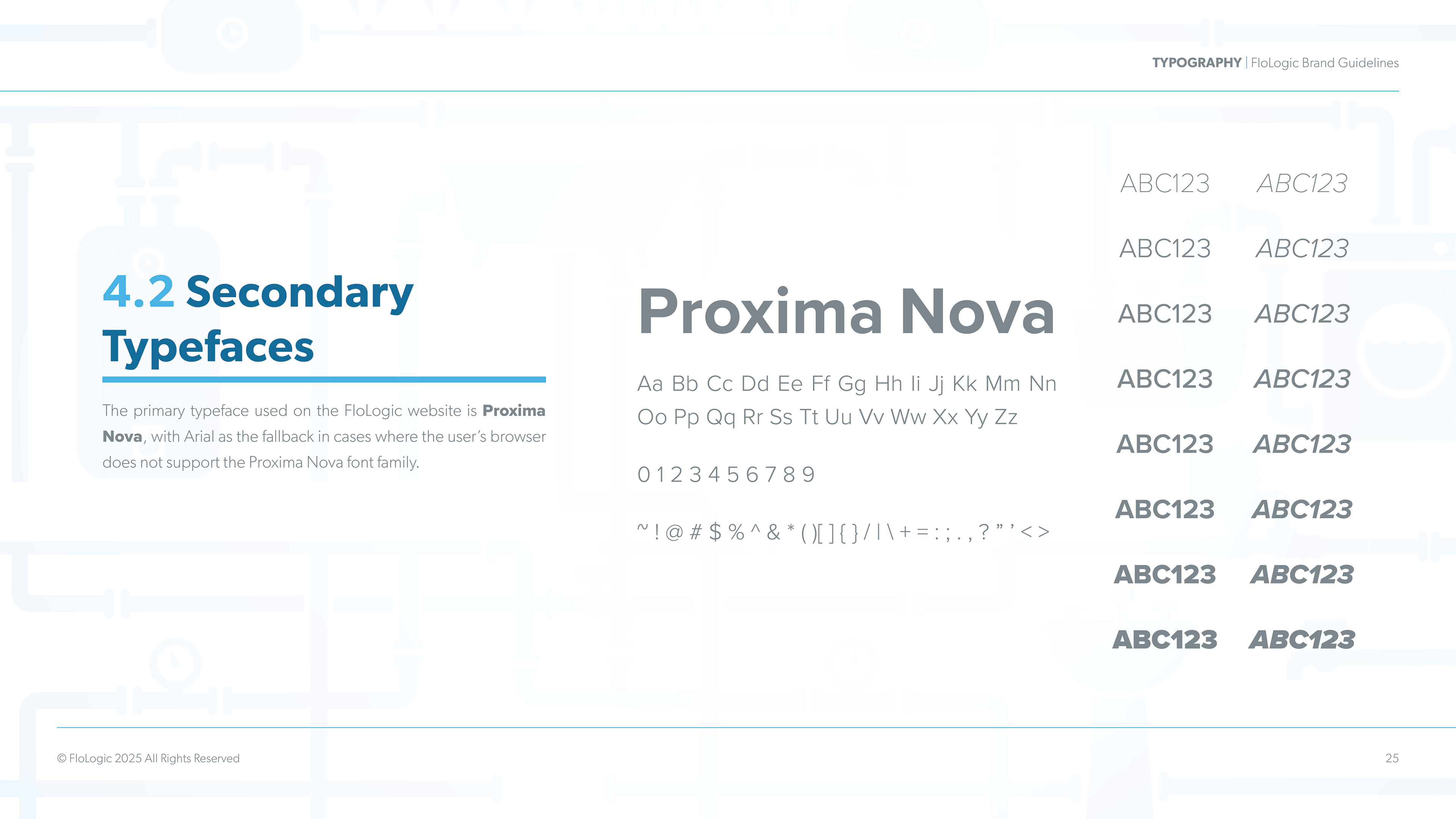
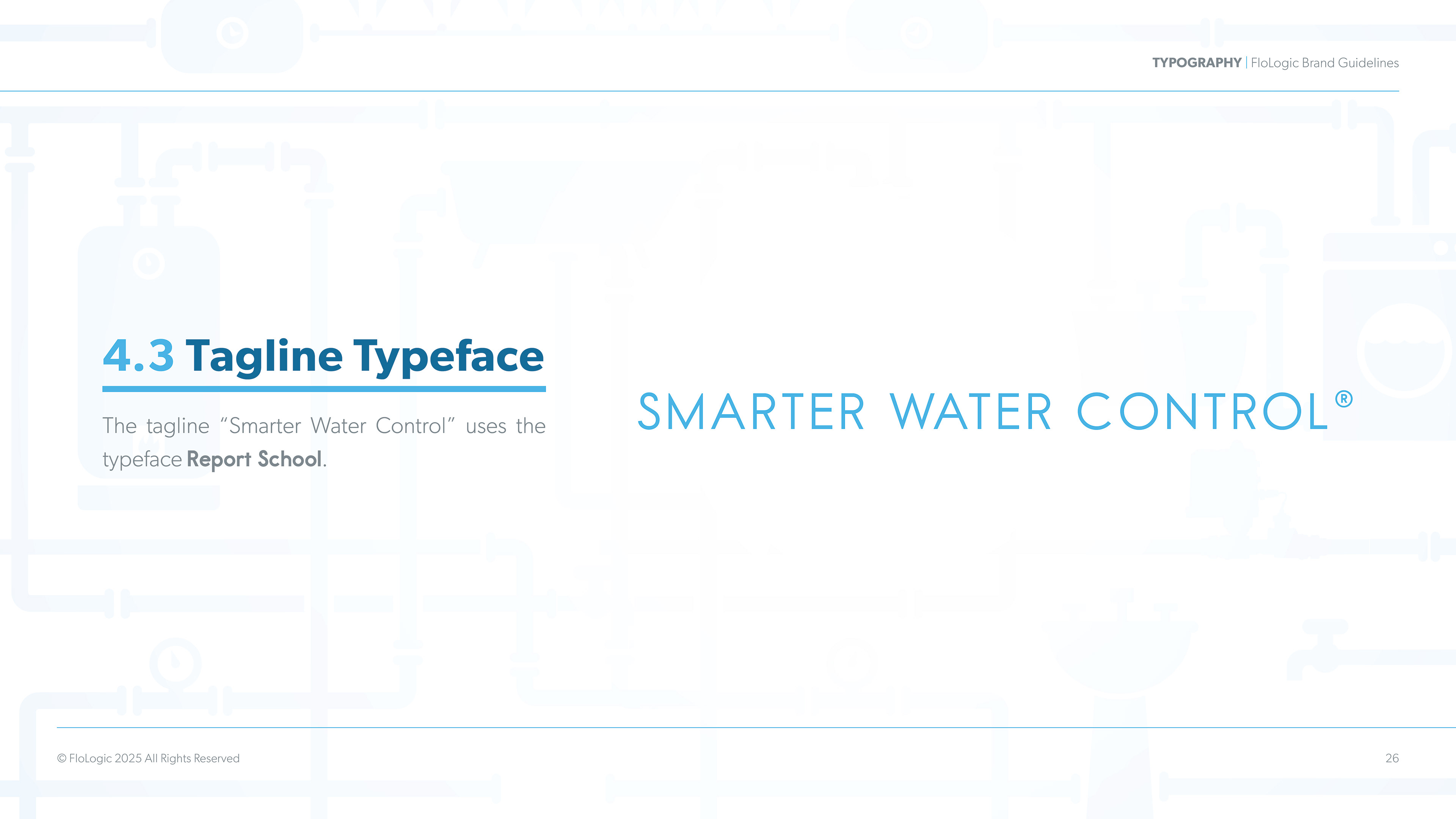
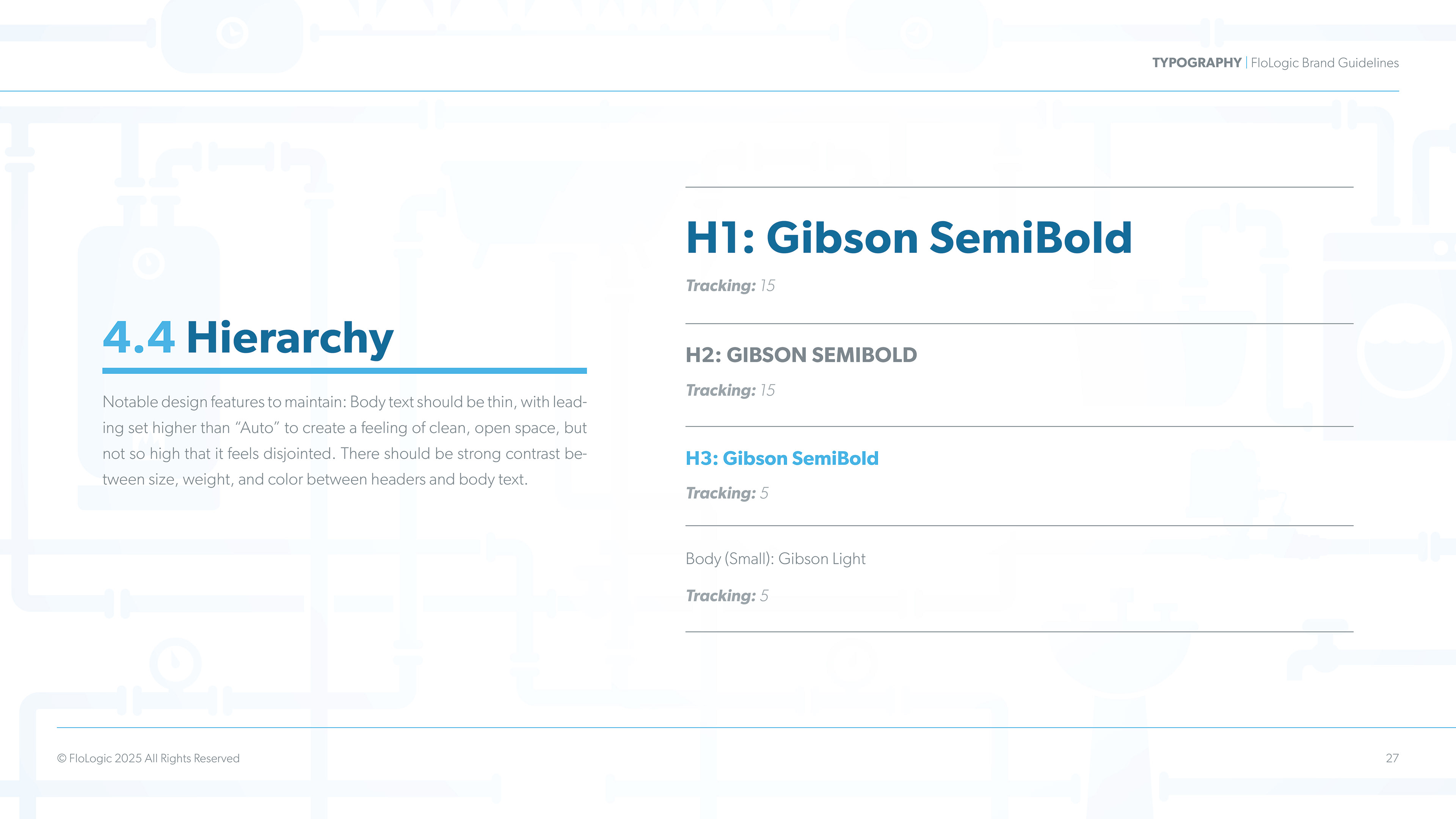
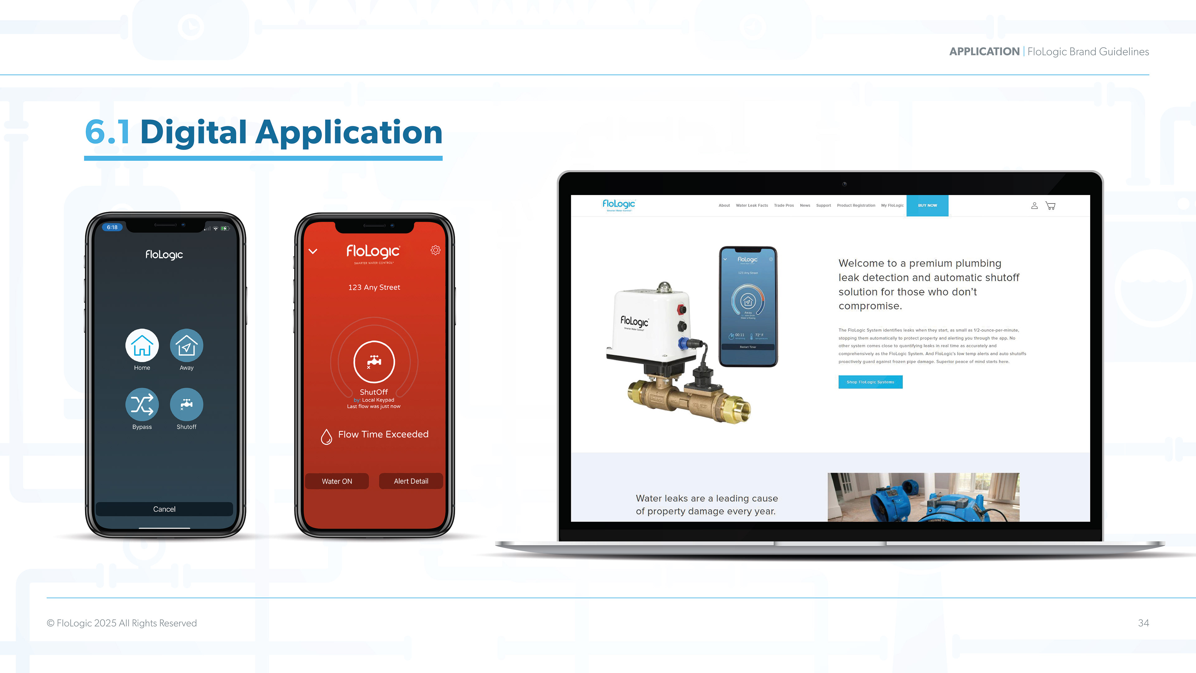
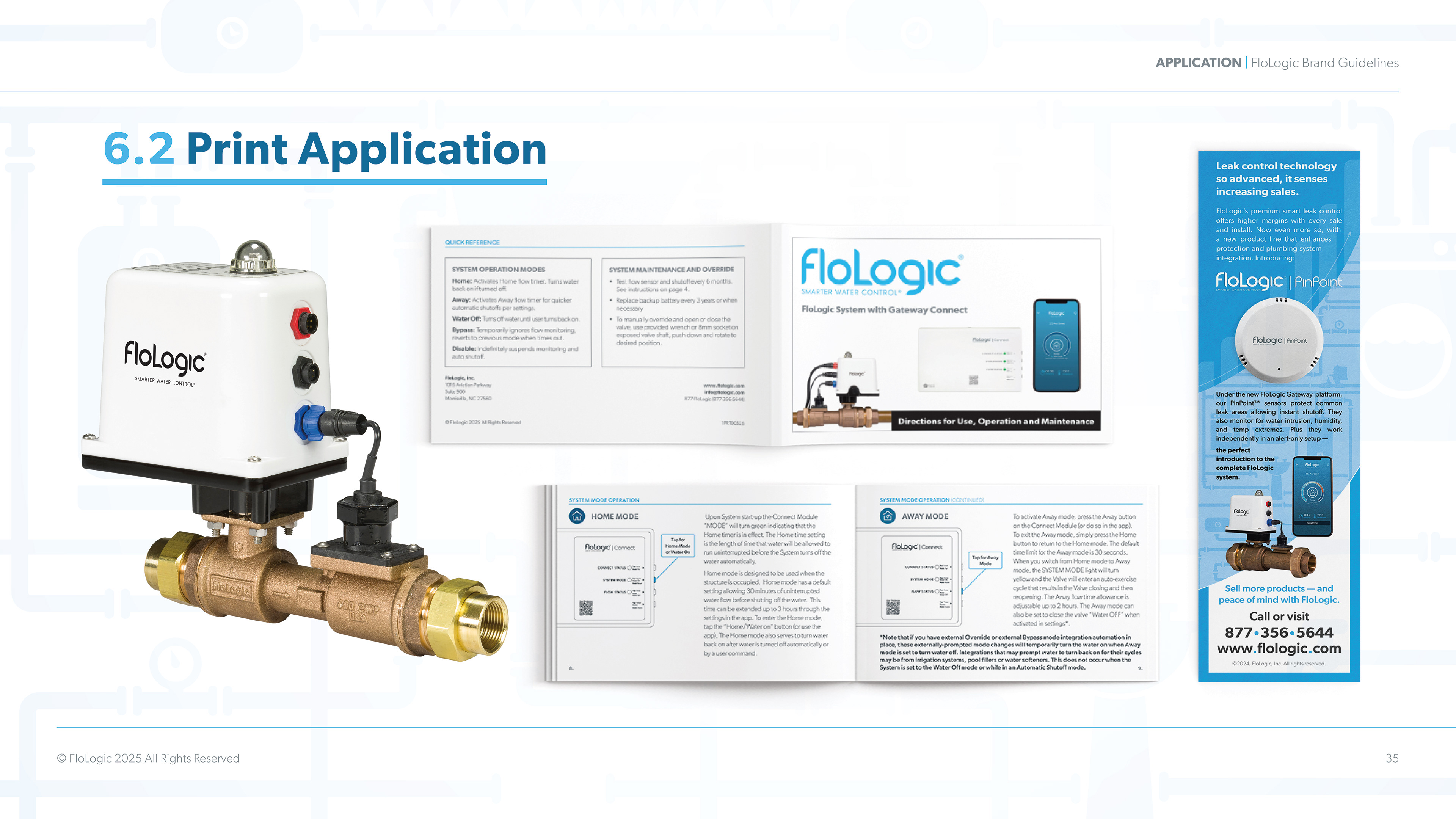
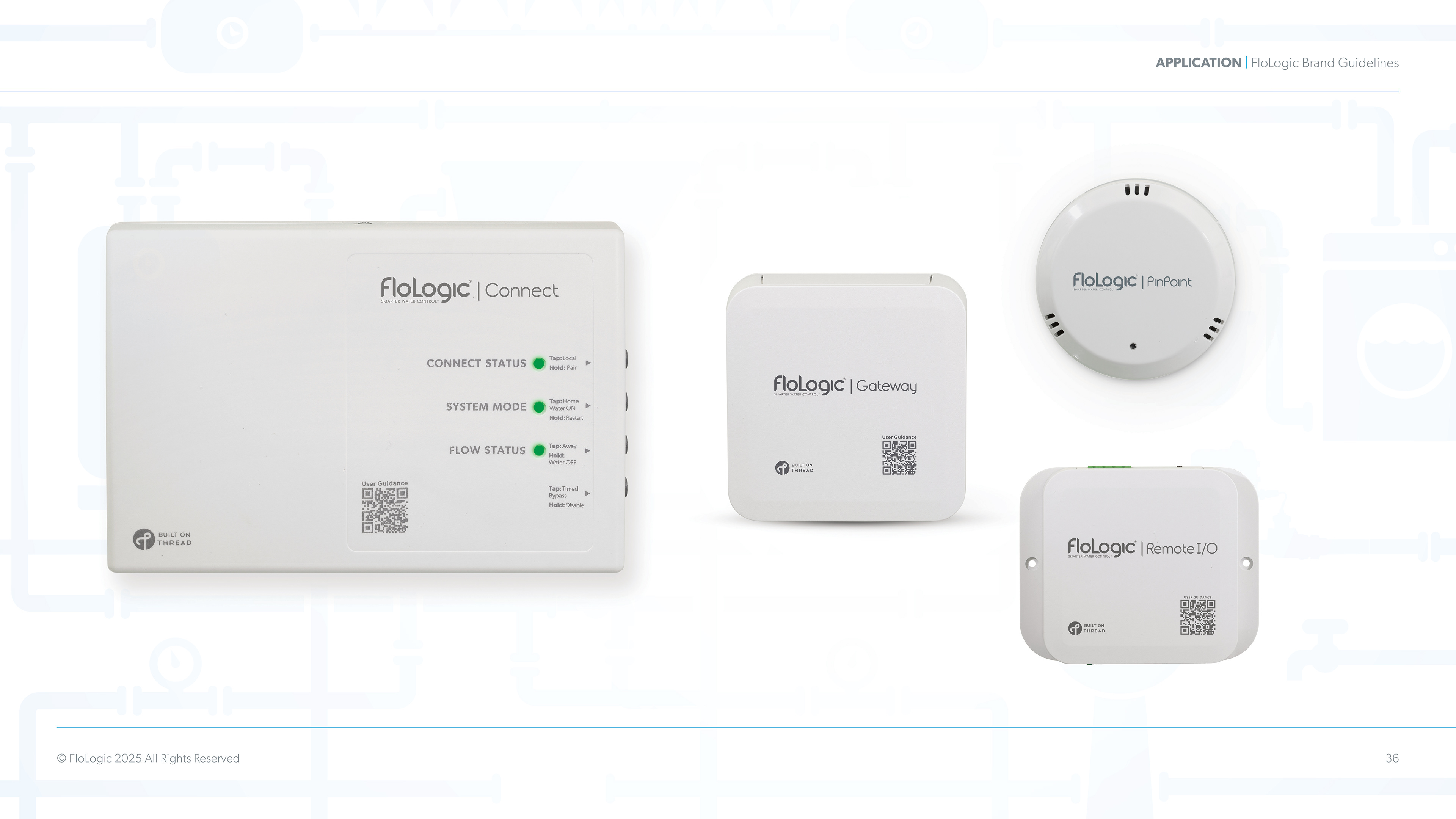
FloLogic: Brand Champion
Brand Guidelines, Product Guide Booklets, Logo Design, Product Design, Interface Design Packaging Design, Interactive Guides, How-To Videos, and more.
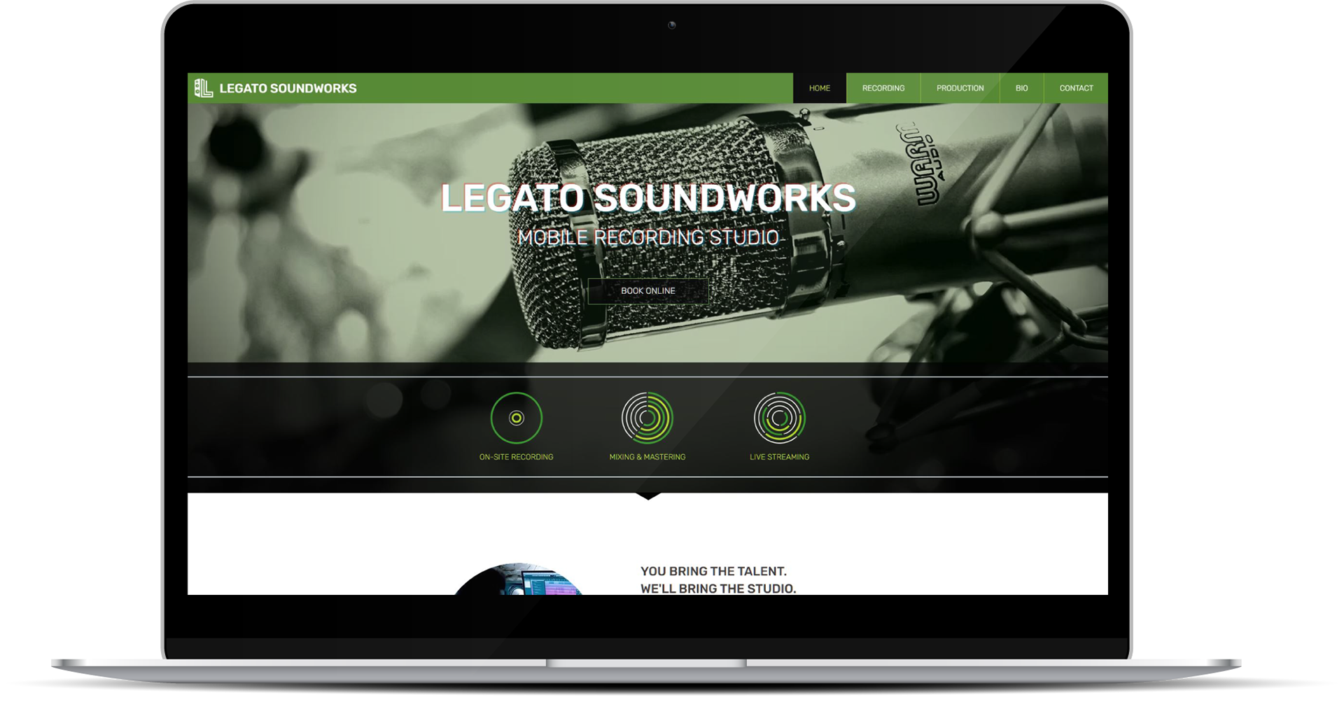
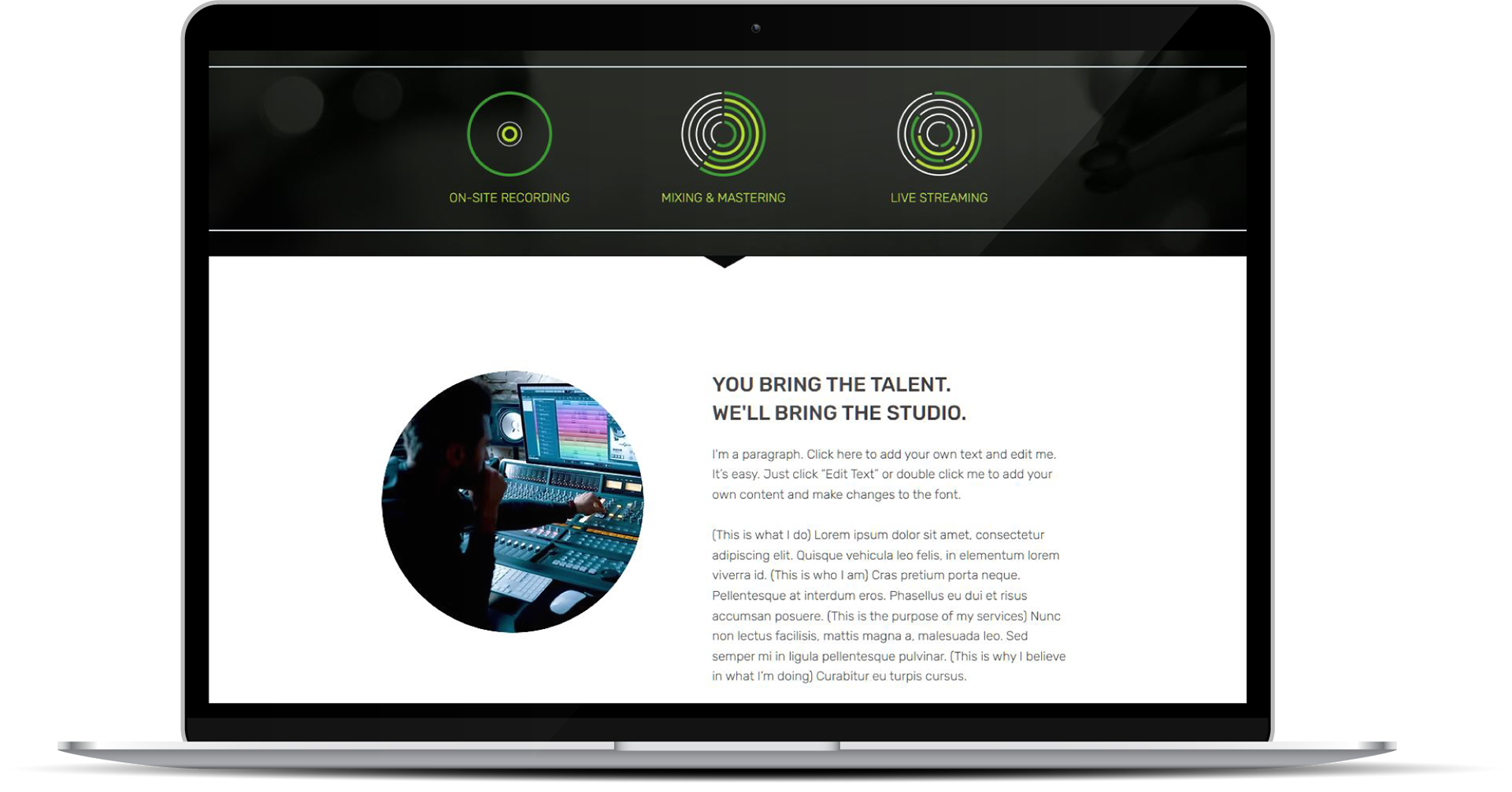
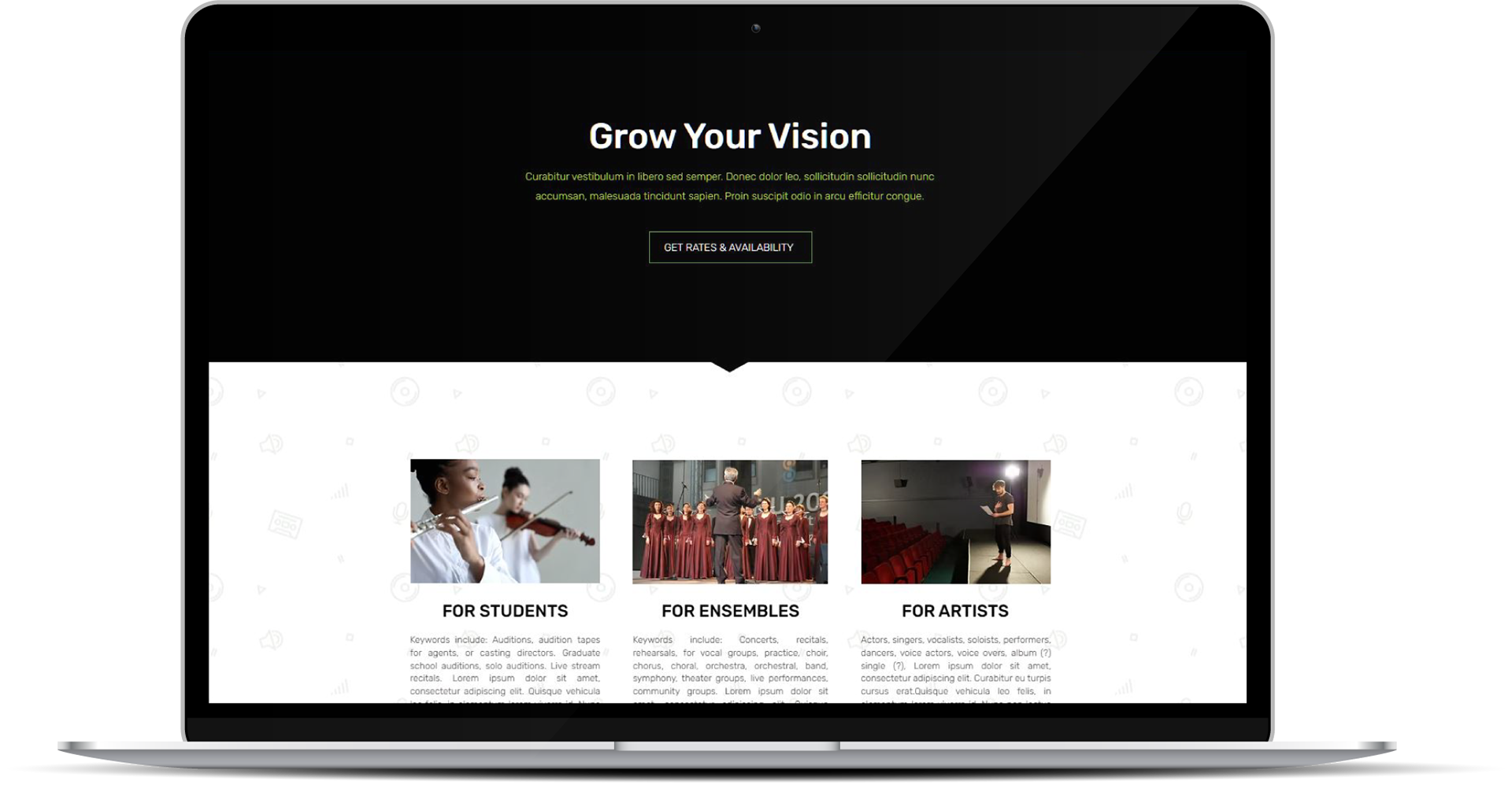
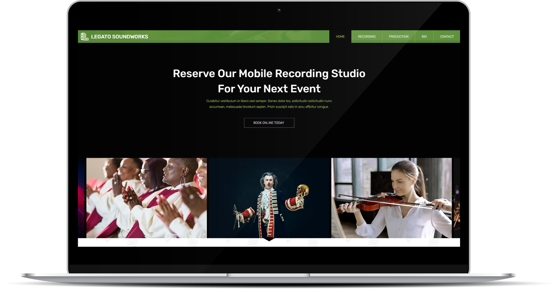
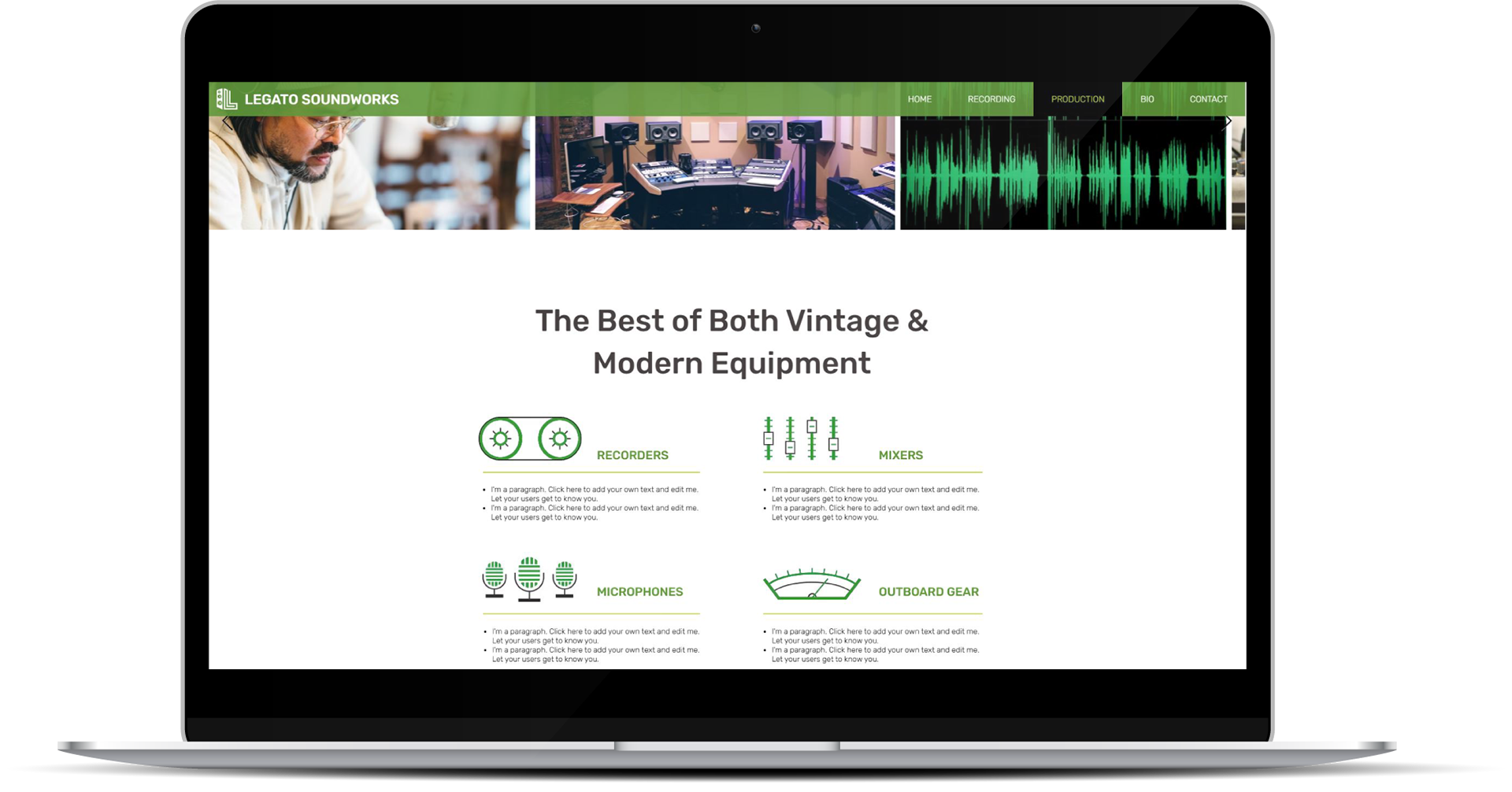
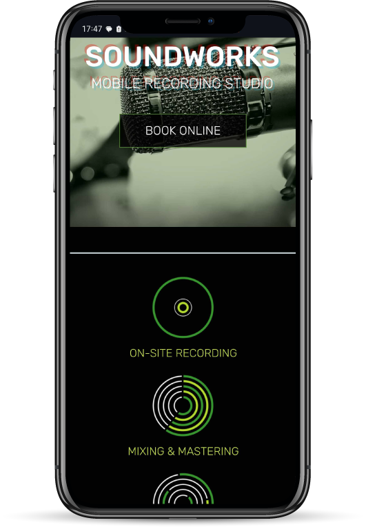
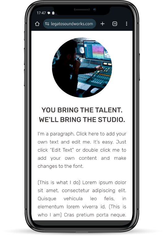
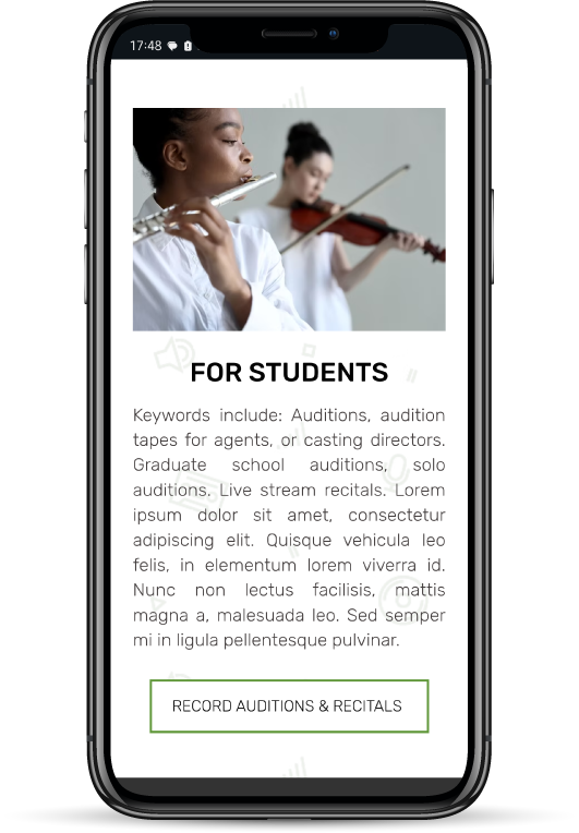
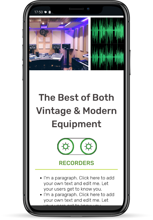
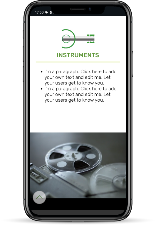
Legato Soundworks: Website Design & SEO

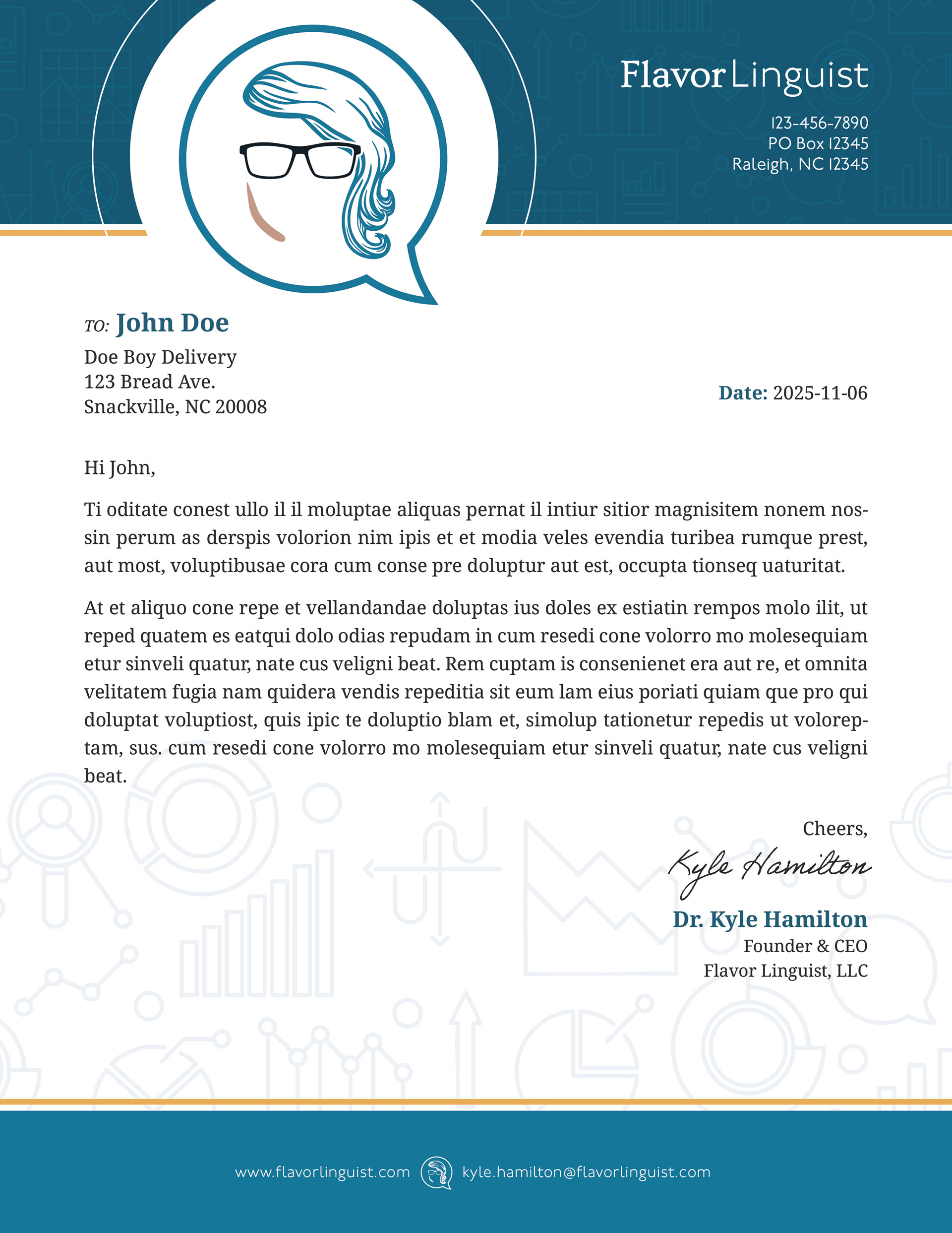
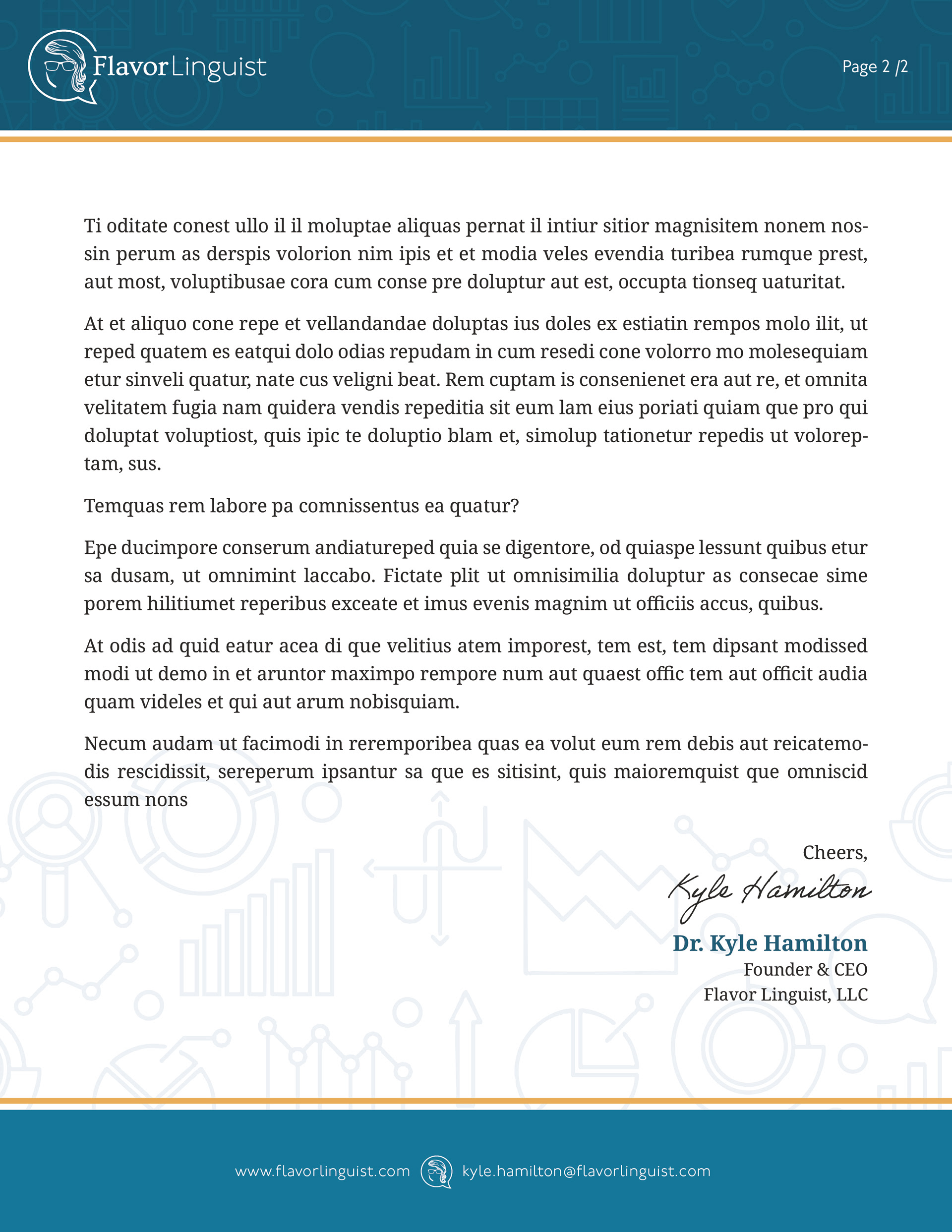
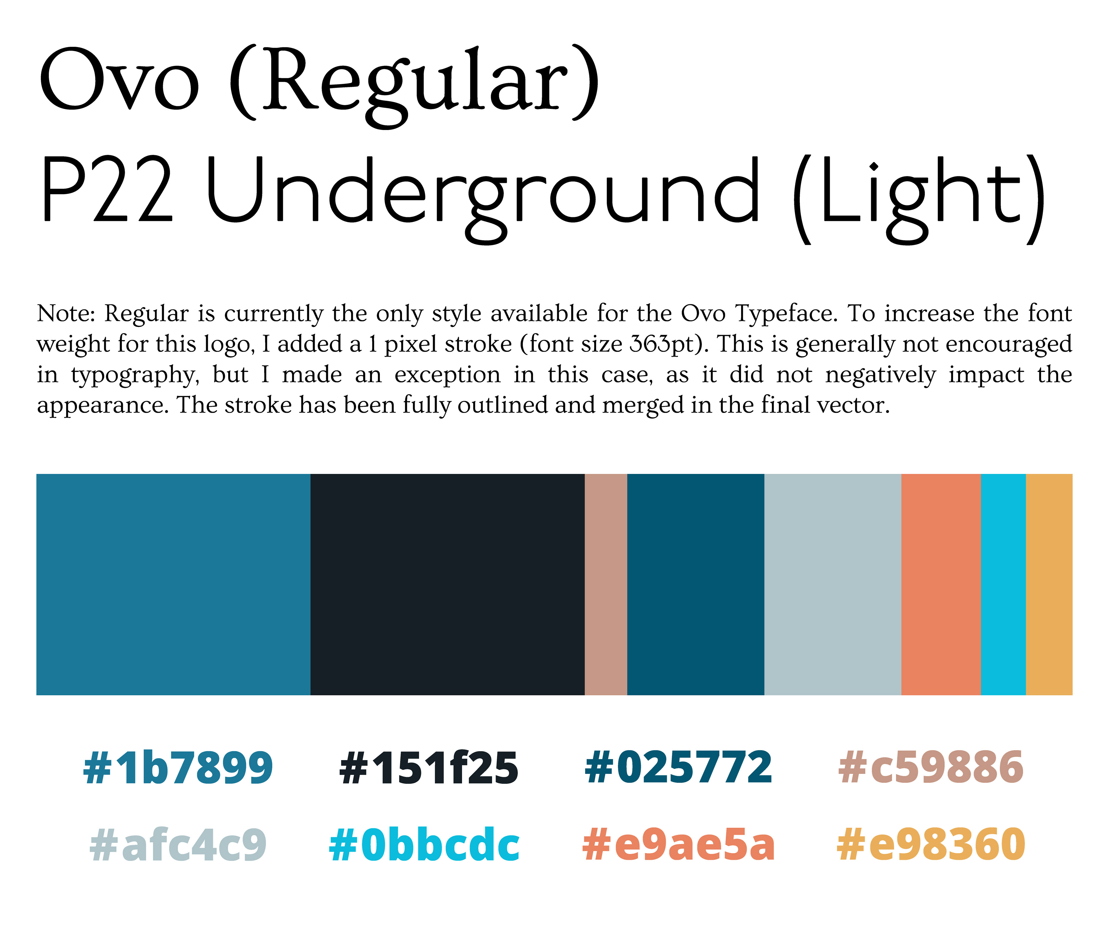
Flavor Linguist: Logo Re-design & Brand Package
Marriage Tattoo Design
D&D Character Expressions: Baz Brightmoon